How to Quickly Create an iPhone Mockup in Figma
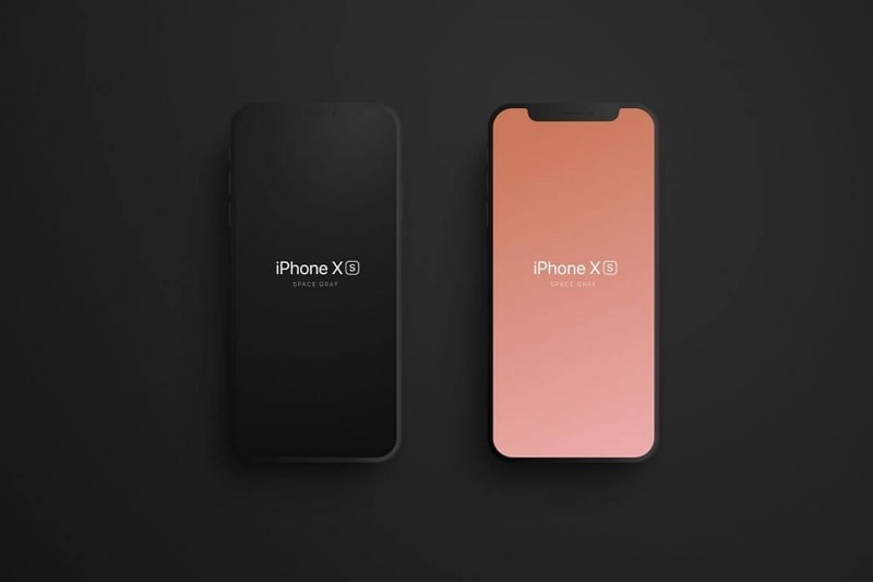
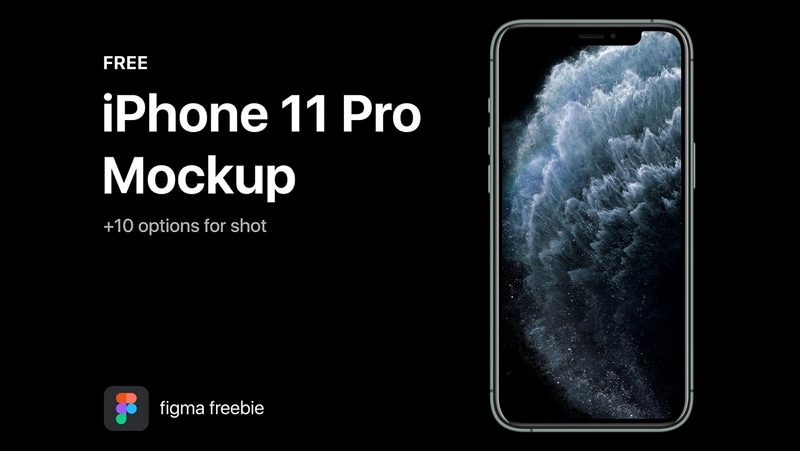
Creating a Figma iPhone mockup for an app or a mobile-friendly website is actually a very simple process. That's because the Figma interface is designed for usability and simplicity. For an iPhone X Figma mockup, as an example, you can choose your device type before beginning work on your markup. This gives you the correct aspect ratio of an iPhone X screen so your mockup looks more realistic. These preset screens for iPhone UI/UX design are also called device frames and are used to set the dimensions of your artboard before you begin adding the components and designing the layout. You'll also find vast collections of Figma iPhone template downloads that you can import into your Figma account.
- Part 1. How to Use a Figma iPhone Mockup
- Part 2. Advantages of using iPhone Mockups in Figma
- Part 3. The Best Figma Alternative

How to Use a Figma iPhone Mockup
An iPhone mockup, as we saw, is simply a template that shows the specific device so other stakeholders can see what the app that's being designed will look like on the target device. You can download them from third-party sites like Dribbble and then import them into Figma to use in your design. The design can be implemented within the Figma iPhone template to display a realistic look for your app design.

To get a Figma iPhone mockup, just download it from a third-party resource and import it into Figma. In case the mockup is promoted on Figma's own website, you'll see a feature to directly add it to your Figma account online. You can use this instead of having to download it and then import it again into Figma.
Once the mockup templates have been added to your Figma account, you can create variants and export them, overlay your designs on top of them to create a realistic-looking design, and much more. Many of them already come with constraints and layout built into them so they're essentially like plug-and-play design templates.
Advantages of using iPhone Mockups in Figma
The biggest advantage of using an iPhone Figma mockup is that it saves you a tremendous amount of time. The work of designing the device frame has already been done by someone else, who has shared it as a free or premium template. Why duplicate it when you can spend time on your actual design for the iOS app.
Another major plus is that these iPhone mockup images are very professional-looking, which will give your design a professional look as well. The more polished it is, the better other stakeholders can see what your app design will ultimately look like on a particular iPhone model.
The variety of Figma iPhone mockup options is the third advantage. With so many free as well as premium choices, you can have your pick of the best mockup templates to work with.
The Best Figma Alternative
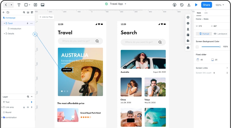
If you've always wanted to use Figma but you felt it was too expensive for some reason, it's time to switch to a Figma alternative like Wondershare Mockitt. Made by the creators of some of the hottest productivity and creativity apps like PDFelement and Filmora, Mockitt is an online UI/UX design and prototyping tool with powerful features but available at a fraction of what you would be paying for a Figma subscription.

Let's look at some of the key features that make Wondershare Mockitt such a compelling alternative to Figma and other design tools:
- Cloud-hosted: Access from anywhere using secure logins. Online access is possible from any connected device with a modern browser.
- Extensive asset library: Hundreds of commonly used components for your design, neatly categorized, and easily searchable.
- Lots of UI kits for iOS and other platforms: Custom-built UI kits to design apps and websites for various operating systems and device types.
- Fast prototyping: Easy linking and ready-to-use gestures, transitions, and effects make prototyping possible in a very quick time.
- Easy-to-learn interface with convenient drag-and-drop and other features: Superior user experience delivered through design and usability excellence.
- Enhanced experience in an uncluttered and distraction-free interface: Everything you need and nothing you don't need, all put together carefully for optimal user-friendliness.
- All the controls at your fingertips: design, prototype, preview, share, comment, and download - each function has its own section for a better navigation experience - ideal for first-time users and experts alike.
- Dynamic widgets to create in-page interactions: No need to create multiple page states to show the interaction of a single widget within a screen.
- Master widgets for global editing of all instances: Assigning the Master status to any widget makes it editable globally. Edit one instance and all of them instantly get updated.
- Add widgets to the My Widgets section for quick access - Create your personal asset library for frequently-used icons and symbols.
- Customize and share personal libraries: Tailor your widgets and share your personal collection with other team members.
- Fast feedback loop with live URL/QR code sharing: Secure sharing using a simple link or QR code - permissions and other parameters can be dynamically set after the link or code has been shared.
- Auto code generation as you design and prototype: Backend code (HTML and style code) is auto-generated so the designer doesn't need to worry about knowing HTML or any coding.
- Simple and uncomplicated developer handoff: Code inspection is simplified, and the developer can directly download all asset information they need to begin their development phase.
All these features at an unmatchable price - that's what Wondershare can bring to the table, whether you're a one-man freelance team or a large design team spread across multiple locations. A free-forever plan is also available for small-scale users, which provides 3 free projects with up to 20 screens each and a generous cloud storage limit. Once your workload exceeds the limit, simply upgrade to an affordable plan and continue working.

