8 Examples of Successful Payment Page Design

When you have a commercial website, you have many reasons to care about the payment page design. It is the mirror of your organization and what makes your visitors and customers happy.
No one wants to engage with a site with a final checkout and payment page that regularly neglects to renew. Even though the visitors judge the login and main pages, the payment page must be fast and information encrypted.
For that reason, you can learn the procedure to build a payment page right away on the Mockitt application. Other apps that make it feasible to have a reliable payment page are also good to know.
Design a payment page prototype online
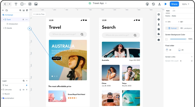
Payment page prototypes are easy to create in the Wondershare Mockitt environment. The online payment page design is what makes this application different from the others. There is no general rule as to what you possibly need from your payment page; however, Mockitt can give you plenty of examples to choose from.
First, you need to sign up on desktop and build a page for a desktop computer to match the demand from seniors.
The mobile payment page design is always available as an option in Mockitt. There you can have it ready and see the pre-installed features from the main screen. The well-known drag and drop environment gives you the chance to select from a thousand patterns and templates that would make your payment page more attractive.
Mockitt is having all the SSL and HTML5 protocols supported and integrated into its code. For that reason, you can rest assured that your payment page will enjoy the best security level without the fear of an information breach.
The application can also propose several payment page design examples that will give you a glimpse into what needs to be implemented for people to feel innovative when entering the payment section.
The interactive page report remains necessary for site builders that rely on their existence the flow of money through their website. Let's now check the viable alternatives for Mockitt in building a payment page for your site.
8 Examples of Successful Payment Page Design
Here are some of the most popular online payment pages.
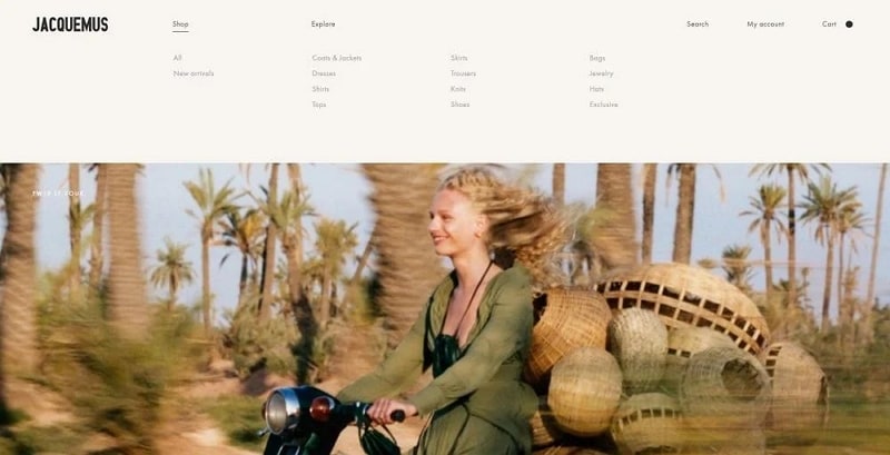
#1: Jacquemus
It is the first fashion website that made it possible to pay online. The payment page has a simple pattern, and the fonts and templates resemble the product pages.
You can enter all your information and create a personal log that will stay active for as long as you remain a customer. The payments get processed fast, and the encryption remains at the highest possible point.
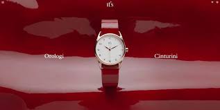
#2: It's Watch
The designers of this checkout payment page have shown that simplicity is the best rule. They point out the card payment page design, giving a white background to the visitors. Experts say that this background removes distractions from customers and allows them to focus on the payment procedure.
Its Watch payment page supports all types of browsers and can work even when the internet connectivity remains low.
#3: InVision
InVision has an ingenious system to identify the customers on the payment page. The payment page design templates are unique for each customer, making him think that he gets an extra service.
This site has a connection to the credit card history and makes it easy for returning customers to proceed to check out their orders.
The online archive has secure encryption to ensure the security of sensitive information. On the other hand, the customer can access the invoice and the shipping details directly from the payment page.
It seems like InVision has created its payment page according to the needs of modern customers.

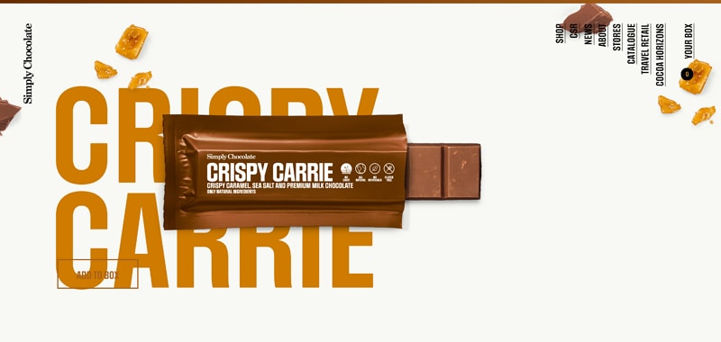
#4: Simply Chocolate
Specialization in chocolate bars and subproducts needs to have a well-organized payment page. The Simply Chocolate website has gained many online customers by merely giving them the best products efficiently.
The payment page option is always close to the right bottom of the screen.
Visitors have the chance to press the button even when their cart is not ready. Most of them can see their transaction history through the payment page.
Finally, the Simply Chocolate payment page also supports many languages and has a different template than the other pages for people to know that they need to proceed with paying.
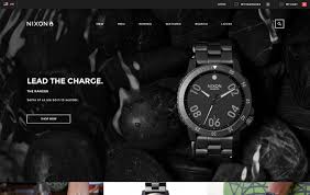
#5: Nixon
The famous Nixon watches and accessories have developed a revolutionary payment page to honor their customers. Not only does it have a progress bar to show the current status of their payment, but it is also apparent to every part of the site.
Nixon prefers to have clear lines and fonts to its payment page. It has pointed out the importance of SSL encryption for people who use the site to fee securely.
At last, Nixon tries to incorporate a new proposal bar for the payment page. It seems like it can give customers the chance to order more items for a reduced overall price.
#6: Barbour
Barbour has been the online marketplace of choice for many customers in the western world. Even though the payment page remains simple, there are some significant effects.
The menubar takes a different color when people proceed to the payment page. On the other hand, there is always the chance to create viable connections to the customers' accounts.
The payment pages at Barbour have a personalized tone so that people know the site is taking good care of them. The online card payments are instant, and the invoice comes as an add on to the final payment page. There is nothing else you can ask from a payment page!

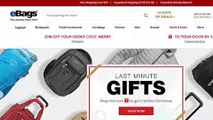
#7: eBags
The real innovation in eBags has to do with the live chat add on in the payment pages. For some weird reason, people are always reluctant when the time comes to give their money.
eBags has created a personalized payment page that gets along well with the tastes and expectations of visitors and returning customers.
The payment page supports many languages and can automatically adjust its size to fit all kinds of devices, from mobile phones to desktops.
eBags can thrive in sales since its payment page provides viable information about the customers, sales, and inventory.
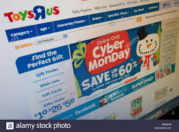
#8: Toys "R" Us
The world-famous toy manufacturer and retailer has managed to create a state of the art payment page for its website. It seems like people use the Toys "R" Us website when they need to buy birthday gifts for their children.
Since they don't want to spoil the surprise, the payment page prints out an invoice without describing it. The customer proceeds with payment and receives an RF code having the unique description of the item and is available only for the customer.
The payment page also gives information about the shipping and status of the order.