10 Best Landing Page Design Examples for Website and Apps
Creating a spectacular landing page design for websites and mobile apps can be tricky some times. Your overall lead generation is depending on these landing pages you designed. So, if you want to generate some leads for your website or your client’s website/company, you will need a high-class landing page design that attracts the customer. If you get successful while creating an attractive layout, there’s nothing else better than this.
Through the landing pages, you can easily track the users’ data. This will ensure you how engaging your content is in front of visitors.
In this article, we will cover the top-notch landing page design ideas/example for newcomers in the field of design.
Wireframe Tool for your Landing Page Design
There are many questions in the mind of new designers, which tools they should use while designing the professional designs etc. And they choose the expensive ones. They think going for expensive tools will make their design more professional and attractive, but unfortunately, they ended up heartbreaking.
There are many prototyping tools available in the market that will cost you empty your pockets. Be aware of such tools, they are getting profit only, nothing else.
Well, you shouldn’t worry about that either. We bring you the best prototyping tool to design a fantastic landing page design for your website.
Wondershare Mockitt is a fantastic prototyping tool to create the best landing page design for your website. With Mockitt, not only can you design landing pages but also design professional high-quality web design layouts and much more. Amazing tool, isn't it? There are lots of fantastic features available in Mockitt you can take benefit from.
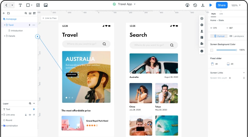
Now, it’s time to discuss some of the features and advantages ofMockitt.
Mocking Features and Advantages
There are many features in Wondershare Mockitt to assist your design, but we will cover important ones.
Assets
Wondershare Mockitt has hundreds of built-in widgets and templates you can take benefit from. All of them are present in the “Assets Library.” In Wondershare Mockitt, you can easily customize your widgets and templates and save them for future references.
Design | Presentation
Wondershare Mockitt provides the facility of drag and drop. Stop worrying about the code. Now, you can design anything on Wondershare Mockitt without knowing the code. All you have to do is just drag an element and drop it onto the canvas. How simple it is to design in Wondershare Mockitt.
Cloud | Collaboration
Another fantastic service that Wondershare Mockitt gives to its users is Cloud Service. Now you can work from anywhere in the world. All you need is a laptop and internet connection. With that, there’s another thing you must know; you can share, preview, and co-edit projects with other team members of the project.
Well, that’s a brief introduction to Wondershare Mockitt. If you are more curious to know about Wondershare Mockitt, you can visit their site and sign up to create an account on Wondershare Mockitt and become the community of Wondershare Mockitt.
Top 10 Website and Mobile Landing Page Design Will Inspire You.
We have collected some best landing page design for web and mobile phone apps and listed them below:
Landing Pages for Web:
1. Landing Page Design Example-Trello
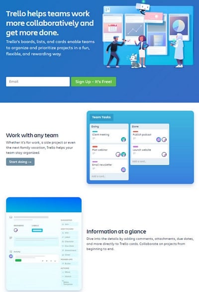
Trello has an excellent landing page design for their website. A website must design a beautiful landing page that attracts visitors, not themselves. Trello’s landing page is straight to the point by highlighting the collaboration aspects. The subheadings describe the features of their product they are offering to its users.
Finally, there is a sign-up field for the users to sign-up for their product for free. Well, it will not be free of cost purpose of the free sign-up is to gain attention from the visitors. It’s all about marketing strategy, how well they have created a landing page, and managing all their content on a single page.
2. Landing Page Design Example-Moz
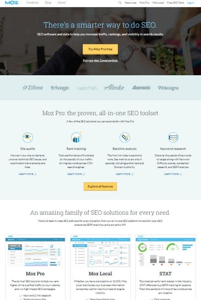
Moz is a digital marketing tool that analyzes your website and creates a detailed audit report. There are many companies like Moz, such as SEMrush, Ahrefs, and many more. We told you before; landing is the key aspect of generating leads on your product.
If we look at the Moz landing page design, we might see the same thing that we have seen in Trello. A little bit of description of the product, how it works, and how website owners can take benefit from it. And in the end, the same thing, baiting users to download their copy for free.
3. Landing Page Design Example-Marketo Engage
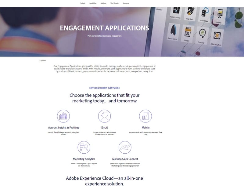
Marketo Engage has done a fantastic thing on their landing page design. Like other websites, they are promoting their e-book related to engaging content marketing. They asked the question on the page and answered those questions to convince the readers to sign-up for their guide.
Below you’ll see the contents of the books and what you will find in that book. Lastly, you’ll see a sign-up form for the complete e-book guide on the right side of the navigation bar.
The primary purpose of the Marketo Engage landing page is to boost content download.
4. Landing Page Design Example-Microsoft
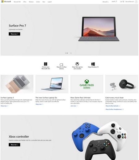
The purpose of Microsoft landing page design is similar to what we’ve seen in Marketo Engage. Both of them are boosting their content to download. Though, Microsoft has done an excellent job on the design of its landing page. It’s landing page design perfect and user friendly and engaging. The way they explain their mission objective, solutions to a problem, and how they collaborate is incredible.
There CTA right on the header section of the page. If you click on that CTA, it will redirect to another page where you have to fill a form to download the e-book.
5. Landing Page Design Example-Hootsuite
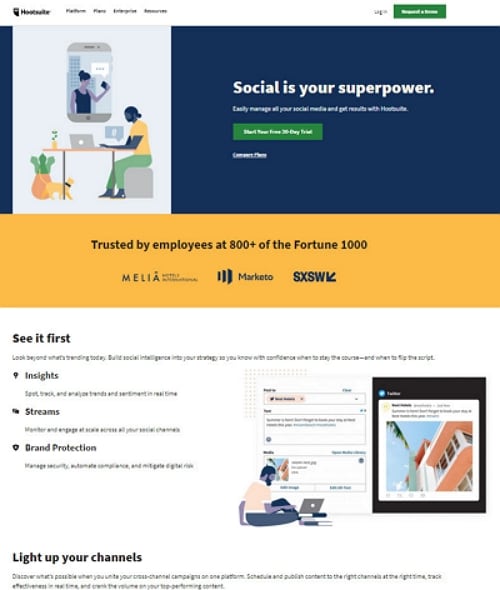
Hootsuite landing page design is also similar to Marketo Engage. These thoughtful designs are a classic example of marketing. Every landing page has only one purpose that is Lead Generation. Hootsuite is also a digital marketing agency.
Their page design is typical, as it would be for marketing purposes. Every landing is offering something to sign-up for its website. That’s what we called an excellent marketing strategy and product promotion.
Landing Page Design for Apps
So far, we’ve seen the best landing page design for the web. Now, it’s time to move forth and get a glance at landing page designs for apps.
1. Landing Page Design Example-Cash App
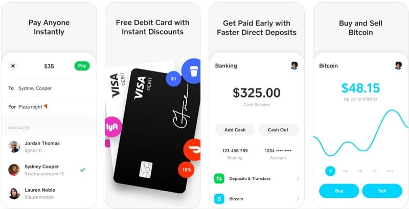
Cash App has a significant landing page design to promote its application—a cozy and user-friendly website design layout. They put everything on the landing page that is related to the mobile app. They even put guidance on how to use the application. And where you can spend your money online.
There two CTA’s, right on the header section. Click on any of them, which will redirect you to a respected store to download the application.
2. Landing Page Design Example-BrightLock
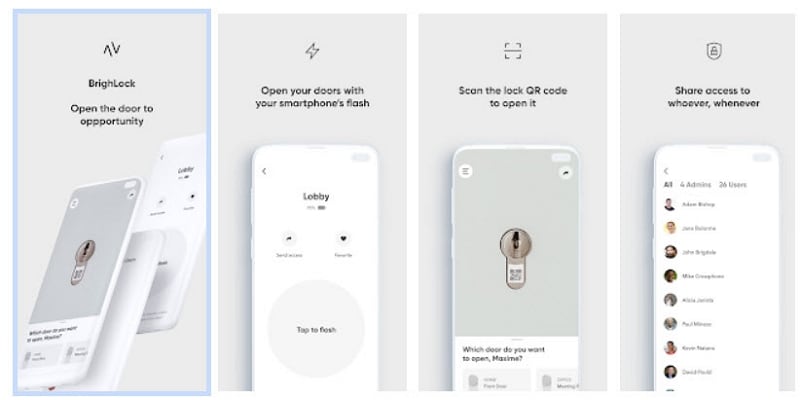
Have you ever heard of the BrightLock app? Well, we bet you don't know about it yet. So far, you have seen this technology in science fiction movies, but this lock exists in real life. This application is merely as beautiful as their landing page design. This application lets you unlock your door; just point your phone’s light at the door’s lock. Isn’t this incredible?
3. Landing Page Design Example-Ibotta
Ibotta uses the simple gateway to promotes its mobile application. Ibotta is currently killing the market. Ibotta gives you cashback when you make purchases participating in retail stores. This application allows users to scan receipts and even make purchases from their phones.
Ibotta's landing page design is impressive and highly attractive to visitors. It’s a simple gateway to more of a sign-up. Plus, this is the best landing page design we’ve seen so far.
4. Landing Page Design Example-Carly
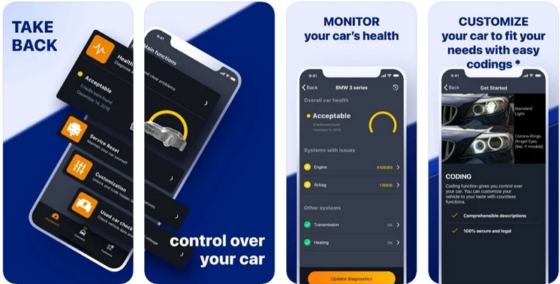
Carly is just another fantastic invention like BrightLock. It lets you generate insights into your car’s health and check for maintenance. Also, Carly has the best landing page design that fits your offering. According to them, Carly users can save up to $500 a year on car maintenance. Well, that’s interesting.
5. Landing Page Design Example-Aaptiv
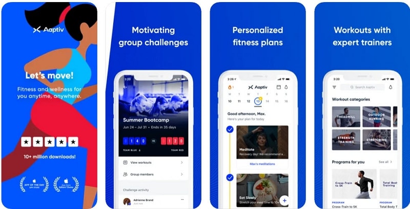
Aaptiv has an attractive and extremely user-friendly landing page design for its users. The name of the application remains top of the alphabetic list because it starts from double a’s. They have done power marketing campaigns. This landing page focuses on users who might be part of the Aaptiv community and its wellness plan. Everything is clear as crystal in this landing page design.
Well, that was all the examples of the best landing pages for websites and apps. We believe that these designs that we bring in this article can be beneficial for new designers.

