10 of The Best FAQs Page Design Inspiration
The FAQ page can be the hardest part of your website you ever work with. Many designers and developers think that the FAQ page isn’t necessary for the site. There are many reasons that every business website needs a FAQ page. Also, the FAQ page design must be well-designed and well presented on the website. The FAQ page design can be intricate for the designers as well as developers. Therefore the designers should take care of every little thing that needs to take care of while designing the page. Since the best FAQ page design provides a direct connection between the users and the owners.
And remember, don’t add complications to the FAQ page area, only put those questions and answers on the FAQ page frequently asked by the users.
In this article, we will cover the best FAQ page design for the new designers to get some inspiration.
Design Your FAQ page online
If you are a designer and want to design a FAQ page for your website or client website, don’t overthink yourself and pick up a tool to start planning the FAQ page. There are many tools available on the internet for prototyping. Most of them are very difficult to use and expensive.
Well, don’t worry about that we already have a solution for you. We’ve got a simple and straightforward tool you can easily make an excellent FAQ page design on it.
We’ve tried many tools for prototyping but find this fantastic tool that works wonders for us. For now, we are using this tool for our professional design.
Wondershare Mockitt Prototyping Software
Wondershare Mockitt is the best tool to create FAQ page design, 404-page design, layout designs, and landing pages. New designers always get confused about which tool they should use for designing and waste their time in thinking. Sadly, and that’s how they fail.
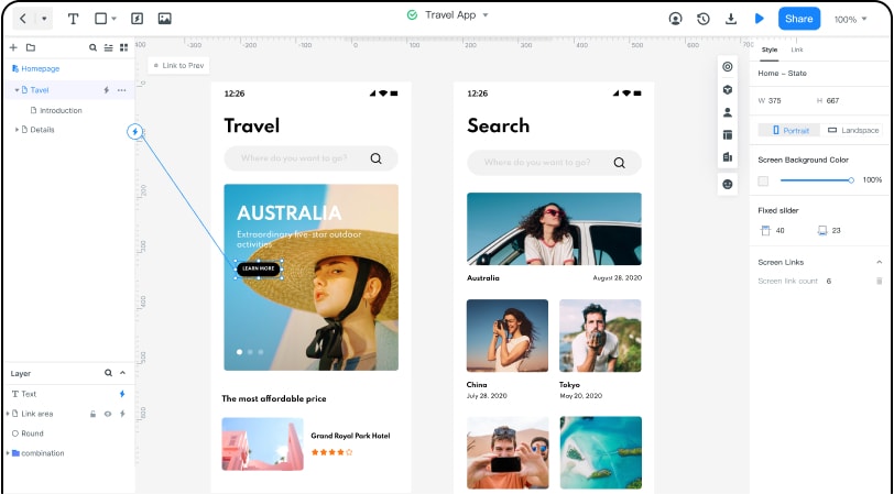
Mockitt has many amazing features and elements that can enhance your design to the next level. Designing professional designs for beginners is never easy, but with Mockitt, the beginners can quickly become professional designers.
Features & Advantages of Mockitt
- Assets: In the “Asset Library,” there are hundreds and thousands of widgets and default templates available. You just need to drag and drop them. Mockitt gives you the facility to edit and customize your widgets or templates for future use.
- Design | Presentation: Forget about the code, Mockitt provides a drag & drop facility for the new level designers. All you have to do is drag your particular object and place it on the canvas and leave the coding part to the Mockitt.
- Cloud | Collaboration: There’s another fantastic thing that Mockitt offers to its users, the Cloud It allows you to work anywhere in the world and save your project online. You can also share your work with your teammates. So, you can freely collaborate.
That’s all from the Mockitt if you want to know more about Mockitt or wish to join them, just go to their site and sign up and bingo! Start designing.
Top 10 Excellent FAQ Page Design Example Websites
We’ve searched for quality FAQ page designs from top-notch websites and listed them according to their level so the new level designers can take some inspiration from them.
1. FAQ page design-Zappos
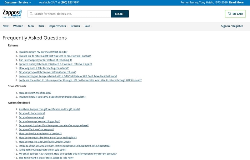
Well, Zappos is an e-commerce website containing different categories of products for men, women, and kids. Zappos FAQ page design is quite remarkable. How well they have managed and arranged all the frequent questions commonly asked by the users. This FAQ page design will surely save the time of visitors. Users don’t have to search for a particular question in the search box. First of all, there isn’t any search box for details on the page. They listed every possible frequently/commonly asked question by the users. The user just needs to find what question they are looking for and just click on that particular question; it will rightly take them to their respected answer.
2. FAQ page design-Nintendo
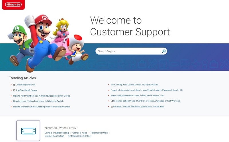
Nintendo is a gaming store website with that they have their gaming product named “Nintendo Switch” and “Nintendo 2DS XL.” Nintendo's FAQ page design is also a masterpiece. It is different from the Zappos design. Zappos has a simple structure, but Nintendo has some fancies in their design. All FAQ websites’ purposes are the same, but they might be different in their design—every answer to the question hidden inside the question menu. Just hit the question tab, and the answer will show up as an options menu does.
3. FAQ page design-Microsoft
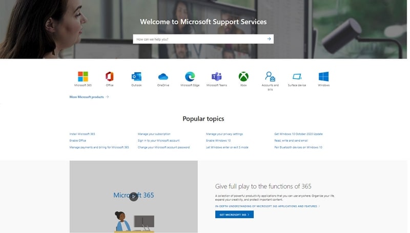
Microsoft has a beautiful FAQ design page for their visitors. Well, nobody needs an intro about what Microsoft is! Or should we?
Microsoft is an American multinational technology company headquartered in Redmond, Washington. It manufactures system hardware and develops software and other related products/services.
The FAQ page of Microsoft is remarkably the same as their website. There are two different products listed on the FAQ page. One is Windows, and the other is Office. You can call them parent questions. One you clicked on the parent question; it expands the other questions like it's child-related/linked to parent/main product.
4. FAQ page design-Adobe Creative Cloud
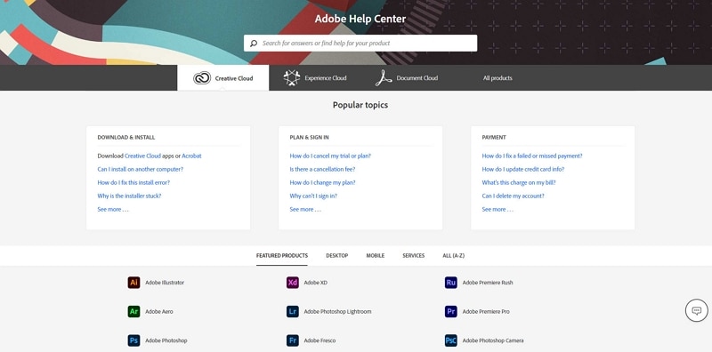
Adobe Creative Cloud is the collection of its many Adobe products like Adobe XD, Illustrator, Photoshop, InDesign, and many more. Every Adobe product is compressed into a single service called Adobe Creative Cloud. Adobe Creative Cloud also has a fantastic FAQ page design for its users to find what they are looking for. The questions divided into categories like General Category contain questions related to general FAQs, FAQ by plans, and Basic questions.
It becomes easy for users to find what they are looking for without wasting their time.
5. FAQ page design-WhatsApp
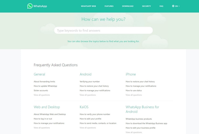
WhatsApp website also has an FAQ page for their users. Although WhatsApp is a mobile application, you can still access WhatsApp from the system. Like Adobe Creative Cloud, WhatsApp has the same FAQ page design on their official website. They also divided the questions into categories.
6. FAQ page design-YouTube
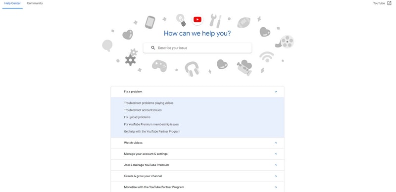
YouTube has a spectacular FAQ page design for their users. Well, everybody knows about YouTube. No one needs any explanation or intros of YouTube. Let’s talk about its FAQ page design. The has a remarkable way of presenting the questions to the users. It is almost similar to Nintendo or Microsoft’s FAQ designs. YouTube never disappoints its users. Everything is excellent as expected, the design, and the user experience.
7. FAQ page design-SoundCloud
SoundCloud is an online music platform that provides access to users for thousands of audio songs online. SoundCloud is very popular in iOS devices because there’s no external storage system available for them. Therefore, they use applications like SoundCloud to listen to music.
No doubt, SoundCloud is very popular among iOS users; that doesn’t mean it is not beneficial for other users. Now, let’s talk about the FAQ page design. Sound Cloud’s FAQ page is different from any other FAQ page. Other websites use two to three lines of answers, but Sound Cloud has written an article on those questions.
8. FAQ page design-Kraft Heinz
Kraft Heinz is a website for foodies that have an excellent looking FAQ page design for their visitors. A search bar is available in the page design to search a particular question or related to that question. The questions are listed below the search bar. Once you have clicked on any question, it will take you to the other window to see a detailed article on that question.
9. FAQ page design-Charmin
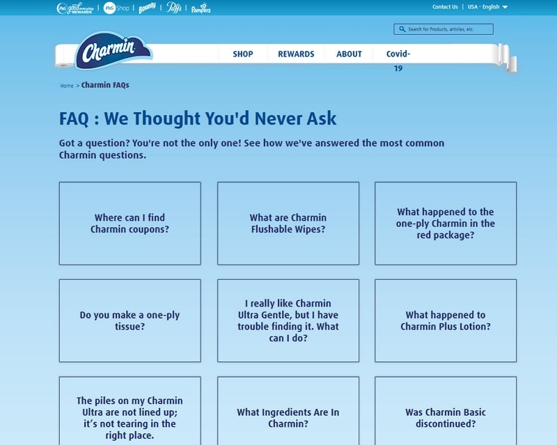
Charmin has a beautiful FAQ page design for users. Like the website name, the looks charming and user-friendly. So far, the best FAQ page design for modern requirements. This is the most comfortable design for the user perspective. The questions on the Charmin website are well managed and presented beautifully. That’s another time-saving website for their users.
10. FAQ page design-Spirit Airlines
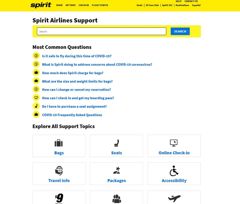
Spirit Airlines ensure that their FAQ page design looks like the rest of the website. It's an Airline ticket booking website where users select their destination. As it looks like in FAQ page design the overall design of the website is the same. The color combinations are quite attractive and eye-catching. The simple and easy design of Spirit Airlines. This website uses icons at the beginning of the questions. They placed common questions that were asked by the users and all Support topics were placed down the page.
So, these were the best FAQ page examples that new or beginners get some inspiration from and start to design beautiful and attractive FAQ page designs for their websites.

