Best Examples for Profile Page Design for Web and Mobile App
Like other design pages, profile page design is also an essential factor to keep your audience engaged. Do you want to create your community on your website? Well, create a beautiful and good-looking user profile page design. People come to your site and fill there their info on your site and bingo! Your community is ready. Building an excellent profile page design can be very helpful for both the website owners and the users. How can a user profile page design be beneficial for the owners and the users?
Since you have the users' information, website owners can easily use their information such as their names and email addresses for marketing activities to increase their profit.
Same as the website owners, users can receive personal product recommendations regularly.
This article will discuss the best material UI profile page designs and which tool is perfect for designing the user profile pages. So, stay with us right to the end.
Excellent Prototyping Tool for Your Profile Page Design
There are many tools available for prototyping, some of them are difficult to learn and use, and some are way too expensive and out of reach for a regular middle-level person. Considering this scenario, we've brought to a perfect tool to make your design professionally easily and without any difficulty.
Wondershare Mockitt
Well, if you are already using the Wondershare Mockitt tool. In that case, you can skip this part and move to the examples of profile page design, or if you aren't using Mockitt or curious about its features, you can continue reading the article.
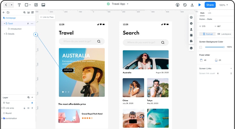
Mockitt is a highly recommended prototyping tool for beginners and professionals as well. Plus, there are hundreds and thousands of new features available in it. You can easily create an amazing and beautiful profile page design in it. The most exciting thing that we liked about Mockitt is that you don't require to remember any type of code. It will take care of your coding. All you have to do is simply drag and drop your essential elements on your drawing screen.
Well, this was all about the introduction of the Mockitt. Now, heads towards its essential features and advantages that can be productive during designing.

Features & Advantages of Mockitt
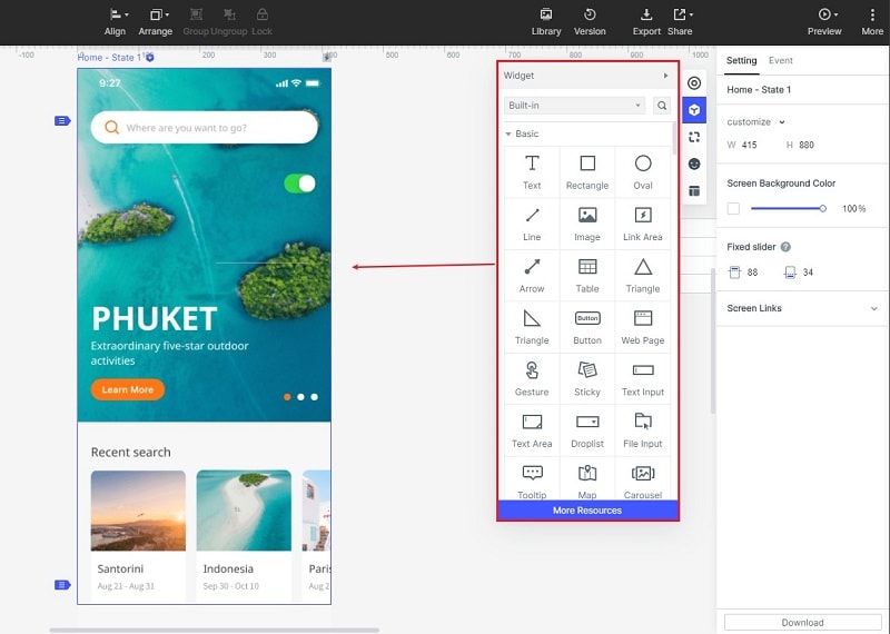
Assets: There are hundreds of widgets and templates available in Mockitt to assists you. Plus, you can edit and customize your templates according to your need. All these widgets and templates are present in the Asset Library.
Design | Presentation: With Mockitt, you can easily create a beautiful and attractive profile page design for your website or your client's website. It lets you design by simply drag & drop the elements on the canvas. You don't need to remember the code at all. You can also preview multiple views for design, and there an option of quick sharing in it.

Cloud | Collaboration: Mockitt also provides the Cloud functionality/service to its users. You can easily save your project online or share it with your team members. It makes collaboration between members makes so easy.
Top 10 Profile Page Design Examples that will Inspire you
Designing a good profile page design needs creativity. If you are not creative enough or want to get some inspiration, here we've collected some user profile page designs.
Profile Page Design for Web
Twitter frequently changes its layout design from time to time. Here is the latest look of Twitter that is currently available to everyone. Previously, Twitter had made some changes to look stylish and modern. Before that, twitter's design for the web wasn't so appealing to the users' perspective. Now, they have done a fantastic job in their design.
They also included a cover photo to their profile page design to look modernized. After the changes, there is a significant change in the Twitter community. Lots of users started creating accounts on Twitter. Look, that's how things get change due to a perfect design. On the left side, you'll also see featured photos and a trend navigation area.
- Upwork
Upwork is the most popular freelancing platform. They also allow buyers to create an account on Upwork. That means two types of users can create an account and get access to Upwork. The profile page design of Upwork seems simple and straightforward. The best thing about this profile page design is that they haven't included unnecessary like profile cover photos, timeline photos, galleries, etc. Because there isn't any need for such a thing at Upwork. Upwork is a market for professionals, not for the models or actors.
- Jobong
A designer at Dribble uploaded a profile page design for Jobong.com, but unfortunately, this job searching site is not anymore on the web. Now, you can only see its designs and layouts in the form of pictures and docs. Flipkart acquired jobong.com in 2016, and they officially shut it down in Feb 2020. Nonetheless, their website designs and profile page designs were prolific and attractive from the user's perspective. Don't know why they discontinued this beautiful site.
This design looks touchy and similar to Upwork. This website could be beneficial for them if they'd continued this site.
- Socsal
And here, we have another calm, clear, and elegant profile page design idea on Dribble. The arrangements of the elements are fantastic. The design looks familiar with Twitter. Nonetheless, this idea is impressive from the users' perspectives.
However, this design needs some changes on the right side of the navigation bar. Otherwise, this is one of the best designs we've witnessed so far.
Personal thoughts, this interface looks competitive to big platforms.
Well, everyone should be familiar with this platform and its design because we don't see a thing that this platform needs any kind of introduction. Everyone goes through this social media platform daily, and they also experience its design every time they open Facebook. A well-managed profile page design was created and is handle by many professional designers. So, there's no chance that their design goes fail.
Profile Page Design For App
- Fitness App
A UI designer shared a concept of the Fitness App on Dribble. The design looks cool with a dark-themed idea. Actually, it seems pretty cool because dark-theme is the trend in 2020. Users are more attracted to dark-theme. That's why we picked our first choice as the best profile page for mobile applications. This profile page design seems similar to Instagram because of its bottom custom toolbar.
- Auction App
Well, we have another dark-themed profile page design. Told you, dark-theme had been the trend so far in 2020. There is no doubt; people attract to dark objects or designs. Every big company/organization like Facebook and Google also introduced dark-themes to their applications product. Now, every designer is working hard to design dark-themes to come into everyone's eyes. No doubt, some of them get successful, but some of them are still trying to get the limelight.
- Zedian App Messaging Filter
Well, another profile page design concept from the designer at Dribble. The design looks suitable material-wise, but personally, this design needs some polishing. Everything in this design is white, needs some changes in colors and font family. Nonetheless, this design is not bad, either. The designer does an excellent job of creating this design as a concept. But remember one thing there's a lot of competition going around the corner. You need to more specific and prolific.
- Minimal Ecommerce App
Well, this is another profile page design similar to the previously mentioned design, but this one is better in color perspective. It is also just a concept design for an E-commerce application. The designer perfectly places everything on this page design. Every picture is set correctly, like the featured image and product details—sweet taste in choosing font family and style.
- Neon Style Blog
Phew! What we have here in the end? It's a fantastic concept for a blogging app. Subtle color combination and the way of presenting the content is merely magnificent. The design did a tremendous thing to design such a fantastic profile page design. There are hundreds of designs available across the internet. If you think these designs weren't enough for you to get any ideas from them, you can find them on the internet.

