Controls in UX Discipline


With the development of technology, there has been an increasing demand to improve the user interface by offering various control options. When arranged in the most appropriate and user-friendly manner, the visual elements on the screen of the computer allow the users to communicate with the system productively.
The controller features offered by the input controls and selection controls allow the user to enter the command, requests, or even make a selection based on their need. A smooth user control that is straightforward to understand and offers even a more detailed look about the design is more preferred than others.
The controls determine the pattern of the interaction and extension that customizes the user experience. The control panel on the platforms acts as the navigation tool that helps users move from one location to another. The efficiency with which the UI control allows the users to navigate directly brings in more clicks and visits.
What is Control as a principle of user experience? - A Brief Introduction.
Control as a principle of user experience is viewed to be one of the most important practices. This one defines how easily the user can communicate with the system and access the files or the information they are looking forward to. The idea behind using simple control is to ensure that the customer feels connected and linked to the system.
The controls design meets the aim of being aesthetic, accessible, engaging, available, and fun. The controls can be of various shapes and implementation methods. the benefits of having the control library are:
- Offer the reach to reusable UI controls
- It makes the controls simple and feasible
- Allows the developers to ensure better usability
- Consistency in updating the controls allows better connectivity
- Acts as the technical building block for designing.
- Renders the performance of high degree and suitability
- helps to streamline the overall development process
- Allows the process of customization in a systematic way
- Variety of UX control helps customers ease of use.
- Consistency in looks and features is key to perfect usage.
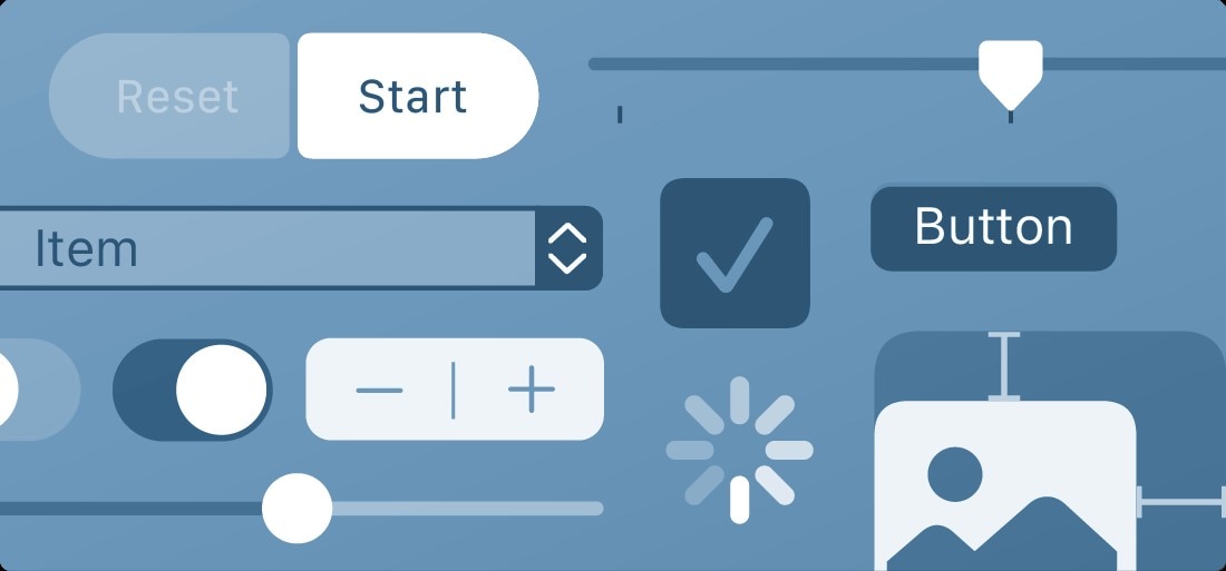
In addition to the visual and graphical elements, the UI control acts as the technical building blocks that make the platform's design smooth and simple to use. The most common types of selection controls that are used while designing any platform are:
- Checkboxes
Usually used for multiple choice or yes/no type of inputs, the checkboxes allow the user to select the option based on the individual choice. The group checkboxes allow the user to make multiple choices, while the standalone checkboxes are used as the on or off button.
- Toggle Switches
Just the switch we have at our homes, the toggle switches allow the user to turn on or off either option. Say, for example, while visiting a platform related to the food supply, the toggle switch can help the user to select the option of viewing non-vegetarian items or not.
- Radio Buttons
This is the control that allows the user the option to select either of the options. In this, when a new option is selected, then the previously selected option is automatically deselected. Say while in the agreement, there is an option for I agree and I disagree, the user when selected either, the second one is deselected.
- Dropdown lists
This is the option where the user clicks on the menu, and a list of the options under the same is displayed. The dropdowns can include both the checkboxes or radio buttons, depending on the applicability and placement. The drop-down option is used for the menu list, profession list, hobbies list, and navigation.
- Activity Indicators
It is displayed on-screen when a task is performed. It shows the expected amount of time, such as loading or synchronizing complex data, will take. It disappears when the task is complete.
- Buttons
These can be labels that consist of text, an icon, or a combination of both. The most common buttons are Call-to-Action, Greyscale, Text Button, and Icon.
- Dialogs
It is the box that helps the user to initiate the conversation with the system. The dialog box is the manual control option for the users that address queries, questions, complaints, and various other related concerns.
An Example of Everyday Controls.
The controls are key to offering a better and smooth base for functioning for every single online platform. From google forms to retail shopping platforms, user control is key to defining how the platform is expected to operate.
Websites like Myntra and Jabong offer the dropdown menu and the toggle button to switch the products' selection. On the other hand, the survey sites that collect the user information use the checkboxes or radio buttons to help the user make easier selection and submission of information.
The mobile applications, puzzle games, and various other interactive platforms use UX control for better user experience and connecting with the system.
Common Uses for Controls.
Before understanding the common uses of the controls, it is important to know the perception of the control, which are:
- To offer ease of usage
- To promote accessibility
- To ensure flexibility
- To ensure effectiveness and efficiency
- To empower communication
- To offer better link and connectivity
Based on the perception and types of the controls, the most common uses are:
- Building the websites that offer the option to the user to communicate and select easily.
- In games like puzzles, the user can select the options to solve and win the game.
- While making the mobile applications, create the form or registration platform to secure the customer information necessary for onboarding.
- In the job portals and educational platform for understanding user choice, capabilities, and conducting surveys, and seeking answers to draw insights.
- On the medical platforms that offer the doctors' service online, dialog boxes allow the users to explain their questions, seek solutions, and know the potential solutions.
- Above all, the word, excel, and related professional softwares, the dropdown menu allows the users to select various options and choices while designing the professional documents to be used for further study.
In a nutshell, the controls are used in every field irrespective of the type and help gain a higher degree of customer satisfaction and experience.
The relationships between Controls and UX.
Controls and UX are interlinked as the efficiency of the former defines the experience of the latter. The better and smoother the controls are, the higher the positive relationship between the controls and UX. The controls design principles that explain the relationship between the two are:
- The simple controls offer good UI and better UX.
- The high degree of visibility of the controls offers smooth navigation and a better user interface.
- The controls seek feedback from the users that help to improve the interface for better user satisfaction.
- The control allows people to opt-in or out of data sharing about the service or of using the service at all.
Conclusion
Controls are key to designing a platform that is user-friendly and straightforward. Before designing the controls, the question that a designer should ask includes, "How many options the user should be provided with for the question?", "Are the options interlinked or separate in nature?", "How many options a user is expected to select?". Answering the said questions positively, one can be sure that the controls design is effective and efficient.
Enhancing the controls is the key to creating a better UI and UX experience. Simple yet attractive controls not only keep the users connected and design a beautiful, user-friendly interface. User controls and freedom go hand-in-hand, so ensure to design one that offers greater usability and accessibility.
