Things about Daily UI Design Challenge
What is Daily UI Design Challenge?

The Daily UI challenge started with a designer, Paul Flavius Nechita, who posted an interface work on Dribbble every day (regardless of holidays). It was difficult not to notice under the crazy washing. This insane designer. I'm not sure if he is the first person to attempt such a challenge, but he did complete it successfully. The most important thing is that each of his works can maintain a certain level.
After completing the 100-day challenge, he inspired many UI designers to do the same. However, when taking on such a challenge, the biggest headache at first is the problem. It is not an easy task to think about the problem on your own. So someone created a website, dailyui.co, to solve the topic's problem. As long as you subscribe to this website, it will send an email to the participants at a fixed time every day, and the letter will provide the topic to be drawn that day.
What You Should Know Before the Daily UI Challenge, and How to Do.
Daily UI challenge encourages every designer to set a goal, and then continue various changes for a hundred days. In addition to challenging yourself, you can also enjoy the results of this period. This article will introduce another recently discovered 100 Days UI. If your job is related to interface design or application development, this website is of a great reference value.
100 Days UI can tell from the name that this is a website related to user interface design (User Interface). The challenger is a designer from Romania. Paul Flavius Nechita uses these hundred days to publish different interface designs every day. , In addition to being organized on the same webpage, it is also posted to the Dribbble website so that more people can share or retrieve it.
Although Pseric is not engaged in design work, I do see many ideas from 100 Days UI, and concepts that may (or have been) applied to applications or software operating interfaces. It is not just a 100-day challenge. Sometimes I visit similar websites. There can also be a lot of gains.

Step creation of
A start in the creation of some theme is clear, so you can quickly complete the creation, for example: sign up, log in, 404page, credit card, these pages for designers familiar interface, so the content is determined. Creation is very fast; but when it comes to the later challenges, some unfamiliar topics will appear. Such as car interface, dashboard, blog post. If you use the same method to create, you can directly draw on the computer and think about the content while drawing. It will lengthen the time of creation, day after day, the longer the time, the natural will want to give up. Therefore, you must first determine the content and structure of the topic and then draw on the computer, which can save a lot of effort and time.
Retaining some of the UI features
Daily UI still draws the user interface. Although it is not limited to a specific device, the most important aspect of the interface is the presentation of content. Another key point is the retention of call to action (CTA), so A button is a button, and a menu is a menu. Whether it is a realistic style or a flat style, it must be recognizable, otherwise, it will call a graphic design. Of course, some topics will be more like a flat creation, such as a logo. , Background pattern, is not limited to this.
Make good use of online resources
.There are many elements that make up the interface. It takes a lot of time to draw an interface if you want to create the combined elements. Make good use of online resources, such as pictures and icons, which can be obtained through existing online resources. No need to re-create, which can save a lot of time. In addition, when you are challenging, you will encounter some pages that require product presentation, such as a shopping cart, single product. Etc.
Do observe
The challenge of Daily UI, the most important thing is to train one's own observation ability because the process requires a lot of inspiration and constant observation of other people's works, and slowly you will find some details, such as the color, range, and font of the shadow, typesetting, rounded corner size, photo selection... etc. When you find that the more details you see, the power of observation is gradually improving.
Feel the sense of progress
When you continue to accumulate your work, even if you feel that the work is like a masterpiece at the moment of creation, you will find many shortcomings when you look back at the previous work. At this time, you will be full of doubts about the judgment of the creation at that time. This feeling is progress, which means that the details and beauty of the work have been improved. Like myself, when I look at my previous works, I feel that the more I look at it, the more dissatisfied it becomes. I want to redo it again. I feel that I am progressing.
The above are some of the experiences in the Daily UI Challenge, but the experience is not enough. The one-hundred-day challenge is also a chance to get to know me. In order to complete the challenge, I have been staring at the computer for the entire hundred days, constantly on Behance and Dribbble. Looking at the works of some foreign masters, I inevitably feel anxious in my heart. I also feel that my efforts in this field are still not enough, and there are still areas for improvement.
Introducing the best tool for UI design - Mockitt

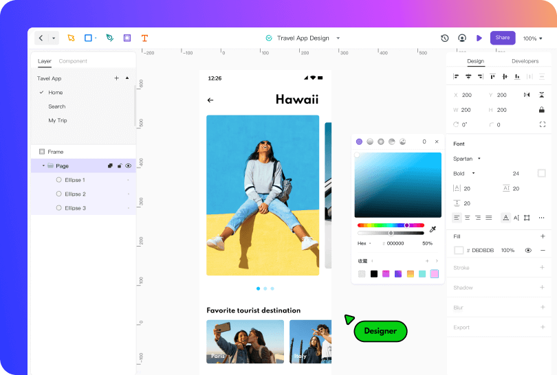
Wondershare Mockitt allows you, the designer, the product manager, and the development team to work on an interface layout or presentation at the same time. At the same time, an even greater number of colleagues can observe the creative process and comment on everything that they hit. Wondershare Mockitt introduces its new design tool. Mockitt Design Tool is simple to use, converting your prototypes or design ideas into highly reproducible design draughts. Wondershare Mockitt design tool has conquered the design community like a storm over the past few years. The many functions and the excellent opportunities to work together in a team are convincing. The possibility of expansion, shared libraries, micro-interactions - Wondershare Mockitt provides everything you need for the professional creation of prototypes and UI designs.
The biggest advantage of Wondershare Mockitt is its simple and straightforward functionality. It is one of the best prototyping tools and it has a huge library of icons and buttons. The program is vector and allows you to work with layers and shapes that can be easily manipulated using the toolbar. Wondershare Mockitt is one of the best tools for UI/UX designers. Wondershare Mockitt will take your design to the next level. You can take a static prototype and turn it into a clickable one. Prototypes are compatible with:
- iPhone;
- iPad;
- Apple Watch;
- Apple TV;
- MacBook;
- Windows;
- Android.
You can remotely demonstrate your work to the customer right on his device, which is undoubtedly very convenient. Wondershare Mockitt gives access to the project not only to designers but also to all other team members. This allows product managers, copywriters, and even clients to view the layout online and immediately comment with edits or comments. Sharing a project and working on the same layout at the same time allows you to complete the task much faster.
Comments
The service makes it easy to give access to the document for both colleagues and customers. The owner determines the level of access: individual pages, all layouts, or just draughts. A user with access can leave comments on the project, which the designer then closes once the work is completed.
24/7 availability, for everyone
This is a point for the non-designers: Product managers, developers, customers, you can all log into Wondershare Mockitt at any time and review the current status of the design. Without installing any software, without going through long PDFs, all you need is a browser and a login. Isn't that awesome?
For the Product managers themselves, it is also a great advantage because we no longer have to export artboards as PNG, make PPTs from them and ensure that they are shared with the responsible people via Google Drive. Everything is just there, always.
Conclusion
Some designers will ask often online "if I’m worried that I'm not familiar with the interface yet, and I'm afraid that the drawing will not look good". What if I want to become an interface designer? In fact, these are all processes. After 100 days, if you have an ulterior motive to draw, There will definitely be some progress. After 100 days, it is not the end, or the beginning of another challenge. Constant practice ability will continue to improve.
But if you really do not grasp Daily UI, I recommend trying other Daily UI challenges. Resources are abundant, along with the progress of learning, and will soon be fruitful. In addition to Daily UI, I saw many other Daily UI Challenges. The difficulty is relatively low but the time is relatively long. This just makes up for the shortcomings of my lack of illustration ability. I think I will find a time to start, and then interested designers are welcome to accept the challenge together!

