The 5 Principles of Dark UI Design

Light has always been an issue for various users, the shades and effects of multiple colors have allowed the designers to use gradients or the color codes of white and some light color, and now the trend has gotten pretty old. When people started to look for more fantastic color combinations and shades that might enhance the looks and effects on the screen. Recently there has been a great uproar and demand for a new phase and color effect, which might make up for the problem faced by colored UI. Working in light mode is suitable for clients, and over time, it's fine, but it comes to significant issues the moment the users have to switch to another device or another screen, so came the idea of Dark UI.
The dark theme UI was a ravishingly new name in the market, and everyone wondered how this effect might be, and it didn't fail to show its supremacy and expertise as soon as it hit the market. The websites started switching to this dark mode because it made it easier for the users to work for long hours, and also, the dark mode increased the battery efficiency. So the Dark theme UI started gaining immense liking in the coder's community, and also there's a famous slang that states, "When a coder enters in dark mode then there's no turning back."
Top 5 Principles of Dark UI Design
Text contrast
The content plays a significant role for the website because it allows the user to focus on the primary content material. Also, it will enable the user to grasp all the necessary data for the user. We all know that content is summarized in various parts ranging from headings to subheadings and then to the main content. In the same way, the text has to be placed on a website where the content is based on the priority of its context. And in the dark mode, to keep your data visible and make your content highlighted, one must indeed work upon the text contrast, making it easier for them to make the text directly visible. This is one of the significant principles of dark mode UI design.
Focus color shades
The color combination plays a significant role for the developers as it allows the designers to work on various combinations of colors, which make multiple components of their websites visible. The best thing about the dark theme UI design is that it allows the other color to blend out and show up in the best way possible. Furthermore, the dark mode UI design makes it easier for the user to relate. This is evident in the way we can see if we place yellow with the black color. We will see that the component will be obvious on the website, and users would also love to scroll down such a website which makes them look fabulous.
Leverage negative spaces
The negative spaces play a major role in the website because they can ultimately decide the effect of the content on the website. For example, suppose there is a website that displays content. They have a lot of content displayed on their website, so when the user opens the website, he will feel grateful that he can see so much content, but that's the bad part because, with so much content, the website cannot make the user focus on the exact content. Instead, it is looking for, so the designer must take care of the negative spaces and then develop the dark UI designs accordingly depending on the interest and need of the developer.
If the negative spaces are used wisely, they can help the designer focus on the exact content, which is the advantage of black UI.
Typography
The content is a significant part of the website, and designs play an important role in focusing the user's attention on the content, so then comes the second most crucial thing, which is font. The font is the primary factor that decides and allows the user to develop and contrast various headings. Also, the size and style of the font make it easier for the user to keep enhancing its work and make it better on every evaluation. Furthermore, the dark mode UI design helps the client keep the user interactive and increases the active time.
Work on palette
The black color also comes in various shades, and these shades make it easier for the user to work on the palette and manage the working. So it is not compulsory that users use only #000000 code there are various color codes for the different color gradients of black, making the website look much more cache and creative. When the designer shifts to another shade of black, he also can manage other colors with this shade and hence make working better with UI dark mode.
The 5 Examples of Dark UI Design
The dark mode has already earned itself a great name in the market, and now the companies are shifting to dark mode too by providing the user the chance to work in either light mode or dark mode. Many big international companies and many social networking sites have switched to dark mode, which is discussed below.
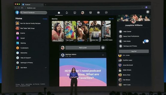
Facebook is a well-known company, and it has millions and billions of users on its platforms; there are hardly any people who wouldn't have heard of Facebook. It has offered its users the option to switch the networking site in the color combination of some shade of blue and the black color, and the text is a highlight in white. This casts a terrific impact on the person observing. The black UI makes the website look much more attractive.
WhatsApp is another broadly used messenger by people, and it has a large user base on both android and iOS; and recently, it has also launched the dark mode for its users and is earning a great name.
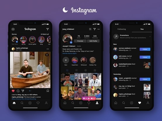
Instagram is also a part of the Facebook enterprise, and it has allowed a significant number of media sharing and multimedia platforms for users in the last decade. It has provided its users with the feature of dark mode and has many users on the list. The UI dark mode has resulted in user growth.
Windows
The most used operating system named Windows is one of the greatest inventions of all time, and users from all over the globe are using it. It has also offered its users the dark mode option to work upon. The black UI has proved to be of greater use to people.
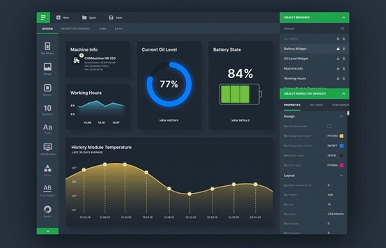
The best tool for UI design – Mockitt
Dark mode can cut back power usage by a significant quantity (depending on the device's screen technology).
Improves visibility for users with low vision and people World Health Organization area unit sensitive to bright lightweight.
It makes it easier for anyone to use a tool in very low-light surroundings.
The dark theme applies to each system UI and apps running on the device.
As a beginner, you must grasp that the night filters on the market on iOS associate degreed simply cause an illusion of reducing eye strain. Discoloration and distortion might occur, whereas victimization night filters.
On the other hand, the dark mode is tuned in to aesthetics (like sleekness). The dark background has 3 purposes:
- Limiting image distortion
- Easing eye strain
- Saving energy
This mode uses additional muted colors that area units easier on the eyes and needs less power to show. Take an associate degree instance. Reddit manually lowered its brightness to enhance visibility via distinction. But you must grasp this; energy conservation depends on the kind of screen the smartphone has.
Mockitt brings out the most advanced software that allows the user to develop the most significant dark mode applications and enhance their working.
The dark UI feature was enclosed in apps to scale back eye strain. In addition, dark background conjointly eliminates distracting white areas on some web pages, thereby enhancing focus.
However, there's a little bit of discomfort within the eyes if you utilize this in the dark. This discomfort is one of the explanations why dark mode includes a health profit. However, the dark mode is less painful than the quality views, even throughout sunlight hours.
What we mean is, dark mode is best optimized in OLED and AMOLED screens. This is because, per Google, the dark mode doesn't have much control over digital display screens. However, within the case of AMOLED screens, the dark mode saved close to sixty-three powers.
Shifting is removed from digital display models and specializes in those displays that save energy, whereas dark mode.
When it involves laptop monitors and portable computer screens, you'll be able to still activate the dark mode somewhat effectively on LCDs as a result of the filter it places over the blue lightweight that the backlight on your monitor emits. Thus, late-night browsing ought to offer you less of a headache. However, the UI dark mode is for greater goods.
Conclusion
The dark mode is no less than a revolution in designs because it has allowed people to work in their backgrounds. In various open-source platforms like Linux, users choose to work in multiple background shades and give out their best in any field. Everyone has a taste for different shades, and the customizing system allows the person to work on such features. And use the hues which bring the best out of themselves.
