What Are the Top Newsletters UX Designers Must Subscribe to?

A newsletter is more than just an email. This is an email sent to educate and attract readers to the sender. Sure, there are a few calls to action, maybe even some promotions or direct marketing are woven into the content, but the overall purpose of a newsletter is not to make sales. It's about building and developing relationships - which ideally lead to sales. A successful newsletter design automatically catches the attention of your subscribers and encourages them to click and buy. In this article, you will find the top 10 newsletter examples for UX designers.
Some eye-opening facts and stats on newsletters
According to GetResponse.com, the average share of open mailings is 20.48%. The average click-through rate - the percentage of readers who open the newsletter and click on links within them - is 2.84 percent. This may not sound like a lot, but when tens of thousands or even hundreds of thousands of people have subscribed to your newsletters, that's a lot of clicks on your content. Email marketing is generally considered to be one of the most effective forms of digital marketing. Here are a few more email characteristics from Hubspot to keep in mind:
- 99 percent of email users check their email every day
- Of the email users surveyed, more than half of those who live in the US check their email more than 10 times a day.
- Among the users surveyed, email was their preferred way of communicating with brands
- 56 percent of emails with subject line emojis had a higher disclosure rate than those without
- 93% of B2B marketers share content via email
List top 10 UX Newsletters in 2021
1. Brighton

(Source: Newsletter from Brighton)
Today, when we all lack communication with old friends in parks and cafes, what could be better than meeting them on the Internet? Customers of the world-famous jewelry brand Brighton, who are used to seeing the Brighton team and other regular customers in California offline stores, will be delighted to have the opportunity to meet them all online.
2. Adidas
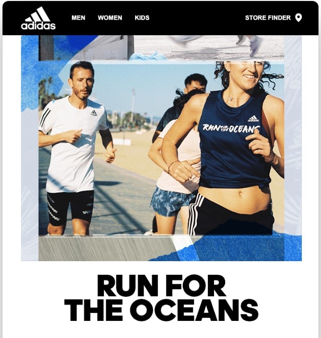
(Source: Newsletter from Adidas)
This Adidas newsletter is about caring for planet Earth and part of a flawless sales launch campaign. In its letter, Adidas promotes a new shoe made from recycled plastic waste taken from the sea. This email marketing example is engaging and inspiring with its theme! Such a letter will be opened by everyone who is really worried about the problems of ecology and our future. Adidas encourages us to take part in the promotion because they will donate a dollar for every kilometer we run to Parley.
3. Gap
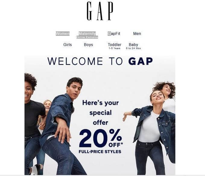
(Source: Newsletter from Gap)
I literally fell in love with this GAP newsletter. See how the discount of the product category that is shown stands out. GAP shows prices - the cost of the currently displayed item of clothing turns blue, while others remain blue. And you know exactly which category of goods this price belongs to.
4. TLDR
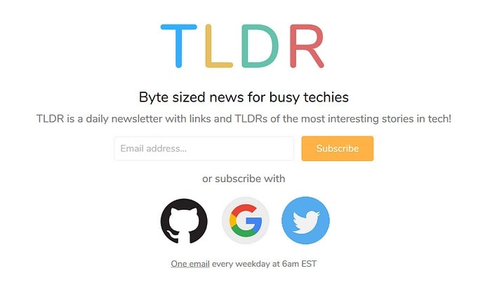
(Source: Newsletter from TLDR)
We like this newsletter because it's short and concise, how a daily news roundup should be. It brings you a maximum of 10 titles at once, just the number you need to start your day or take a break from your routine tasks. TLDR only focuses on tech, so you will rarely find mixtures with other news segments.
5. Hacker Newsletter
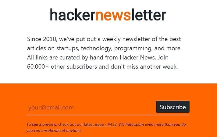
(Source: Newsletter from Hacker Newsletter)
The Hacker Newsletter uses exquisite colors and font for their newsletter. They always keep their newsletter design simple but attractive. As you can see, this is a very diverse newsletter that will keep you informed and entertained at the same time.
6. Quartz
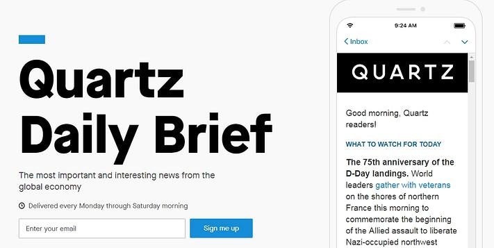
(Source: Newsletter from Quartz)
Quartz newsletter is another light newsletter when it comes to tech but rich in content, in general. It combines tech articles with politics, curiosities, funny stories, subjects of debates, discoveries, and a lot more. In short, Quartz will send you a daily email with brief stories about almost anything.
7. Box of Amazing
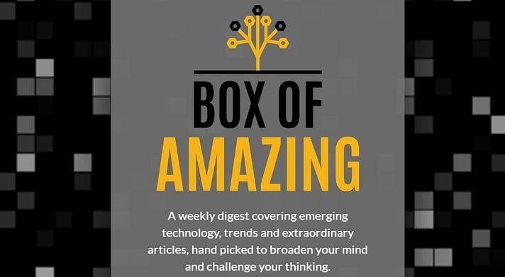
(Source: Newsletter from Box of Amazing)
Box of Amazing kept everything simple in this newsletter. Another great example of a newsletter that arrives in your inbox every Sunday and brings your weekly dose of everything tech: from AI and robotics to cryptocurrency, drones, 3D wonders, apps, e-commerce, and anything that entails the evolution of our world.
8. Fully Charged by Bloomberg
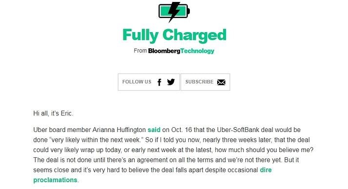
(Source: Newsletter from Fully Charged by Bloomberg)
What's nice about this newsletter is that it delivers the content in a story-like manner by linking all the resources and articles. I like this storytelling approach because it makes you read further without skipping parts, worrying that you might be missing the point. In the end, you'll also get individual links with short global technology news.
9. Benedict Evans Newsletter
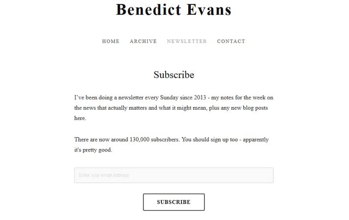
(Source: Newsletter from Benedict Evans)
Benedict Evans is doing a great job with his free newsletter by curating the freshest stories and resources from the realms of mobile, productivity, innovation, cars, machine learning, AR & VR, plus a lot of other topics that you will discover yourself after subscribing. Benedict's newsletter comes to you weekly with a minimalist structure and design.
10. The Download
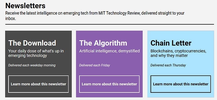
(Source: Newsletter from The Download)
The Download is a weekly newsletter that has a modern, colorful presentation. It's not just a pretty face, though; the content is also interesting as it goes with many concrete, futuristic, or potential perspectives of the world we live in.
UX Design for Email Newsletters: 5 Things to Know
A good newsletter has to meet two crucial criteria: It has to be easy to understand and stand out from the crowd. These eight email design tips can go a long way in helping you achieve that.
1. Less is more
A newsletter allows you to provide an overview of your most important products or offers. Above all, this saves your recipient: a lot of research time inside. However, be careful not to overload your mailing. Also, make sure that the most important content is at the beginning or above the first-page break.
2. Well structured
Graphic elements such as dividing lines, infoboxes, checklists, and crisp headings clearly demarcate individual elements and ensure a better overview. And that, in turn, ensures better readability for your recipient: inside and invites you to scroll further.
3. Use Emojis
Emojis have already arrived not only in private but also in professional newsletter marketing. They make reading fun and trigger clear associations. Emojis give your newsletter a personal touch and help to replace spam words, and get the length of your subject under control.
4. Build-in visuals
Visual elements such as images, videos, or GIFs bring your email marketing campaigns to life and attract attention. Images alone generate a click-through rate up to 42% higher than emails without images.
5. Responsive design
Nowadays, many users check their e-mails on their mobile phones while they are on the move. Whether smartphone, tablet, or desktop - to meet your readers' needs today, you need a newsletter design that automatically adapts the display to the screen size of each end device.
