Why Most of UI Portfolios on Dribbble Look in The Same Style
User Interface, or UI, as you may call it, is one of the most incredible and important aspects of the design. Be it a mobile, TV, website, smartwatch, or anything else, a good UI pivots the users in the right direction and helps build an understanding between the interface and the user.
Dribbble UI designs are always setting new trends in the market while bringing new ideas to the forefront. Irrespective of the experience, expertise, and understanding, every designer develops a perspective in their mind, "Why are almost all the designs on dribbble similar?"
If you are also experiencing something similar, then it is a good thing because you have one of the properties to become successful at dribbble UI. This shows you are observant and understand how things are working on the platform.
As to the why part, we will help you with it. First, let's check out what we mean by similar style UI.
- Part 1: The UI design style on Dribbble
- Part 2: Why most of the UI designs on Dribbble are in the same style?
- Part 3: Software to help your Dribbble UI Design
The UI design style on Dribbble
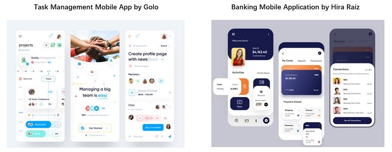
Have a look at both the designs and try to infer the motive of all these UI elements.
Look at the intuitiveness of both the dribble UI platforms;
- While using the application, the users will get most of the information on a single page without having to look for it on different pages.
- Look at the main button placement, everything is within the range of a person's thumb. The entire page is intuitive and added with engaging elements like animations, transitions with smooth scrolling.
- Everything is on a single page and color-coded for better understanding, and the icons are self-reliant to tell the entire story.
Let's take a look at another set of dribbble UI designs.
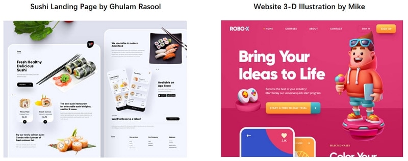
Here we have two websites landing pages created with intelligent UI to amplify the user experience.
- If you look closely, both the landing pages give a 3D effect.
- Above the fold, both the landing pages have minimal content with large size images.
- The main CTA (View Menu in Sushi landing page) and (Start Trial in RoboX landing page) is given above the fold.
This implies that the designers have to create such strong and appealing designs that the users do not scroll down and take the desired action in the first instance.
This is what we aim to help you understand. Why do these four randomly selected interfaces have similarities? If this is the case, then how can any design be unique.
Read on to know why!
Why most of the UI designs on Dribbble are in the same style?
Below you find five important reasons to understand why dribbble UI designs have a similar style.
1. Designs Follow the Trends
Trends are preceded by a unique idea and a hope that it will get mass adoption. The same goes for designs and everything else that we observe in this world.
We see this with clothes, apparel, languages, and so on. Dribbble UI designing is similar because everyone wants to be part of the famous trends. That is how they can get more project views because the people who want to design their platforms and website want to follow the trend.
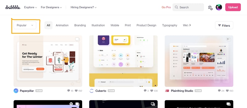
In dribbble UI, you will observe styles characterized by rounded corners, minimalism, soft color palette, and the use of soft shadows. This helps create clean designs that are functional and easy to make.
So experienced designers follow suit because that is what the end-users like. The newbies are impressed by the thousands of project views that are made on similar lines, and they want to get the same attention.
2. It's about the Clients
Clients want to give their users a similar experience as the competitor. So, they present the designers with samples of the designs that are famous on dribbble UI or they experience mass adoption.
3. Template-Driven UI Styles
The template making industry runs parallel to the design. So the designers who are creating the designs also help make templates for others to use and edit as per their requirements.
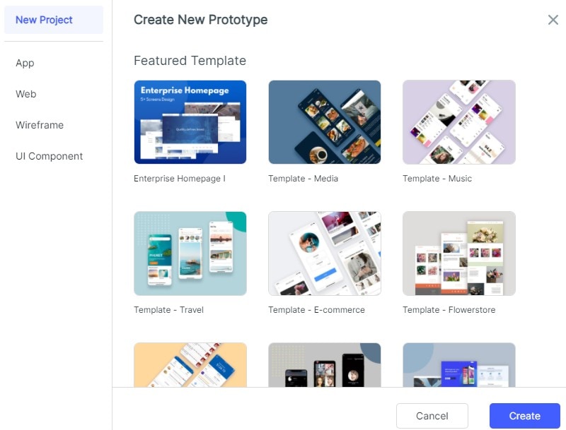
But the core principles of these templates are also following the same trends as the designs. This also brings us to the chicken or egg question. What came first, design, or the template?
Well, we think trends are made by unique designs, and once a trend is cruising, templates follow.
4. Working on the same problem
Think from a designer's perspective. It does not matter what sort of application you are making, UI has to be good. That is why the dribbble UI designs that you see above are similar, even though the purpose of the application and the website is different.
So, the problem for which we are creating a dribbble UI is not real, and due to this, the design is also not real but an imitation.
5. It is not an Art form
Yes, the designs we create are not an art form. We say this because every type of design should not necessarily have a unique UI. The reason being, if every design is unique, think about the learning curve every user has to go through.
It will take the same amount of time to get familiar with a new design, which can lead to abandoning the design instead. Creativity has a lower ROI as it takes time to develop and generate new ideas.
Whereas imitating trends is easy, fast, and creates the same impact as any other design with minimal tweaks.
Software to help your Dribbble UI Design
You cannot deny the fact that even though we see similar designs on Dribbble UI every day, they never get old. Great UI is essential to get outstanding UX. But how do you create stunning UI?
You need the perfect UI design platform to imitate or recreate productive and user-oriented dashboards, application designs, landing pages, and other digital solutions.
We recommend working with Wondershare Mockitt. A versatile design platform embedded with advanced design tools and functions enabling you to create any sort of dribbble UI that you come across.
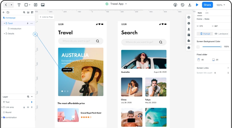
Here's what you will get with Mockitt:
- Access to Asset-based libraries and editable widgets that you can also add to your library for future use.
- Explore your creative side with relevant gestures, transitions, animations, and effects.
- Link pages with widgets and other pages to create an authentic experience of working with the digital platform.
- There is a dedicated feedback loop system integrated for the designers.
- With cloud compatibility, you can work together with the team or invite clients to check the designs in real-time.
- Automatic HTML and style code is created for every element, which streamlines the handoff process.
- Pre-built templates for newbies and first-timers to make it easy for them to create designs.

