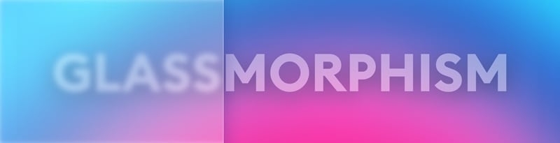
Glassmorphism Design Tips and Inspirations

What is Glassmorphism UI Design?
Glassmorphism is a relatively new and therefore incredibly popular word in interface design. This trend is characterized by the effect of translucency and depth of the image, bright colors with light borders, and blurred outlines of the background. Often in this trend, you can find objects simply floating in space, as well as a combination of photography and its blurry as behind frosted glass.
Despite the popularity of the trend, it is important not to blindly copy it, but to build the interface thoughtfully, testing its readability - glass morphism will be appropriate only on individual elements, so as not to interfere with the visual perception of ordinary people in a hurry. It is also important to adapt the design with it so that it is comfortable for people with eye diseases. Add contrast to important buttons to make them stand out and enhance the user experience.
Characteristic features of glassmorphism:
- Transparency - the overlay of layers creates the effect of frosted glass with a blurred background;
- Layering;
- Objects freely "floating in space" without support;
- Bright, neon colors that emphasize the airiness and transparency of the design;
- Colorful backgrounds and photographs, the overlay of "glass" on which looks the most impressive;
- A very thin semi-transparent white stroke on objects to simulate a glass edge.
3 Useful Tips to Design Glassmorphism
Glassmorphism UI design trend noticed at the end of 2020. This is not a completely new thing, because we have already seen a user interface that used glass material years ago, with Windows Vista. These days, designers have begun to use glass intelligently to keep it attractive and comfortable. Good examples of user interfaces that use glass are Apple's iOS, macOS, and Microsoft's Fluent Design System.
Apple and Microsoft are making broad use of the glassmorphism UI. Examples of this type of background can be found in abundance in the new macOS Big Sur. Apple has also implemented the partially transparent look of floating UI elements in the latest version of its operating system.
Apple is neither the inventor of the trend nor the first to use it. For once, Microsoft was faster here. The look of brushed glass surfaces has long been part of the in-house Fluent design system. Microsoft does not speak of glass morphism, however, but calls the design method Acrylic. Users should like the look not least because it evokes associations with current premium smartphones. Brushed, i.e. matt glass surfaces are simply in. So why not benefit from them?
1. Make the effect
The effect itself is easy, but there are two points to consider. As with any card-based layout, the first one is the closer an object is to us, the more light it attracts. In this case, this means it will be more transparent. The basis of the whole effect comes from the combination of shadows, transparency, and background blur. This style can only use one transparent layer, or multiple transparent layers, but when at least two translucency levels appear on a fairly busy colored background, this style will be most conspicuous and visible.
2. Choose the right background
The background plays a vital role in making this effect glow (literally). They cannot be too simple or boring, otherwise, the effect will not be visible. They can't be too detailed. This may be the reason why Apple chose a colorful background as the default wallpaper for Mac OS Big Sur. When the blurry transparent surface is on top of it, those easily discernible tonal differences are also easy to see. When choosing a background, make sure it has enough tonal differences to make the glass effect really visible.
3. Set the correct transparency
It is important to remember that you cannot make the entire shape transparent, but you cannot make it transparent. When the fill rate is 100% and the object transparency is low, most design tools will only disable background blur. In the example above, the background blur value is exactly the same at 8, but the image looks completely different. When the fill opacity is 100%, it doesn't matter how low the object opacity is. We simply won't get the blurred background we need.
5 Glassmorphism UI Design Examples that Inspired Me
In 2020, when the epidemic is sweeping the world, the industry pulse is forced to stagnate, and many design trends have not changed much and will continue into the new year and continue to dominate. As we all know, the Neumorphism style imitates the squeezed plastic material. At the end of 2020, another new style has gained a lot of attention. The new style pays more attention to the use of vertical space Z-axis.
Elements to the Glassmorphism Aesthetic:
Transparency
The frosted-glass effect is achieved by using background blur. This adds depth to the design and establishes verticality. The blurring of objects gives the layout a sense of perspective, almost as if they were floating in 3D space.
Multi-layered approach
With objects floating in space, the layered interface maintains a clean look that's easy on the eyes. This style works best with one or more transparent layers on a bright, colorful background.
Vivid colors
The background color plays an essential role. To highlight the blurred transparency it should be colorful but subtle. This is necessary for the effect to be properly visible. Dull, low-contrast backgrounds would simply fade away under the objects and the effect would be lost. They also can't be too cluttered or detailed.
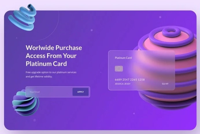
1. Banking Fintech Web Design
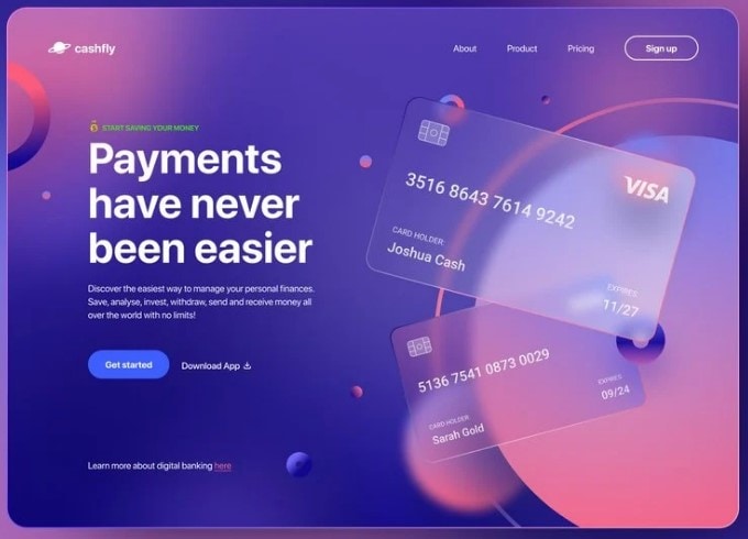
This is an example of Glassmorphism used in visual elements, in this case, credit card illustrations, on an online banking website design by Bogusław Podhalicz.
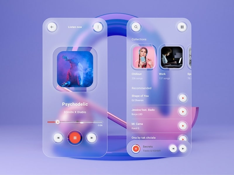
2. Music Player Exploration
This is an ideal example UI of a music player app design by Rudi Hartono for Plainthing Studio that combines Glassmorphism with Neumorphism style.
3. GlassmorphismHeader Concept
Here's an example of a Glassmorphic website header with a frosted glass effect on the credit card and email input fields, as well as a call to action button.
4. GlassmorphismApp
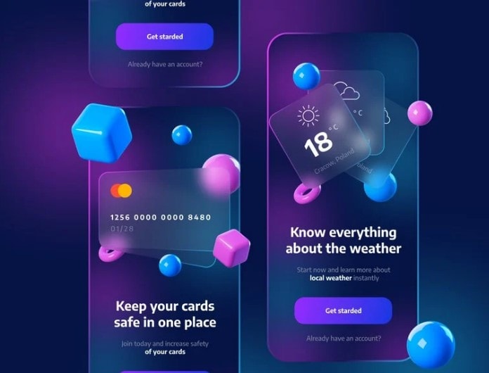
Mikoaj Gaziowski's design employs glassmorphic UI elements with colorful 3D shapes in sample onboarding screens for a weather app and a personal finance app.
5. Sign Up/Login UI Design by Stefan Brown

UI/UX designer Stefan Brown shows the application of Glassmorphism design style in Sign Up and Login Screens of a mobile app.
Introducing the best tool for UI design – Mockitt
Prototyping tools are like your best friends at work. You need to know which one is right for you, depending on the team and the project that you working on. Most of the designers don't have just one tool because they work with different teams and have to adapt to their cultures. They use Sketch, Figma, Adobe XD and Principle every day. Each tool has its own advantages and disadvantages. But I think it's part of a designer's job to keep up with the trends and be fluent with different design tools. We need to know which tools are right for us. Ultimately, the decisive factor is how we communicate our ideas at a certain point in time. Although switching between software can be frustrating.
Wondershare Mockitt is a cloud-based prototyping tool with extensive real-time collaboration capabilities. You can use Mockitt to quickly prototype that show your ideas and enhance customer experiences with ample assets and templates. If you're a beginner, you can work like experts with the huge icon and component libraries, 20+ industry-specific templates, and easy drag-and-drop functionality to add, arrange, and connect components. If you're a designer, you can focus on the design by eliminating repetitive work, dragging and dropping directly imported sketch images, and moving around to easily add your design draft to hot zones.
Wondershare Mockitt Key features and benefits
- A cloud-hosted environment, collaborative by design. Multiple designers can co-edit a project with the Enterprise Space feature, seeing changes in real-time.
- A simplified user interface for easy navigation and zero learning curve. No additional training is required as Mockitt is intuitive for beginners and professionals alike.
- Large asset libraries with over 5000 standard and platform-specific widgets, icons, and other components. Plus, more than 500 templates to speed up design processes, prototyping workflows, and design systems, while 600 UI kits for specific platforms like iOS, Android, and Web.
- Seamless linking method to add interactions, gestures, transitions, animations, and other effects to create high-fidelity prototypes.
- Import Sketch files much faster and creates interactive prototypes in minutes. Designers can choose to download the entire design as slice files and use just what they need.
- Project history is automatically saved, and older versions are accessible with a single click.
- Easily manage team libraries to implement design standards and styles for multiple members across different locations.
- Real-time preview and smooth developer handoff to streamline the transition.
Conclusion
People's aesthetics will always change. We are easy to get tired of one trend and turn to another style every few years. As designers, we need to explore all potential and creative ways of manufacturing products. Although the new pseudo-materialized style has its inherent flaws in the readability of special people, and the glass-based pseudo-material style is insufficient on the icon, this does not prevent the popularity of these two styles. At present, more and more famous domestic and foreign The factory applies these two styles to its products.
