UX Design Tips for beginners- The Navigation

The structure of your website affects the overall website's performance. You may think and consider the navigation bar is an unnecessary factor, but believe it, it is essential. There is a possibility that you are facing a high bounce rate on your website but don't know the reason behind it. Well, that's maybe because of your improper website navigation.
What is Navigation?
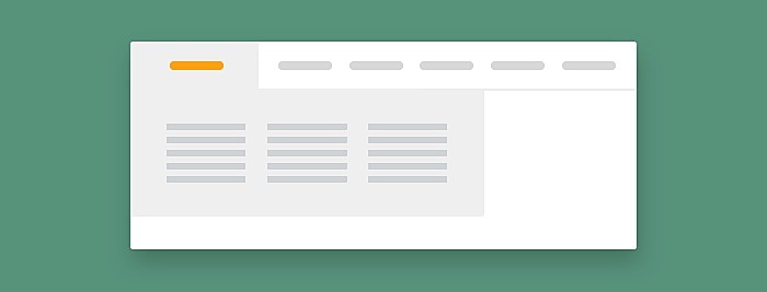
Navigation of a website is a simple but underrated factor. The navigation menu or bar is the collection of information or links at the horizontal or top of the website. This factor sounds simple but is crucial.
The structure you design of the navigation bar has an impact on the bounce rate, sales, and conversions of your site. Has it ever happened to you? You visit a website, roam on it for around seconds, and something clicks your eyes. You want to know more about the content or find some other related content, but where is the navigation bar? An obvious fact that your mode will spoil. That is why the navigation bar matters.
You have to allow the users to navigate through the whole website rather than being lost. Another factor that most web designers recommend instead of the navigation bar is the "Search Bar." But do you think that users are interested in searching all the content?
Via research, it has proved that 40% of the users use the search engine on a website, while 60% use the navigation bar. That is why the navigation bar has priority.
Why is Navigation Important?
Have you ever thought that why users are leaving your website so fast (high bounce rate)? That's maybe because of the improper structure of the navigation on the website. Here are solid five reasons that why navigation is vital.
- It Increases the Visit Duration: Here is the first solid reason that describes the importance of the navigation bar. The navigation bar decreases the bounce rate of a website by allowing the users and audiences to explore more about the business.
- To the Point: The users want to get straight to the content they want. That's when the navigation bar comes to play the role. The navigation bar prevents the users from getting lost on the website. It allows the users to quickly and easily access the information they want.
- It Generates More Sales: With proper integration of the information and purchasing method, the navigation bar encourages the users to purchase the products.
- Serial Position Effect: Serial position effect is a psychological phenomenon. It is when the customers prioritize the first and the lowest product over the ones in the middle. Let's take an example from everyday life. You make a list of the grocery items you need bread, milk, veggies, eggs, and fruit. By reaching the supermarket, you realize Ohh! I forget the list at home. What items do you suppose to remember? Bread, Fruits? The navigation bar inserts links to all the products on the website. That makes it easy for the customer to find them out.
- Overall Design: The location of the navigation affects the overall design of the website. Usually, the navigation bar locates at the top or horizontal left of the website. Placing the navigation bar in the middle of the website will affect the website design. Organize and standardize the navigation bar location so that your website looks attractive.
10 Best Practice Tips for Website Navigation
Use Breadcrumbs
Breadcrumb is a type of secondary navigation scheme that tells the position of the users on a website. It encourages the user to search more about the website and explore more about its hierarchy. The term breadcrumb comes from the Hansel and Gretel Fairy tale.
Just like the fairy tale, the breadcrumbs on the website allow the users to locate their location. The thing you need to know about breadcrumbs is that never use them on a single-level website. The use of breadcrumbs is recommended only for hierarchically arranged pages.
Make Hyperlink Apparent
This mistake of web designers has ruined their business. How is that possible that the users will recognize a hyperlink until you do not highlight it? Make the hypertext and hyperlink accessible, not usable.
Use a distinct color (specifically blue). Underline and bold the text so that it can recognize easily. Also, use symbols and indicators to indicate the text and link. All these practices will make the hyperlinking more visible to the audience.
Make it Organized and Consistent
Don't consider the navigation bar as a place where you can insert hyperlinks as much as you want. Make it organized and consistent. Consider yourself as a user. You visit a website you like a product and want to know more about it, but the too much clutter of the hyperlinks confuses you what you will do?
Keep in mind that every single detail of the UX navigation design will affect the user experience. Make the navigation appealing and easy to access.
Make Categories
Don't stuff all the data in one place. Organize your navigation menu and make categories in it. You can categorize the menu on your business type. For instance, if your website is about health and fitness, you can make sub-sections of fitness and health-related content.
You can categorize the health section into a more detailed version. The same goes for the fitness section. That is how user experience increases by providing them convenience.
Use Sticky Menu
Scrolling down a long-form web page, want to check about the business, but is the navigation bar? AHH! Scroll it up again to find the bar.
If you apply this factor to your long-form website, then believe it, your website will have a higher bounce rate than the sky. Sticky navigation menus are specially for long-form content. You must have witnessed that when you scroll down a page, the navigation bar at the top remains there no matter if you reached the footer.
Sticky navigation menus help the users to get straight to the point without the need to scroll.
Exclude Confusing Navigation Titles
Visitors want accurate information about the business. If you provide them misleading titles and text, they will give you a high bounce rate in return. Keep the content of the navigation bar attractive.
Have you thought about why 90% of the websites have the same word "About" in the about us and about me section? That is because it is clear and straight to the point. All the text that you use in the navigation bar should be to the subject.
The Dropdown Menu Should be Vertical
You set the navigation bar at the top of the website that is great but waits! What is this? Did you horizontally set the dropdown menu? Ohh! You did a blender, man!
You have to set the navigation bar horizontally and the dropdown menu vertically. The reason behind this is that horizontal scrolling is troublesome as compared to vertical. Make balance in the sub-menu of the navigation bar. Don't forget that users are interested in sub-scrolling. They will reach there in search of information.
Make Sure it Works on Mobile Devices
We have noticed that designers design out-class navigation menu, but they lack to perform well on mobile devices. Nowadays, the majority are the users are using mobile devices as their medium. So it is necessary to make sure that the mobile navigation bar also works the same as it does on desktops.
To make the navigation bar respond on the mobile device, you need to design it horizontally. Customize the dropdown menu as we have mentioned above. Use the select concept. This concept hides all the information on small screens like mobile and pops them up when the user demands.
Keep the Navigation Title Short Yet Informative
Don't lengthy sentences to describe what the function is all about. Use sort sentences maximum of around 2-3 words. Do you think that the user will read the lengthy sentences of the menu? Not only the navigation menu but also in any menu kind. If the length of sentences is long-form, it bores the readers.
Use simple-short navigation labels like About us, Contact us, and Our Services. These sentences are short but are to the point. That is why they are widely used.
Make sure that the Search Bar Works
We accept that 60% of the users use the navigation bar to find information, but if you got a user who uses the search engine, what will you do then? That is why it is necessary to add all the features to the website so that it completes the demands of every kind of user.
Conclusion
Once you apply these tips properly, you will see a visible difference in your website visitors’ rate. If your website hierarchy is more extensive than 3-4 levels, then redesign it to increase the user experience.
