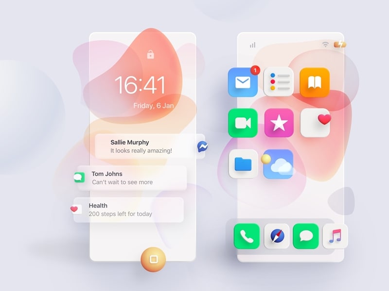
5 Useful Tips for Neumorphism the Right Way

The most important thing is how we perceive things and whether we like them or not, but our brain tends to react to different and new things. So we would have never helped but wonder how things are pretty diverse and cached when it comes to advertisement, either there will be a cache line that will make you wonder how unique the item you just saw was, the effect of such things is different on people.
As we know, the internet has opened global doors, and now people worldwide can interact with each other and share their ideas, which has led them to believe and develop the most eminent sources and new ideas. Everyone wishes for a tremendous amount of traffic on their website with a growing number of clients, but have we ever helped to wonder how to develop websites better than others? The answer is simple: work on your designs, and when one talks of design, it means icons, themes, and other sections of the website. Further, we will discuss neumorphism and some tips to implement it on the website.
Top 5 Useful Tips to Design Neumorphism
The website consists of various components which contribute to deciding whether the website is attractive or not because an unattractive website cannot attract clients. Some multiple methods and techniques collectively contribute to the complete establishment of a well decorative web page known as UI or User Interface. As we all know, interface means a platform that allows the cross-reference of two mediums; we can see that the website is the cross-reference of the Internet and the standard user base. Therefore, the UI has been beneficial for the websites as each website has a different UI, which makes its working much smoother and easier.
Various factors can affect the website interface, but the main factor is the icons because icons tend to create more interest to people, known as Neumorphism UI Design. So there are a few methods or tips listed below that can help the user further break down and enhance the interface's efficiency. But, of course, we never know what a difference a square and a circular design could ever make for the user. So there are some things to be kept in mind by the user before making Neumorphism UI designs.
1. Coloreffect
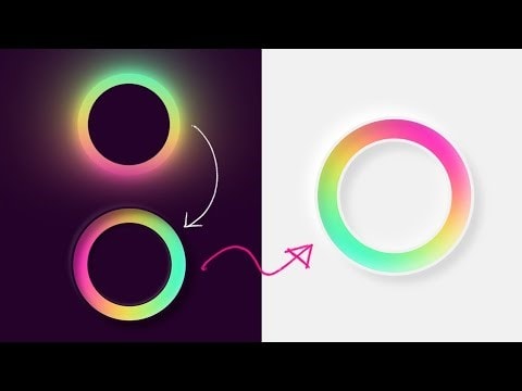
We have heard that everything around is the wonderful effect of the color fusions, and these color effects combined make sure something looks different. We have spent our childhoods looking at the rainbow across the sky and still wonder how wonderful color can be, so for creating a website attractive, the textures of the colors must be well-matched. It can be concluded as the colors should have a slow pace switch which is like the colors should be the gradient of a parent color. People use gradients to signify and relate the various parts of the websites; whenever a user clicks on a button in the website, its color changes to the faded color, making the user realize that some action has been performed. Therefore the color effect is the principal constituent of Neumorphic UI designs, and it is the vital factor that decides user interaction.

2. 3D view
We have heard that things can be seen from two points, and these two points are often described as the axis. So, for example, suppose a person can walk straight and then walk in left or right either direction then it is a 2D view, whereas if a person can walk into three movements and view a thing from all perspective on a 2D sheet, then it can be regarded as 3D view.
When explained, then this process looks quite challenging, but the 3D view can be easily added to the neumorphic UI by simply using the shadow effect. The shadow effect of the CSS allows the user to put a little curved shadow at the end of the button, which makes it easier to produce an impact when it looks like the controller is lifted. So it is vital to give a 3D view to the text boxes and other components to make it look much more realistic and cache.
3. Animation
We know that a picture speaks a thousand words, but a moving picture can express millions of actions. As we know that moving images create a remarkable effect that can be understood as an object moving in the background, it is easier for the person to see what they want to convey. This is one of the most innovative ideas of neumorphic designs that has cast a revolution on people because now people have finally started using it to complete their abilities. It looks so amazing when we see that the objects move from one section to another like some movement on the screen, as the best part about being neumorphic.
4. Drop down pallet
When the user uses a new website, he makes sure that he gets fascinated by the working and presentation on the website. Of course, the neumorphic UI designs play their role and make the website look fabulous. Still, the working and the dropdowns also play a significant role because one sees how a list of options appears when a button is clicked or how a progress bar is visible when some process occurs.
5. Innovative cross-platform designs
Various users access the same website on different devices like mobile phones and systems. Hence, the designer must consider that the neumorphic UI designs do not differ too much from the mobile phone platform to the system platform. Therefore, they must look much more relatable, and also they can please the client and make it easier for him to cope when he switches platforms.

The best tool for UI design – Mockitt
If you have the right kind of technology and tools, you will be able to perform in the best way possible. In the same way, if you have the perfect tool, you have the chance to create the best out of anything.
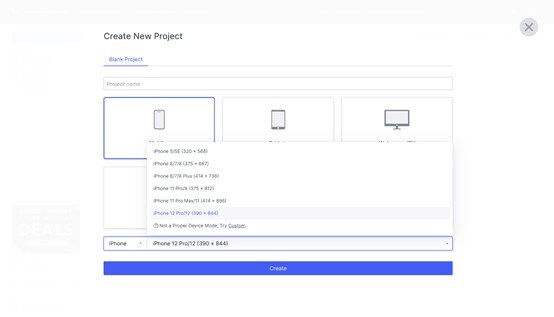
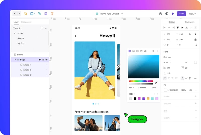
Mockitt presents the best creation and revolution in UI design which has allowed people to wonder at the skills they possess. We have developed the best tool for UI design which makes them much more capable of their abilities and will enable them to enhance their skills by working every day on this platform.

Now the designs and things in the mind are no longer an imagination; they have become a permeable reality. Now every person with an idea will develop an idea that will be breath-taking and will cause the needed effect in the world. The Mockitt software has the wonderful ability to synthesize the best skills and output them in the best way possible. It has made it possible for people to develop products with wonderfully furnished skins, making them more worthy of its sayings. As a result, the software has gained considerable community applause. Also, it doesn't fail to show its clients the tremendous effect it creates and how it has provided designers with the unique abilities to cast an excellent look on the people.
In recent times, the software has shown people its incredible working effects, but it has failed to show them how beautiful things can be carved and how a website can attract people. Allow the designers to cross their boundaries and develop the range of designs that they never could. The Mockitt is the solution and calls to all the needs of the designers, now is the time to switch to Mockitt and develop a unique neumorphic UI.
Conclusion
For a website, they must work on all the website components, and when we talk of all the components, it means that it should be both front-end and backend. The front end should be taken care of; it is the park of the screen which users see, and the back end is the one on which the process occurs, so it is essential to work on the neumorphic designs of the website to make it look much more attractive and classier and to get hold of bunch lot of clients.

