How to Use Typography in UI Design?

If you think that typography is only about choosing a nice font and its colors, think again. Typography is an art that helps you bring the digital interface to life. Defining typography is about using the font and typefaces to make the copy or content look good and clear. It provides legibility to the context and makes it easy to understand for the reader.
Simply put, it is not about the words you use but how you put those words in front of the reader. Typography in UI design involves styling the fonts while taking care of their appearance and structure with an aim to evoke the right emotions in the user.
Yes, you read it right. We can elicit a response from the reader with the help of the right content and context. Hence, it is important to embed the principles of typography in UI design fonts.
Typography has a role to play in UI design, and it goes beyond selecting a good-looking font. The role of typography in UI design is simple. It helps make reading through the digital interface simple, understandable, and memorable.
The reader should have to flinch his eyes or move close to the screen just to read what is written. Secondly, they shouldn't have to call in a calligraphy expert just to read the content. Hence, the role of typography is to catch the user's attention, make the interface look nice and clean without cluttering it with abrupt fonts and character sizes.
5 Tips on Typography in UI Design
1. Use the Principles of Hierarchy
Using hierarchy in your typography design is one of the most effective ways to communicate with the reader. Within this hierarchy, you have to consider the font, size, and layout to create a division of content and information on the interface.
Source: LinkedIn
We need to use hierarchy in UI typography to organize the information and establish an order of things. The task is to take each element of the content and divide it into sections organizing them according to their importance.
So, using hierarchy in typography is akin to maintaining a discipline in your interface design. The same principles of typography in UI design apply to the graphics and the content you insert in those elements.
2. Ensure Perfect Readability in the Design
When you add content to the design, ask yourself the following questions.
- Is it easy to read the context and understand the layout?
- Are headings, subheadings, and other content forms distinguishable from each other?
- Am I able to make out the difference between the main message and the auxiliary content?
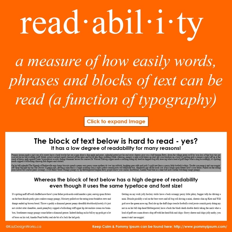
Source: Kaz Design Works
Answering them will help you ascertain the readability of your content and make it more appealing to the reader. The majority of the aspects in this area are about macro-typography. You won't have to look for some subtle aspects.
Another way to enhance readability is using contrast, color, and composition to persuade the reader to focus on the main parts. Because not every reader will have the time to scan through every word. So, you have to use the right elements in the context according to different types of readers.
3. Legibility is different from Readability
Readability and legibility are different. The former is about the ease of reading your content, and the latter focuses on distinguishability. This segment of typography in UI design includes the principles of micro-typography.
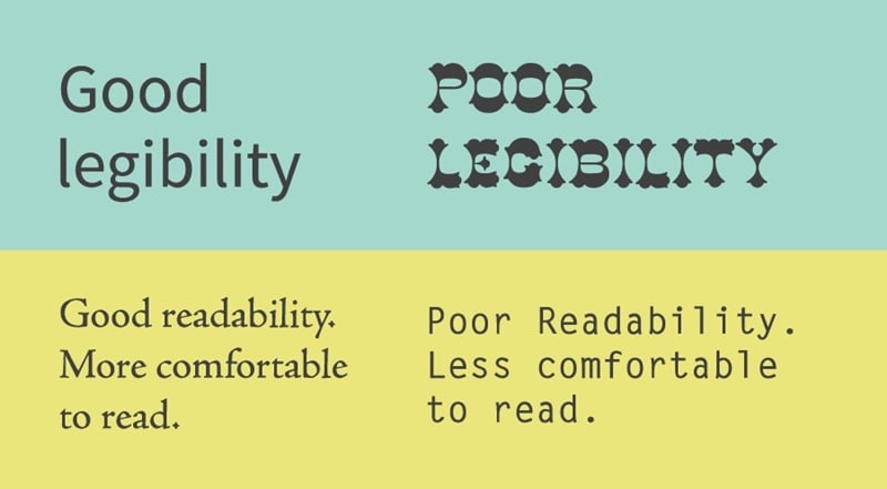
Source: Twitter
Here you must work on the subtle aspects of content. So, here you need to work on the X-height, counters, weight, wide proportion, and letter spacing. The purpose of knowing these constituents of legibility is to learn how to distinguish your content from each other.
In UI typography, we work on copywriting, which is about sharing more with fewer words. The principles of legibility help reinforce the copywriting principles and create a design that has the biggest impact on the reader.
4. Make Usability as your Primary Concern
There is no point in spending hours on the design if it does not serve the purpose. And every design can only fulfill the purpose if it has a usable design. One part of the usability is choosing typefaces that work well in different sizes and have easy-to-read characters.
Source: Usabilla
Different typefaces or fonts have unique shapes and a way of putting the characters in a word. Until these characters are difficult to read, there is no point in decorating your design with impressive colors and graphics.
Hence, typography in UI design must be aligned with the entire interface. So, you must choose a typeface that will bode well with different background colors. When the page fold changes, the typography must also change to conform with the bigger design.
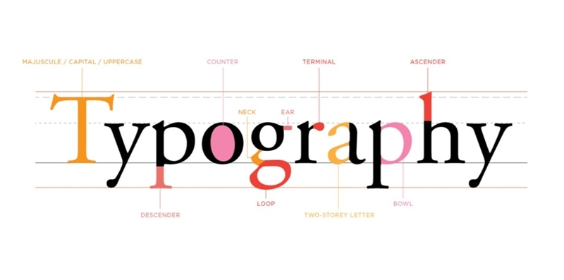
5. Understand the Typography Elements
Typography has several elements, and you must know about them while working on typography in UI design. We have already talked about the font and typeface. Other elements you should consider are;
- Mean line and baseline
- Character measurement
- Ascender and descender
- White space
- Kerning
- Alignment
- Tracking
- Leading
Knowing about all these elements while creating a UI design is imperative to build the perfect and most authentic interface. After including them, you will understand how to consider your text as an integral part of the UI.
Examples of How to Use Typography in UI Design
Enhancing your UI design with the right typography principles is vital. Without a good layout and content structure, the UI design will lack the required communication impact earlier determined.
Here are some examples of how to use typography in UI design.
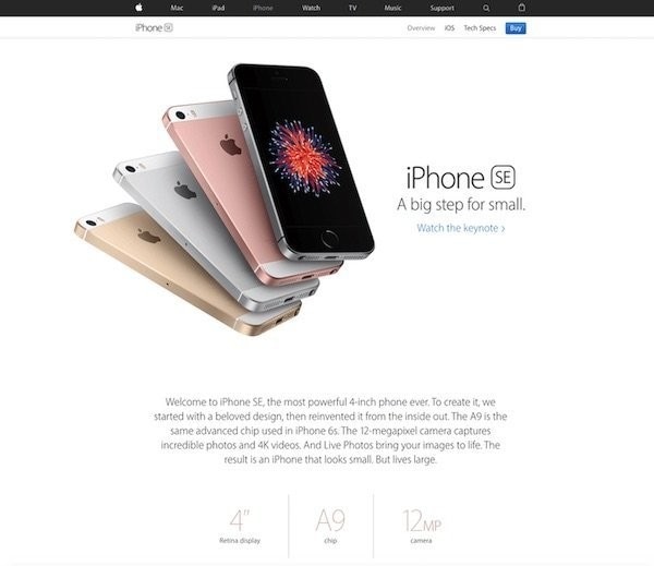
- Apple's Fling with White Space
There is no better example than looking at the web interface of Apple's website. These guys use the white space perfectly to showcase their products and attract the users towards the typography elements.
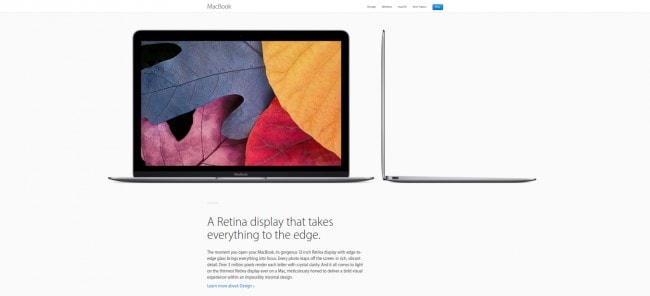
Source: Reseller Club
Apple layers out its content perfectly well to ensure that every reader understands the point clearly.
- Typographic Hierarchy With Colorful Background
There is a way to ensure hierarchy with typography in UI design, which relates to both visual and spatial impact on the interface.
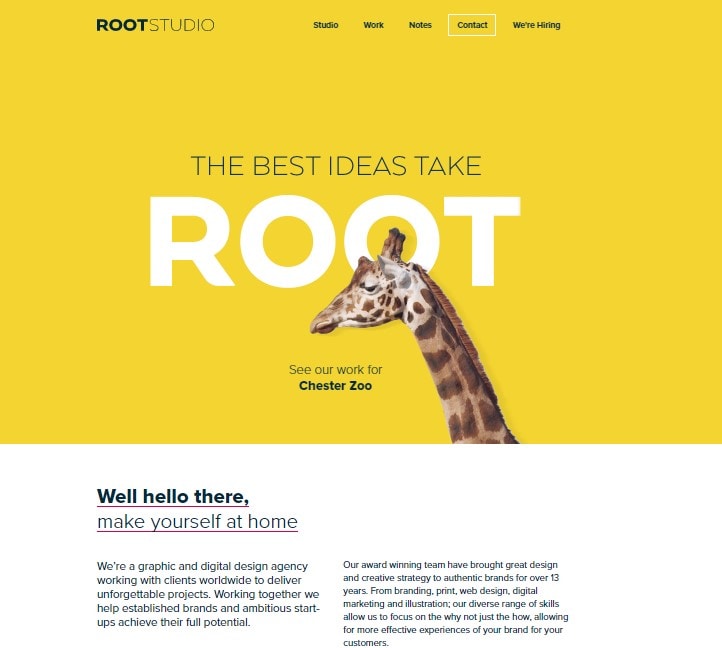
Source: Root Studio UK
Root Studio uses the same fold that every designer has access to but they have used it to provide a better user experience. Beginning with a headline that has the biggest font followed by a CTA to explore the portfolio and then making their way to a formal introduction. This shows how they have framed the entire space to segregate the information sharing aspects and ensure the best user experience.
- Effective Reading Experience
Ditto uses the majority of the readability principles in the book on their website, setting another great example of how to use typography in UI. The best part is that they have a one-page web design. This poses a more significant challenge for the company to format the content and layout to enhance the reader's experience.
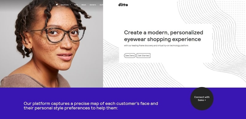
Source: Ditto
Notice how every word, typeface, and character is clear. The background and font compliments each other. This is how you should set your typography and ensure a better user experience.
Once you understand the principles of typography in UI design, make sure to implement them with the right set of tools. It may happen that you are about to utilize a typography element, but the tool you are using does not allow that.
Hence, along with knowing everything about typography, use the perfect design tool to make it happen. We have a recommendation that you should follow in this respect.
Introducing The Best Tool for UI Design - Mockitt
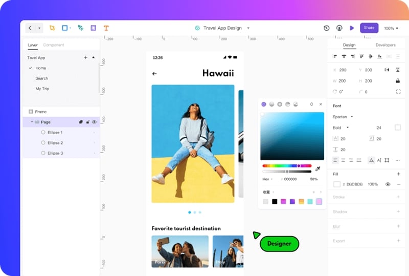
The moment you start thinking about your users while creating a UI design, you have started to work in the right direction. Implementing typography in UI is crucial to create an interface that is welcomed by your readers with open arms. To do that, you need a tool like Mockitt by Wondershare.
Mockitt packs a big punch of features and functions added to help you create an effective design replete with everything you need to improve readability and understanding. Since we are on the topic of typography, let's explore how Mockitt has everything you need to set a UI typography example for others to follow.
- Edit Text: Mockitt gives you the option to edit the text in terms of adjusting the width, height, resizing, etc. You can easily adjust everything about the content you type in according to the requirements.
- Adding Colors: Depending on your background, Mockitt gives you plenty of options to add the right colors for your texts. You can also choose from a large number of fonts and set their orientation between Regular, Bol, and Light.
- Styling your Text: In another area of usability, Mockitt has options to decorate your text and set the alignment as required on the entire page.
For different areas of interface, Mockitt lets you add texts separately with an adjustable box. In addition to the next part, you can set the background accordingly and enhance its utility with several options available.
Mockitt is an online platform that you can utilize to create your UI designs with the confidence that you will have everything you need to create a wonderful typographic-friendly layout for the users.
Conclusion
Using the right methods of typography in your design is crucial to every aspect of the interface. At some point, the text will come into the design, and when it comes, you have to implement everything you know about creating a good typographical experience.
Using the principles of good typography, you will end up creating an interface design that helps build communication and appeals to the audience. Typography in UI design is meant to deliver the brand message with a combination of words, colors, and graphics.
In this, when you use a tool like Mockitt to create the design, everything gets simpler. This is because Mockitt is designed to increase your productivity. The tools available are easy to find, and you will also have the help of official guides and tutorials to create your design.
