Motion is the New UI Trend | The Best Samples of UI Motion Design
Motion and animation have a profound impact on user experience in all sorts of digital interfaces. However, there are a few principles every designer must follow in UI motion. Otherwise, their usability takes a hit, which is not conducive to the overall development of the organization.
While adding a motion design UI, ensure that you are using them for compelling storytelling aimed at creating engagement and communication. Motion is integral to modern designing. As a designer, you will find it easy to add motion-oriented elements into your design.
Adding the design is not a difficult thing to do, but what matters is where and how you are adding the UI motion graphics. Right placement leads to better usability and interaction, while inappropriate placement thwarts a brand's journey to achieve customer engagement and, as an extension, customer satisfaction.
So, to help you with the placement part, here are five incredible motion design UI examples.
Top Five Examples of UI Motion Design
1. Easing the Transitions on Mobile
Switching between two screens is customary for building every application or web product. However, this transition must be fast as slow transitions will tantamount to your users losing focus.
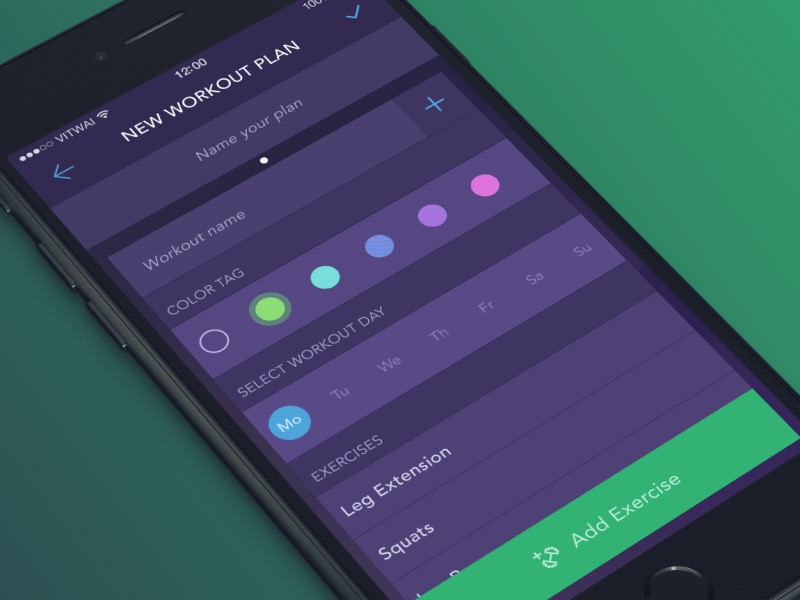
The ordinary approach is to create a simple transition effect, like the ones we have been using for creating presentations. Remember the star-shaped or the curtain opener motion.
Well, these transitions are not user-friendly. So, you need to create the navigation between two screens smoothly. In addition, the motion between these two interfaces has to be more appealing.

Create an animation or move the cards in different directions, as shown in the example above. Such motions are simple, yet they provide an immersive experience to the user.
In cases when the application has to take some time to load the next screen, you can add a couple of animations there to keep the user glued to the screen.
2. Using Micro-Interactions to Ask questions
As the name suggests, micro-interactions create engaging moments with the users and get the desired response. Thus, these small interactions are trigger-feedback pairs that trigger the user to take a response.
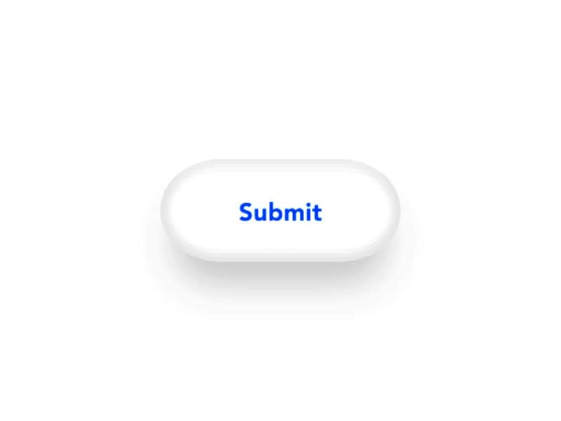
Look at the example above. A small task letting the user know about form submission is depicted with changing color and revolving oval.
The required message is relayed with a small but highly contextual visual message embedded into the interface. Several digital elements go into making micro-interactions. All the elements combine to build a flow of actions.
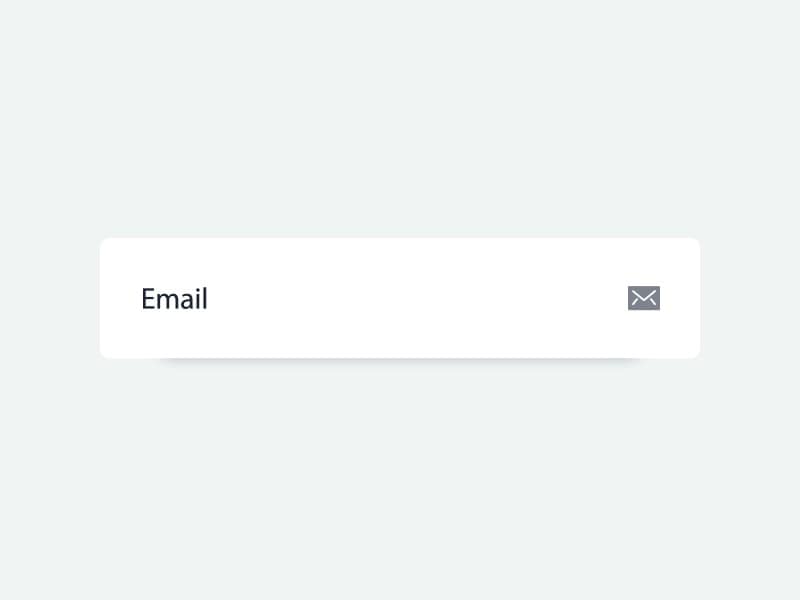
This email submission motion is another example of how we can use micro-interactions in the design.
Elements like a scrollbar, digital alarm, pull to refresh, swiping animation, etc., all qualify as micro-interactions. These small interactions led by motion can be found in almost every aspect of an application or a website today.
Similar to these motion elements, we can use close and hamburger animation, initiate chat, loading, or an action button motion to interact with the users.
3. Using Dimensionality in the Design
Dimensional design is another way of adding motion to transitioning in the design. It can be from one screen to another or from one screen fold to the next one.
Dimensions in the design make the UI look like it has multiple interactive sides. In other words, just as we see, there are different interactive sides of the physical objects that we come across in our lives.
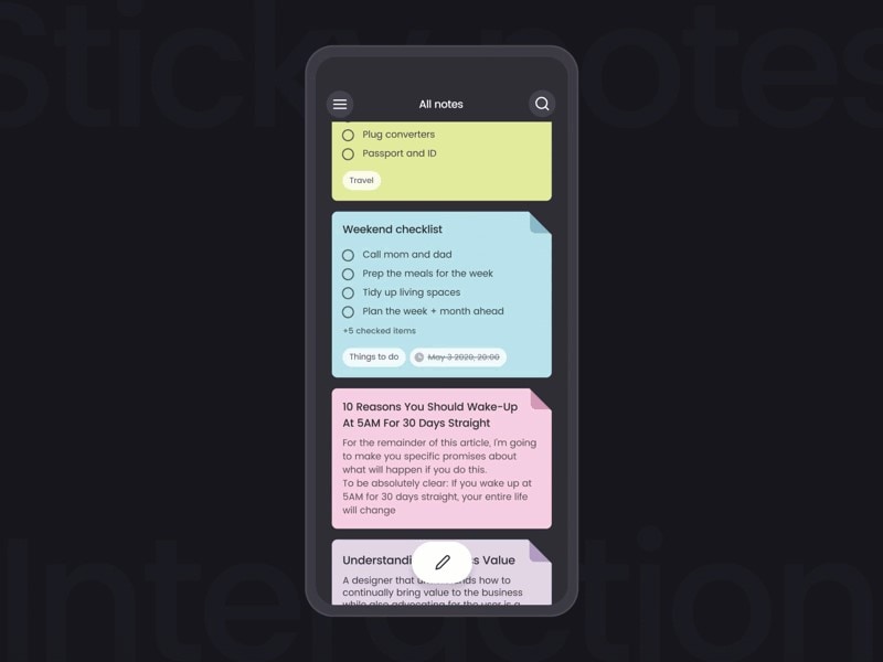
For instance, the way we fold the book pages or turn them over, that same thing is now seen in reading books on Kindle. So the designers try to imitate the exact actions we would take in real life on digital interfaces.
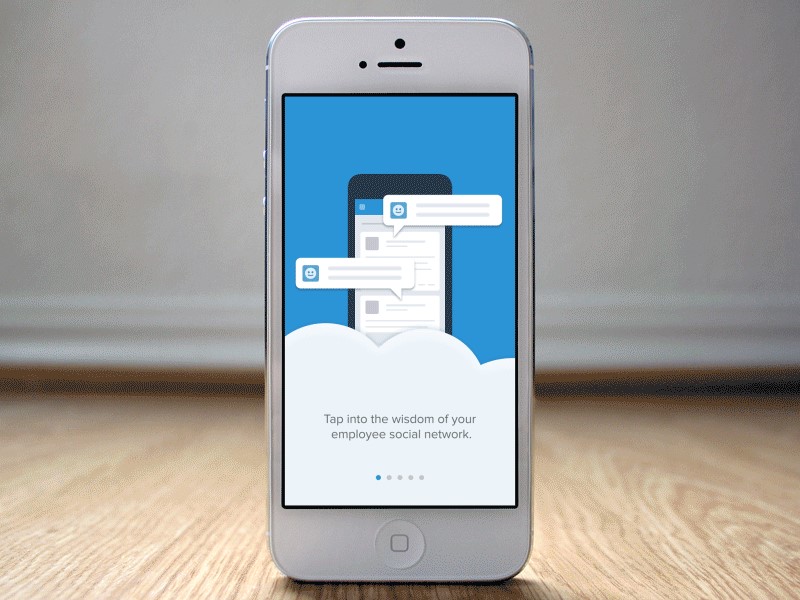
The majority of the concepts in motion designing are about making smooth and interactive transitions. With users scanning through the interfaces, adding dimensional elements in the same are added to improve their experience.
4. Obscuration and Frosted Effects
When you look through frosted glass, everything on the other side is not clear, but you can get some idea about what lies behind that. Applying the same concept to the UI design, we come across several examples of the same nature.
Windows 10 has the same effect permanently embedded into its toolbar. So the viewers can see what's on the window behind or through the toolbar. Otherwise, we can see the desktop's wallpaper through the same.
In UI motion design, this concept is applied to ensure that the user knows what lies ahead while making them stick to the current window. In addition, this gives them an idea about what they are doing right now and what they might be doing in the next steps.
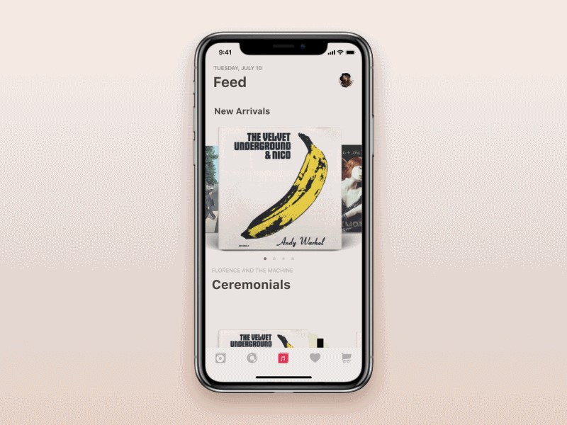
Spotify's interface is a great example in this motion design UI element. When you want to play the next song, sliding over the thumbnail of the present song on either side shows a preview of the next track.
And when you slide over the current song thumbnail diminishes in size, and eventually, it moves out of the picture. In addition to this type of obscuration, we have others that involve blurring effects.
5. Parallax Motion
Parallax is about making different objects move at a different pace in the design. It helps to keep the user's focus on the primary effect while hinting at other things on the screen.
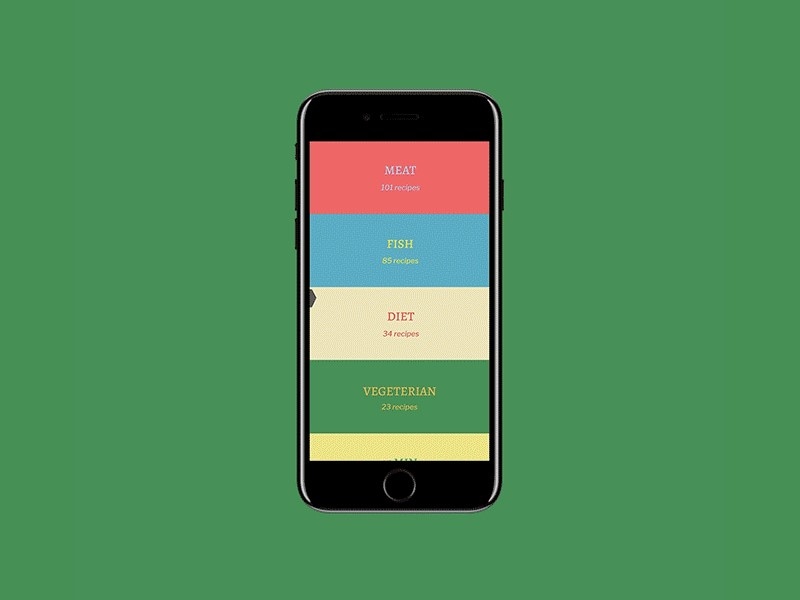
As a result, the elements in the background recede or fade gradually with the user's interaction with the screen. Also, when you add content to the parallax elements, it further helps streamline things as the content aesthetics also change according to the parallax motion.
This kind of UI motion is seen in several applications and interfaces that we use on a daily basis.

Interfaces added with Parallax motions are embellished with a variety of usability aspects. While some are added to show the importance, others create a fun effect and impress the user.
The UI motion designers can also complement the Parallax effect with cloning, changing the color of value, etc.
These are the five great examples of motion design UI that are used in application or website designing. It is one thing to add a design, but it is another to create the design with ease and the right tools. Well, you may be an expert in the designing part; when it comes to using the right tools, there is still a lot you may have experienced if you haven't used Mockitt Design.
Introducing The Best Tool for UI Design
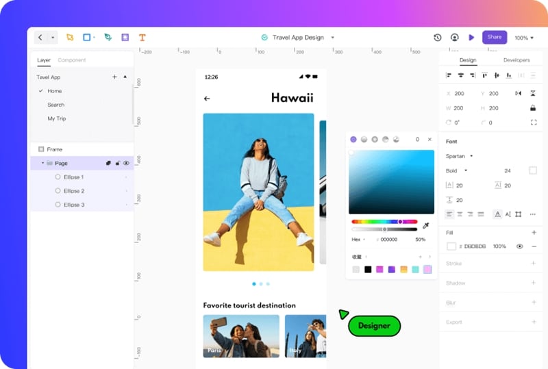
Mockitt Design is an online designing tool built and provided by Wondershare. Earlier, the tool was great at building prototypes and mockups, but now Wondershare has introduced a dedicated design tool. Specializing in creating an effective and impressive design, the Mockitt Design brings the professionalism required to build an incredible design atop an easy-to-use interface.
As a result, you will be working with one of the best UI motion designing tools. There are at least 12 different motions that we can use in UI designing. Five of them we have discussed above, and other seven are overlay, parenting, transformation, value change, masking, cloning, and dolly & zoom.
While working on their interfaces, the designers will find easy access to all the tools and components required to add such effects. Moreover, in Mockitt Design, the processing required for prototyping and developing a design are connected.
Hence, you will be working with a comprehensive UI motion design tool that also offers great platform support. Among its limitless editing and designing features, image editing, layering properties, and vector designing are the most important.
Mockitt Design focuses on helping a designer explore every aspect of creating a cool, fun, and usable design for editing the images. With the help of a myriad of functions that include Vector, Bezier Curve, and Boolean editing features with vector pens and tools, you will find yourself immersed in the creation process.
Mockitt Design has many color filling options and customizations, including linear, radiant, solid, and image filling options. For creating modern UI motion effects, you will find that the Vector and Shapes editing tools will suit your purpose. It has masking features, layering, shaping, vector editing, etc., to create the right design and effect you want for the interface.
If that's not all, Mockitt Design gives you a fast designing and editing interface to create the most efficient designing experience ever. In terms of compatibility, you can import the designs made in the Sketch designing tool and export your design in different formats, pixel scale, and prefix/suffix.
Conclusion
In a world where motion translates to communication, you need to add it effectively in your design if you want to create memorable user experiences. UI motion upholds your resolve to bring the best of interaction with the end-user and helps you share the message with or without using words.
However, every aspect of motion design UI must be added with some principles as, without them, you are only adding motions for an aesthetic appeal and nothing else. But the users are looking to gain value from your design. Ergo, move above from the traditional appeal of making your design look good. Instead, you need to make your design usable by using the UI motion designs and elements.

