Top 10 UX Infographics for UX Beginners

It is often said that a picture speaks a thousand words. This is certainly true when we are learning from others' experiences. UX is all about learning from experiences, and UX infographics have become very popular among designers. A UXinfographicis a collection of imagery, charts, and minimal text that gives an easy-to-understand overview of a UX topic. Indeed, infographics are a great tool to learn quickly and communicate ideas very effectively.
Designing for an excellent user experience is hard. And communicating your design process can be even more challenging. That's why high-quality infographics can be so helpful. They illustrate complex processes and abstract relationships that can be difficult to express concisely with words.
This article shares the top 10 UX infographics for UX beginners to advance your understanding of user experience design.
Top 10 UX Infographics
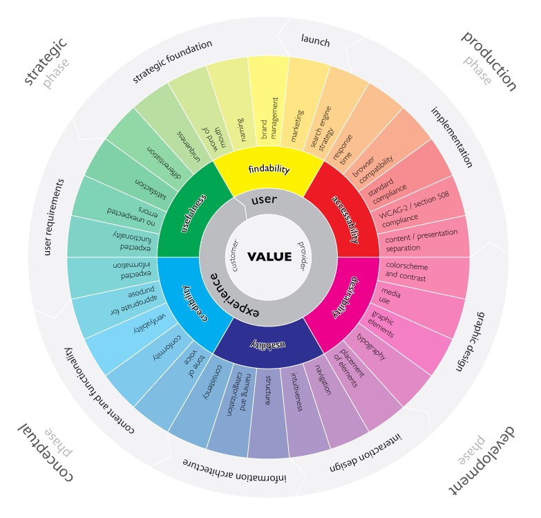
1. The User Experience Wheel
Magnus Revang originally designed the user experience wheel for his own personal use. It tries to answer the question, "What is user experience?"This infographic breaks down a design process within a series of phases and the most common deliverables produced in each stage of that process.
The Model should be explained from the inside. It starts in the middle with a key focus on delivering value. Value is what we want to accomplish. A positive user experience then follows this. Forcustomersandproviders, a positive user experience is a win-win situation. UX designers must accomplish value through a positive user experience. Numerous factors contribute to the phases of user experience; the Model shows30 factors carefully placed.
The Model is the right start for any UX beginner.
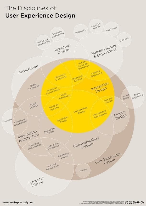
2. The Disciplines of User Experience Design
While User Experience Design is a highly creative field, processes and disciplines that govern this area make it compelling from a business and delivery standpoint. UX designers should also be driven by UX design best practices, and this infographic covers these really well.
Dan Saffer created this infographic and later redesigned and extended by Thomas Glaser. It helps figure out how the terms, which we often use in user experience design, interact with each other. It details the various aspects and dependencies of UX design. Some of the concepts it focuses on are – Architecture, Industrial Design, Human Factors and Ergonomics, Information architecture.
We often throw around terms like user interface design and user experience design, but how do they really interact with each other? This infographic explores the relationship between user experience and other fields like information architecture, interaction design, and human factors.
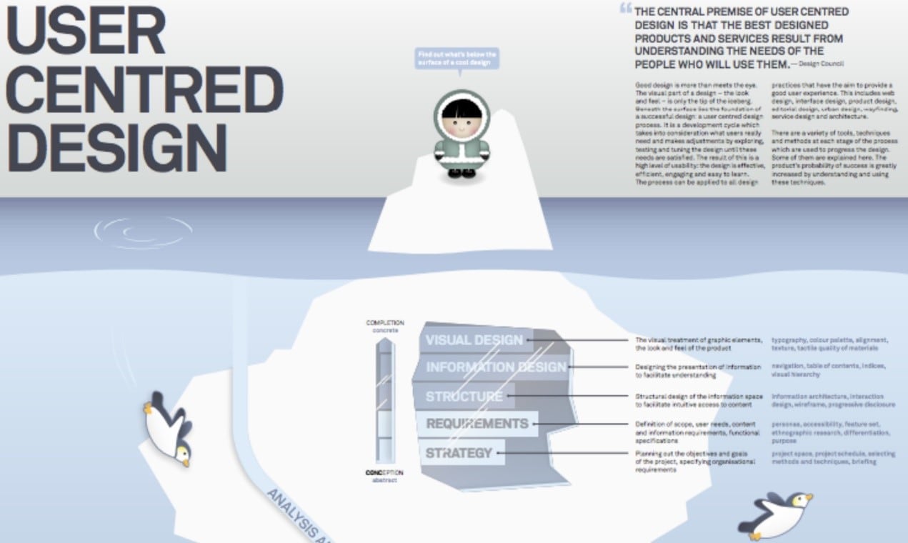
3. User-Centred Design
This beautiful illustration—created by the designer Pascal Raabe—explains that the foundation of a successful design is about more than just visuals. Great design comes from working within a user-centered design process.
He shares the steps of a development cycle which"takes into consideration what users need and makes adjustments by exploring, testing and tuning the design until these needs are satisfied."It also breaks down which methods and techniques to use during each step of the development cycle: analysis, planning, concept, design, implementation, and launch.
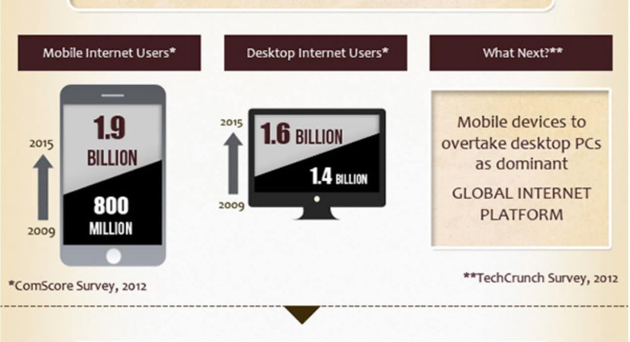
4. One Size Fits all – A look at best practices for Responsive Design
Today, the digital landscape is cluttered with many mobile and desktop devices, each with specific screen sizes and resolutions. If it weren't for responsive design, websites would have to redesign for every single screen size out there. They would have to design and develop the screens multiple times from scratch, which not only sounds like a daunting effort but is also not the best use of a designer's time. Luckily, this infographic tells you how responsive web design can benefit you and your brand with a raft of tips and tricks.
The infographic is indeed fascinating and insightful.
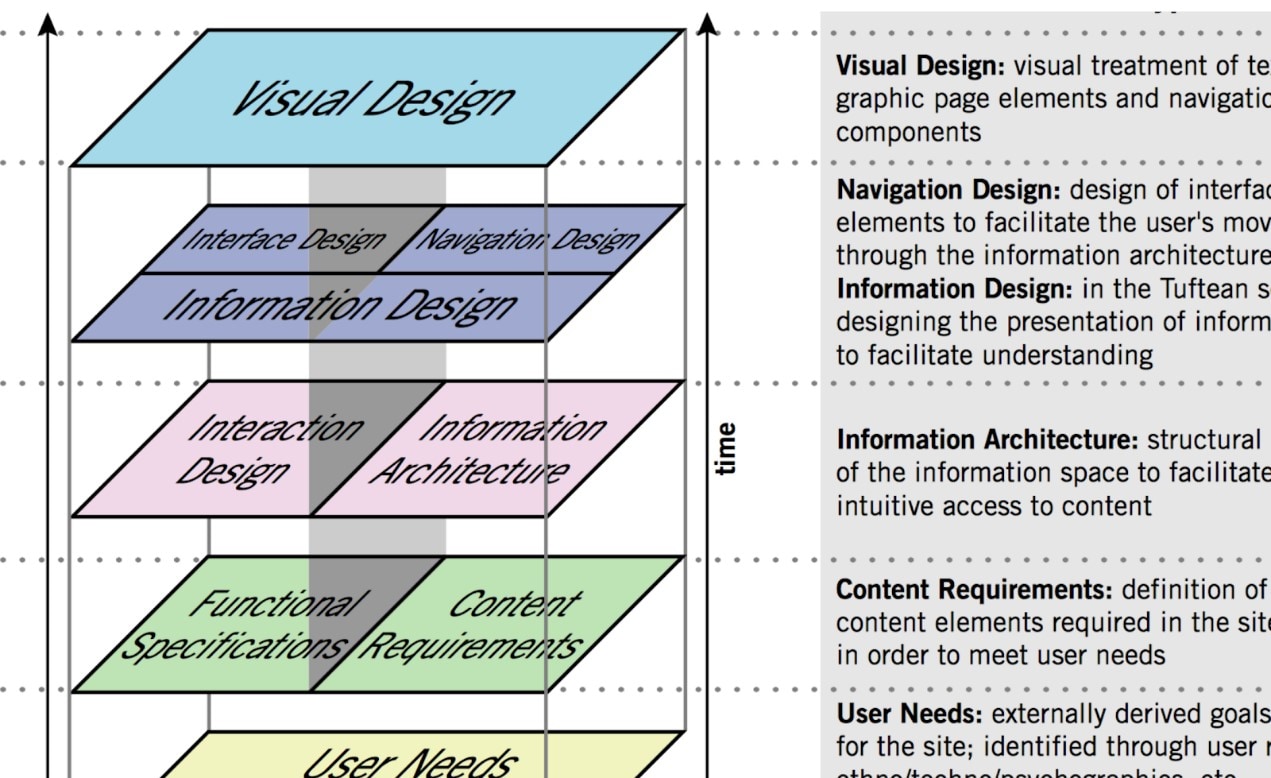
5. The Elements of User Experience
Even though Jesse Garrett created 'The Elements of User Experience' back in 2000, it is still one of the most comprehensive infographics describing the key considerations that go into user experience design. It defines UX terminology such as interface design and interaction design. It also illustrates the underlying relationships between these various practices.
This infographic has a lot of overlap with the previously mentioned infographic 'The disciplines of user experience design. However, both infographics have solid takeaways.
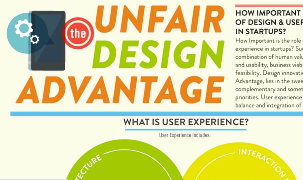
6. The Unfair Design Advantage
If you have ever wondered why Apple products get an edge over competitors, the obvious answer is their focus on design and usability.
The Unfair Design Advantage is the result of the collaboration between Venture 51 and Designer Fund. It shows how information architecture, interaction design, and visual design influence user behavior and emotional experience. Although it's geared towards start-ups, it's mainly focused on how UX relates to business goals. My favorite parts are the mini-case-studies and the mobile statistics at the very end.
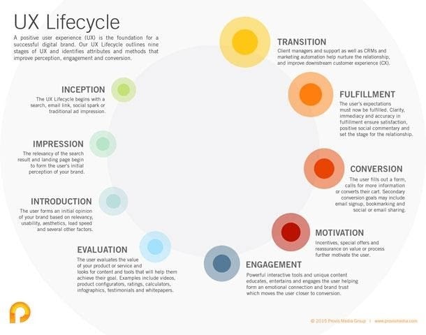
7. User Experience Lifecycle
This infographic represents another example of simplicity in design. A good infographic does not need to have flashy visuals or even have visuals as the dominant feature. In this infographic, the visuals subtly indicate the stages and progress of the cycle, while the words do the work of explaining the steps.
A positive user experience is a foundation for a successful digital brand. The UX lifecycle presented in this UX infographic outlines nine UX stages and identifies attributes and methods that improve perception, engagement, and conversion.
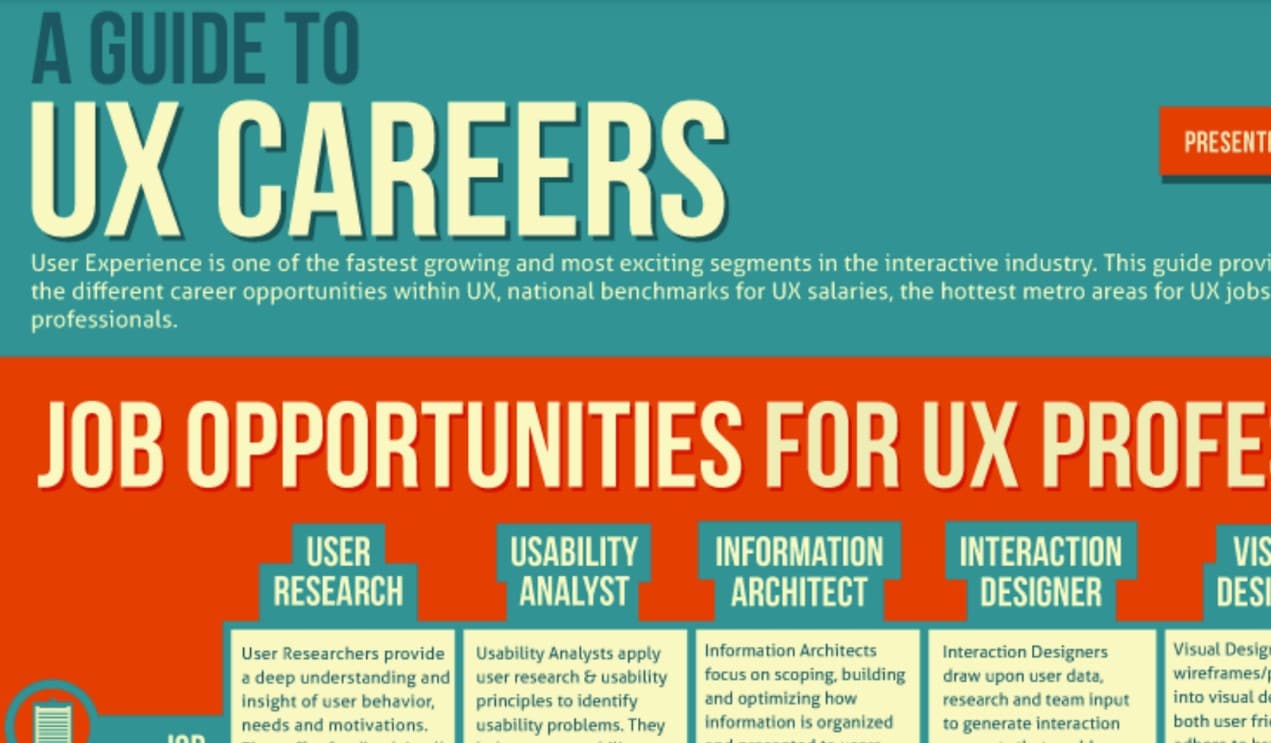
8. A guide to UX careers
While the internet is flooding with UX design, UX design principles, and tools, there is very little information on UX careers. This infographic comes to the rescue of UX professionals. A popular infographic reviewer exclaimed, 'Finally, an infographic that cares about UX careers!'
Onward Search designed this Guide to UX Careers for anyone interested in learning about the job descriptions and responsibilities for different positions within the UX field. It also provides national benchmarks for UX salaries, metro areas with the most UX job opportunity, and some of the skills and tools you will need to be successful. The infographic mentions some UX career paths, including user research, usability analysis, information architecture, interaction design, and visual designer.
9. The many facets of UX design
The following infographic was designed by Jonathan Lupo, VP of Experience Design at the EPAM Empathy Lab. It breaks down all the different hats that a UX designer might have to wear, including:
- Research —Conducting primary research to understand the end-user
- Taxonomy —Identifying behavior trends uncovered in the research
- Consulting —Advising and presenting designs to clients
This visually thorough yet straightforward infographic represents how these facets inter-relate, providing an excellent tool for UX newbies and explaining to the uninitiated.
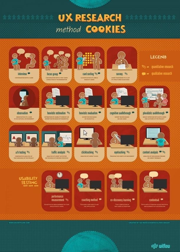
10. UX Research method cookies
If an infographic's goal is not only to be informative but also to be sharable, we think this one is a clear winner. Demonstrating the different UX research types with gingerbread men makes user research methods seem more approachable to non-UX researchers. The handy wall-friendly format helps too. This infographic is exceptionally creative.
UX research method cookies present feasible methods, starting with expert analysis through click tracking, a / b testing, individual interviews, card sorting, to various tests with users. Each of these methods has its advantages and disadvantages and therefore should be used according to specific circumstances.
Conclusion
All the above infographics visually engage, tell a straightforward story and present information in a compelling yet concise manner. It's a bit of magic. Good infographics engender and facilitate an insight by visual means—allow us to grasp some relationships quickly and easily. The simplicity of a good infographic is counterbalanced by the effort required to distill the information into an engaging balance of text and imagery that conveys the message in a concise and shareable way.
UX designers understand the value of good communication, excellent visual communication. So, it makes sense that we also appreciate a good infographic. Presenting information in a visual manner, such as in an infographic, can be an effective way to convey a message. A good infographic will draw you in and can encourage you to share or print it, while a not-so-great infographic can cause your eyes to glaze over and the cursor to hover the 'X icon.
As you continue to learn UX principles, we encourage you to focus on these beautiful yet insightful infographics. You will find a lot of these infographics pinned to the desks of designers. Indeed, an infographic speaks a thousand words!
