How to Use Adobe XD Responsive Design: A Beginner-friendly Guide

If you are working on an app or a website, then you should make sure it has a responsive UI design. After all, it lets the product render according to the environment of the user (by shrinking, expanding, and modifying its element as per the screen size). With the help of Adobe XD responsive design tools, we can easily make our prototypes more dynamic. In this post, I will let you know how to create a responsive design in Adobe XD and use its best alternative.
- Part 1: How to Create Responsive Design with Adobe XD
- Part 2: How to Create Responsive Design with Adobe XD Alternative
How to Create Responsive Design in Adobe XD?
You might already know that Adobe XD is commonly used to create prototypes, wireframe, and mockups of all kinds on desktop and web. Mostly, it is used to work on vectors, but there are other designing solutions to come up with realistic prototypes and high-fidelity mockups for apps and websites.
If you want, you can download Adobe XD on your Windows/Mac or go to its web-based solution. The Adobe XD responsive design feature is available on every platform. You can simply turn on the Adobe XD responsive design option while working on your prototypes and easily scale your canvas as per your requirements. Ideally, you can follow these basic steps to work on a responsive design in Adobe XD.
Step 1: Make a copy of your design
Firstly, you need to have your original design ready. You can select it on your artboard and just press the Control + D keys to make its copy. Now, you can rename the new copy so that we can easily work on it.
Step 2: Enable responsive design in Adobe XD
After creating the second copy of the design (let’s say for smartphones), you can select it, and go to its Property Inspector tool. From here, you can just toggle on the Adobe XD Responsive Design feature.
Step 3: Organize all elements
The Adobe XD responsive design is an automatic feature and would try to rearrange all the elements in the canvas. You can go to the sidebar and manually arrange the design elements into different groups to maintain their authenticity.
Step 4: Adjust the images
The Adobe XD responsive design prototype feature will do its best, but some of your images might get cluttered. You can use the Shift + click option to select multiple images and then go to the Property Inspector to set it to Manual. Avoid setting their width/height to a fixed ratio so that you can freely readjust the images.
Step 5: Work on the entire view
Once you have readjusted some elements, zoom back, and make sure the entire project has followed a responsive design in Adobe XD. You can use the Alt option and drag the elements to maintain consistency in the project.
Step 6: Make the final adjustments
That’s it! In the end, you can just preview the design, resize text, image, or any other widget, and make some final tweaks in your Adobe XD responsive design.
Would you interested in Adobe XD PNG exporting? Click and learn more about How Much Do You Know About Adobe XD PNG Export Feature.
How to Create Responsive Design with an Adobe XD Alternative?
Since implementing responsive design in Adobe XD can be a tough job, you can consider using an alternative instead. A lot of professionals use Wondershare Mockitt to create stunning prototypes and wireframes instantly. The application is available for web and desktop alike with several design features in one place.
- Users can automatically select the environment and perspective (even the device model) on which they wish to run their prototype.
- There are tons of professionally designed templates in Wondershare Mockitt that you can select and customize.
- Wondershare Mockitt features a wide range of design elements, widgets, vectors, etc. that you can reuse in your projects.
- Furthermore, you can get a preview of your project to instantly make the needed changes in it. You can also share your project with others via a link or QR code.
- There are also options to import a Sketch project to Wondershare Mockitt or directly export your prototypes in formats like HTML, APK, SVG, and PNG.

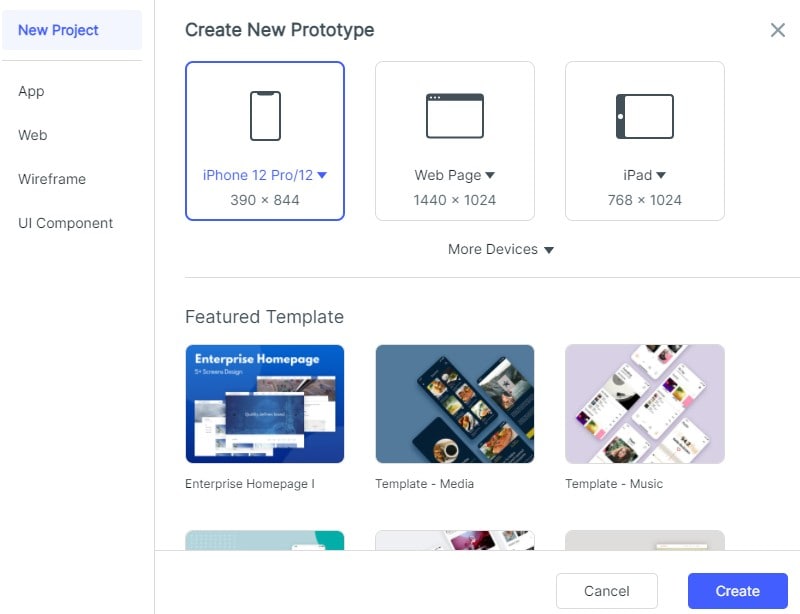
Step 1: Enter Project Details
At first, you can just visit the web-based or desktop application of Wondershare Mockitt and enter project details by selecting a preferred environment. If you want, you can explore and import any existing template from here.
There are options to even specify the project size by selecting the target device on which you want to run the prototype.
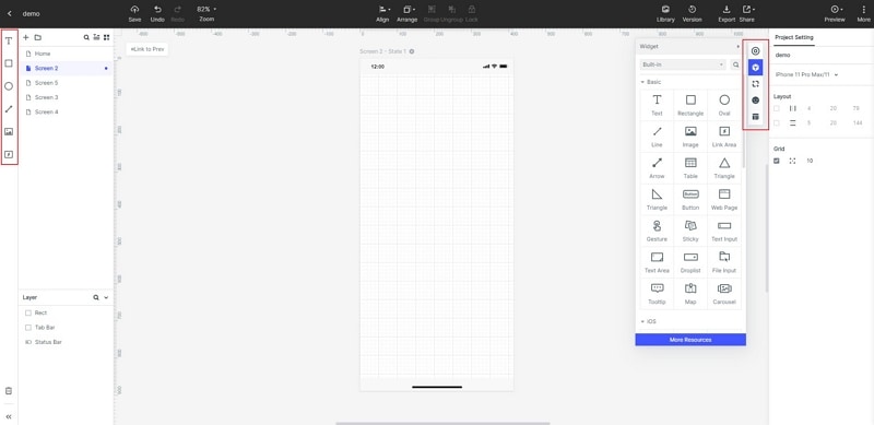
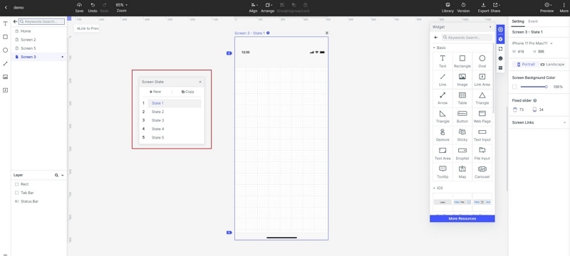
Step 2: Work on your Prototype
Once you get a canvas on Wondershare Mockitt, you can use its inbuilt features to work on your prototype.
- Add or edit widgets
From the sidebar, you can drag and drop all kinds of widgets to the canvas and even customize them by simply clicking on them.
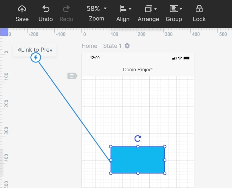
- Link different screens
After working on various screens, you can again go to the widgets and use the link option. This will let you depict the user journey for your website or app design.
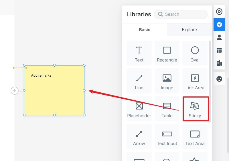
- Leave notes on your design
If you want to add some notes, then again go to the widgets options, and select the Sticky feature. You can now insert notes in your design for your team or yourself.
- Use interactive widgets
Besides that, there are also several options to add dynamic widgets to your canvas. This will let you add media files, animations, transitions, etc. to your prototypes and improve their fidelity.
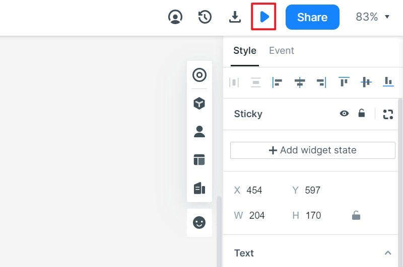
Step 3: Preview your Designs
One of the best things about Wondershare Mockitt is that it lets us preview our prototypes (even for mobiles) without leaving its interface. You can just click on the Preview button on the top and the chosen perspective would be loaded on the screen.
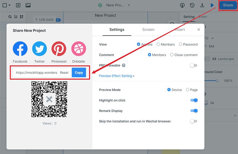
Step 4: Export and Share your projects
That’s it! Once you have finished working on your prototypes, you can click on the share icon from the top to generate a link or QR code that you can share with others. The application also lets us download our project in formats like HTML, PNG, SVG, or APK.
By reading this post, you would be able to work on Adobe XD responsive design like a pro. I have listed a step by step solution to use responsive design in Adobe XD right here. Apart from that, the guide has also included a detailed solution to use the best Adobe XD alternative. Since Wondershare Mockitt is available for free, it will let you come up with all kinds of high-fidelity prototypes without spending anything!