10 Eye-Catchy and Smart Footer Designs for Inspiration

Creating any aspect of the website, be it the header, sidebars, carousels, or a footer design, must target two attributes vis-a-vis the audience. These are readability and aesthetics. Furthermore, both of these properties must be present in equal proportions. You cannot have content that is average and superlative design, vice versa.
So, getting your head around this concept is the key to create an impeccable and conversion-ready header and footer design. More importantly, your footer and header must chime together to ensure that the viewer gets an interactive and engaging experience from the beginning to the end.
He gets interested in what you offer and how you present it; scrolling down, he comes to know more about your services and reaches the footer only to find an innovative and assertive CTA that encourages them to follow your motive.
Are you looking to create a page footer design that has the power to convert? Follow our lead, and we will tell you how to do it like a pro.
How to Create a Footer Design
Some users might have developed a wrong notion that the footer design can be dealt with the least attention to detail. Well, that is not it. Basically a footer is a gateway to all the other crucial sections of the business.
In general, the footer design templates will have the option to add maps, social media handles, CTA, contact forms, trending posts, signup forms, and so on. However, all these integrations are not native to every website design. They can be adjusted as per the requirements. So, we are talking about customizing your website's footer design to ensure that it matches the entire website's narrative and syncs with the design.
For creating a design on your terms, you need a tool that works as deem fit. Introducing Wondershare Mockitt, a new age, highly intelligent, and adaptive website design tools based on the web and running on the cloud, do we need anything else?

Mockitt allows everyone to sketch, create, decorate, and design the best header and footer design that is felicitous to your website. It is added with a large assortment of features, icons, widgets, shapes, fonts, sizes, colors, animations, etc.
Here are some incredible reasons to choose Mockitt for creating page footer design.
- You will get the default size of the artboard that is native to the platform's size. At present, Mockitt's default website page screen size is 1440x1024, and it can be increased at will.
- Everything that you work on is saved on the cloud, and with the automatic periodic save sequence, you can rest assured that the work progress is not lost.
- A linking feature is embedded into the online tool that allows you to link the pages mentioned on the footer to create a real experience for testing.
- Moreover, Mockitt allows you to preview the website in real-time and check its viability plus the aesthetic appeal before writing the code.
- There are two bars that are permanently visible on Mockitt. One is on the right side of the screen while the other is on the left. These bars will provide access to all the design elements required to create an interactive footer.
- Lastly, Mockitt allows the users to create, edit, share and preview the footer designs without handing it off to the developers. Here too, you can get access to the CSS elements and specific dimensions for every single item, box, icon, shape, font, color, and whatnot.
Here are 10 Spectacular Header and Footer Design Inspiration
To better help you understand the diversity and innovativeness possible with creating a page footer design, we have curated a list of top 5 headers and footers. These designs are nothing short of a feast for the eyes and will certainly inspire you to run wild with your imagination.
Best Header Designs
#1: Cleverbird Creatives
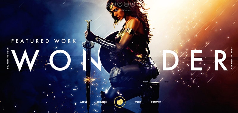
Cleverbird Creatives has made it a point to segregate its website's section into sorted and distinguishable chunks. With the header, they have focused on setting over-sized hero images of their best works done in the past.
Another one of the amazing things about this website's design is that with the hero image, the header content is shown at the bottom of the screen, and as you scroll down, the header content assumes it's default positioning.
The entire page is decorated with stunning typography and elegance. The content is crisp, clear, and concise enough to send out the perfect message with minimum words.
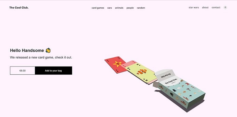
#2: The Cool Club
Well, if there is 'Cool' in the name, then the website for this service must also match the narrative. Well, it does. The Cool Club's header is one of the most simplistic, impactful, and creative designs out there.
The best part is that the header content (menu and logo) typography is animated. Plus, the dynamic illustration that moves along with the cursor also proffers an elegant touch, further attracting the user to interact on a greater level.
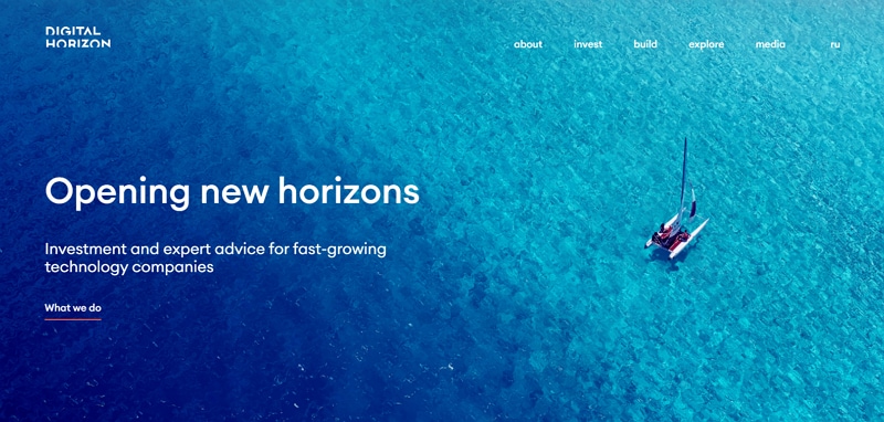
#3: Digital Horizon
Digital Horizon teaches us that not only the backend design elements, interactive cues, and good CTA are essential, but you must also have the right images. Since they help businesses and companies with expert investment-ready advice, the image shown also shows a yacht in the middle of nowhere (which represents the potential client).
Added with the tagline "Opening New Horizons," they want to imprint a feeling that the organization can help the businesses move in the right direction. Furthermore, while hovering the mouse on the tabs, a drop-down window shows which enlists more options for the visitor to explore.
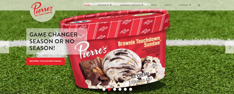
#4: Pierre's
We don't need a reason to eat ice cream, do we? Still, Pierre's has used the header area to show its range of products by adding high-resolution images that encourage the viewer to check it out. Add with this, the eye-catchy content further incites a likable and actionable response from the viewer.
Pierre's also provides the user with an interactive menu along with the company logo that displays on the left side of the screen. The images slide automatically or can also be manually switched.
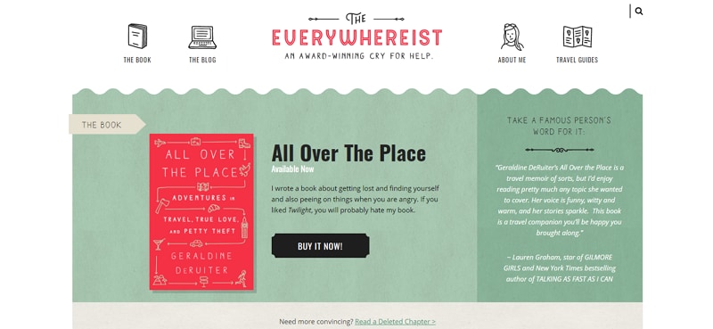
#5: Everywhereist
Personal bloggers are not known to focus on the designing aspects, but not this one. The author has laid a great amount of focus and probably time (especially if she did not use Mockitt) to create an impressive design. The artistic potential is clearly visible with the dual CTAs and a simple yet creative tabs with icons.
Best Footer Designs
That was it about the headers. Moving on to the footer design inspiration and ideas, keep an eye out for the elements that you think might be missing from your website. Let's get creative.
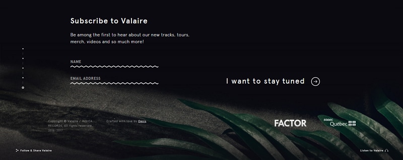
#1: Valarie
Valarie's website is nothing short of a saga in itself. They have stunning creative elements and adaptive screens that move in all the directions without losing the focus of the user's eye pattern.
Coming to the footer design ideas, Valerie creates a unique experience for the user with its sections above, which encourages the user to engage with them. So, to make it easier, they have provided links to their Instagram and a CTA, which asks the user to subscribe. In all the screens, the header menu is frozen at the top position, augmenting the user's accessibility.
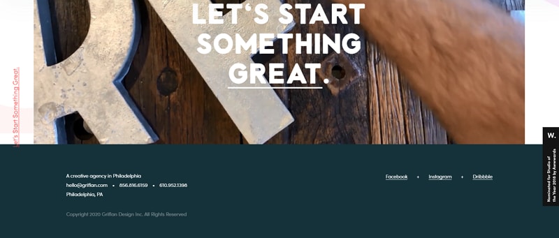
#2: Griflan Design Inc
A video in the page footer design seems interesting? Griflan Design Inc maintains a single color pattern throughout the page, and the same is seen in the footer. Plus, there isn't much to do with the footer. You will only see the contact information and access to their social media channels.
What's unique about this footer is the video CTA that is not seen on the entire page but footer and that too with a catchy headline "Let's Start Something Great." Such effects allow the user to stay in touch and keep the engagement meter running.
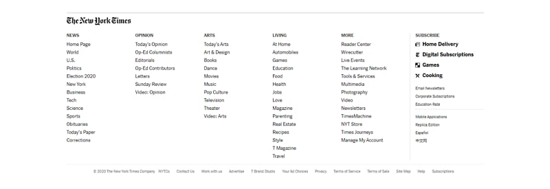
#3: The New York Times
The New York Times has a humungous amount of content available on their platform, and somehow they have managed to distill everything and put in one footer. This is pretty amazing, innovative, and impeccable management. Such footer designs allow anyone with a content-sharing website to arrange their heading in one place for better user interaction.
Aesthetically, they have kept it simple and smooth. The white background and black font boast good readability.
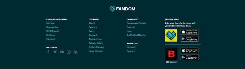
#4: Fandom
Fandom creates an everlasting impression with vibrant colors in the footer design. Moreover, the colors change to white while hovering the cursor over the link. They have also given the links to their applications in the footer and with an enlarged icon of the same to ensure that the user gets to the right application and not a clone.
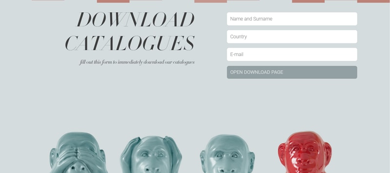
#5: Stylenovels
We have kept the best for the last. Scrolling through Stylenovels's homepage, we feel that it is nothing short of a hypnotic journey adorned with superlative product images. The best part is that the website never misses the user's eye patterns and is brimming with useful information throughout.
Their footer design is yet another unique aspect urging the user to download the catalogs in a bold and impressive font that won't miss the user's attention. Added to this, the image added in the footer is again a perfect example of the relevance and correct usage of the visual elements.
Conclusion
You cannot divide your focus and attention span between the different sections of the website. Since everything is connected to each, there cannot be misalignment between the homepage and the services page or even between the header and footer design.
Everything has to be made according to a single and shared narrative erupting from your business's objectives and goals. To ensure perfect synchronization, we recommend using Mockitt as it allows you not only to design 'n' number of pages on the artboard but also to create a link between them. Plus, you can also preview the transitions and interactivity between these pages for the best results.
