Antd Components: How to Use It in Your Design

The concept of Design System is often confused with smaller phenomena: guideline, UI kit, brand book. In fact, this definition has a broader meaning. A design system is a collection of brand values, tools, and components that makes it easy to create, test, visually and technically update products, and ensure consistency in their interfaces.
In this Article, we will take a look at a UI design language—Ant design. You'll get to know some ant design components and how to use it.
- Part 1: What is Ant design?
- Part 2: How to use Ant design components
- Part 3: How to Add Ant design components to your design?
What is Ant design?
Ant Design is a design system with a React UI library that contains high-quality Antd components and demos for interactive interfaces. It is written entirely in TypeScript with predictable static types to make it easier to read and understand. Ant Design library supports modern browsers like Google Chrome, Internet Explorer 9+, as well as server-side rendering and Electron, etc.
As an open-source project, in July 2019, Ant Design's Github star count surpassed Material UI, becoming the ant design React component library project with the highest star count in the world. It is worth noting the quality and volume of documentation for this library. You need to figure out how everything works, and the more functionality, the more problems can arise.
So having extensive and well thought out documentation is very important. Finally, this library doesn't just give you a set of tools to create your own website. It offers a list of topics from which you can choose. This can be very handy, especially if you are doing front-end design. Keep in mind that some of the best options aren't free, but there's nothing stopping you from grabbing the free option and expanding it in the right direction.
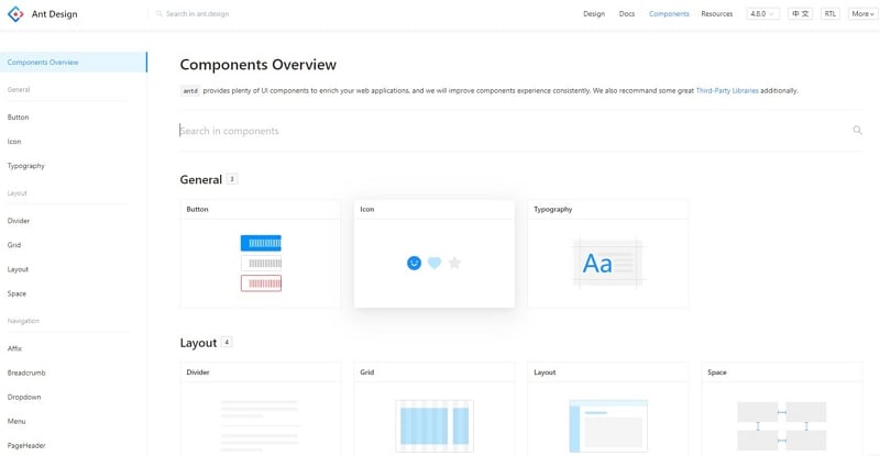
How to use Ant design components
Most of the components can be used separately from Ant Design react-component modules that are suddenly supported by the same people at Alibaba. Ant Design has two features that make it stand out from similar libraries: tables and forms. Both of these features are not, in fact, simple components. Ant design provides plenty of UI components to enrich your mobile and web applications. That will improve your component's experience consistently. Ant Design also recommends some great Third-Party Libraries additionally. Let's talk about them in more detail.
1. Filtering and Sorting
Out of the box, filtering by a drop-down selector with options is available. You need to describe the sorting and filtering functions yourself. By default, tables cannot filter records by the entered row. But you can write your own custom filter, which is described in detail in the documentation. Admittedly, the process is quite painful, but there are many possibilities.
2. Built-in pagination
By default - client-side. But you can write your own without any problems. That is, it will not be difficult to implement server pagination.
3. Nesting
Sometimes it is necessary to make some rows of a table expandable to hide additional information. Antd table components do this out of the box.
4. Row Selection
If you want to ensure that specific table rows are selected for further user action, Ant Design tables provide a fairly flexible API for this.
5. Merging Cells
Merging cells in the header and in rows are different, but in both cases, you need to know in advance which cells you need to merge and specify them explicitly. This greatly complicates the processing of dynamic data. We had a similar experience, which required the creation of additional abstractions that described the features of the union and told the table which cells were already merged and which were not.
6. Column and header fixation
Perhaps the most popular feature for drawing large amounts of data. You can fix both the left and right columns, the table header, and even all together. It works not without occasional bugs, but it is quite tolerable
7. Editable cells
The API for tables is generally quite flexible and allows you to render cells in any way you want. So editable cells are just a special case of clever use of the provided capabilities, which is described in detail in the documentation.
How to Add Ant design components to your design?
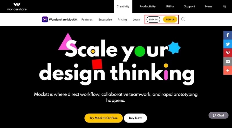
There are many UI / UX design apps for both experienced professional designers and those new to the field. Unfortunately, most of the best design platforms are not built for enhanced collaboration, which is a very important feature for large teams of designers and developers where a single design may require multiple people to work on. The answer to this question is a cloud service Wondershare Mockitt.

Mockitt is an online prototyping and collaboration platform that allows users to create prototype sketches for their website and mobile application designs. You can easily create new designs and improve/ modify existing websites or mobile application designs. Wondershare Mockitt offers three main features:
- Prototyping,
- Collaboration.
- Its library of assets and templates.
1. You just have to enter Mockitt official website. After visiting the site, you need to create an account by clicking on the "Sign Up" button.
2. Wondershare Mockitt offers you plenty of amazing design templates. You just need to click on the "Resources" button in the workspace after you sign up. In Resources, you can find the Ant design template.
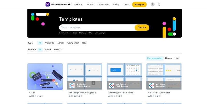
3. Just select your desired Ant Design template. Then you will find and use Ant design components there.
