Ascender Definition: What is an Ascender
While working on your designs, you would need to implement different kinds of concepts. For instance, if you explore typography, then you would encounter terms like baseline, ascender, and descender. Ideally, any stroke of an alphabet that stretches above the size of the baseline is known as an ascender. Though, ascenders and descenders in typography are vital concepts that you should explore with time. In this guide, I will let you know about ascender typography definition with some popular ascender fonts.
- Part 1. What is Ascender
- Part 2. The History of Ascender
- Part 3. How to Avoid Crashing Ascenders
- Part 4. Common Fonts with High Ascenders
- Part 5. Common Fonts with Low Ascenders
- Part 6. Common Fonts with No or Minimum Ascenders
Ascender Definition: What is an Ascender
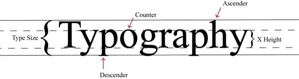
When you will work on typography, you would see that we have a baseline on which the content is written. The baseline has a certain width depicted by another parallel line. Now, when we write any word on the baseline, a part of certain alphabets would cross the x-width. The upper stroke of the alphabets crossing the x-width of the baseline is known as an ascender.
For instance, let's consider the word "Typography". In this, the small alphabet "h" has an ascender that exists above the x-width. Apart from that, the stroke that falls below the width is known as a descender (like the word "p").
Source: DesignModo
A Brief History of Ascenders
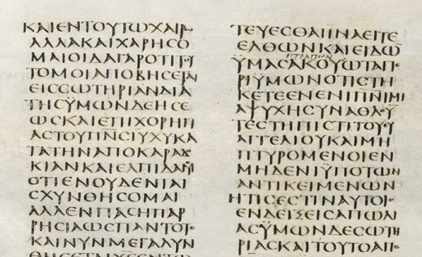
Now when you know about the ascender typography definition, let's quickly consider its history. It might sound surprising, but ascenders were first found in the 3rd century AD with Greek scripts and fonts.
Archaeologists have found some half-uncial characters with upward and downward strokes that crossed beyond the standard line. In today's world, they could fit with the ascender definition.
Source: Found in Antiquity
Although, when we talk about the new-age use of the ascender font, then it can be linked to highway signs. When high-speed roads were constructed in Britain, designers Jock Kinneir and Margaret Calvert were appointed. The designers then came up with ascender typography so that the words could easily be read by others while driving (compared to standard letters).
Pay Attention to Crashing Ascenders
This is a common issue that a lot of designers encounter while working with ascenders and descenders in typography.
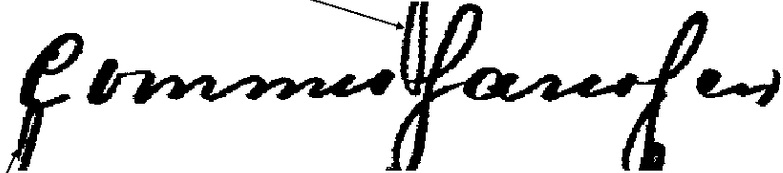
Let's suppose you have two or more baselines of x-width that are parallel to each other. Now, chances are that the descender of the first line might overlap with the ascender of the second line. This crashing of ascenders and descenders in typography can lead to several issues and might make the content harder to read.
For instance, the descender "q" or "f" of the first line might clash with the ascender "d" or "h" of another line. To avoid the crashing of ascender in typography, it is important to have enough spacing between your lines. For this, you can simply test the descender and ascender font with different letters in advance.
Source: ResearchGate
Common Fonts with High Ascenders
Ideally, in any font, we can have high, low, or no ascenders. Therefore, when you implement different fonts in designing, you should be aware of these options. To start with, let's consider some common tall or high ascender fonts.
1. A Charming Font
This tall ascender font is mostly used for titles (like Book titles) and has a unique appeal. As you can see from the character map, most of the letters have an extended upper curve, leading to high ascenders.
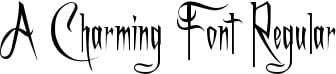
Source: 1001 Fonts
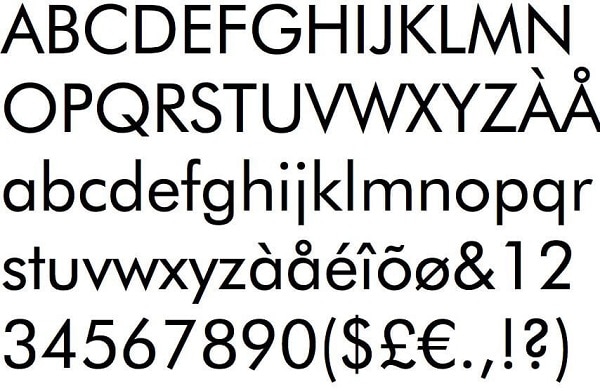
2. Josefin Sans
This might seem like a standard font at first, but there are a few letters with tall ascender typography. For instance, the letter "l", "f", or "t" can stretch way beyond the x-width of the baseline.
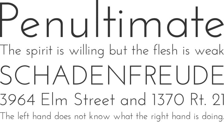
Source: Pinterest
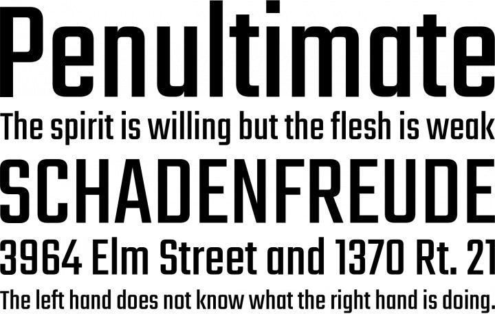
3. Pompiere
This is another commonly used sans serif font that has high ascenders due to its uneven distribution of the length. Some of its alphabets like "b", "d", "h", or "l" can rise above the width and cause crashing of ascenders.
Source: Font Squirrel
Common Fonts with Low Ascenders
If you have limited x-width in your designs, then you should consider these ascender fonts with a lower stroke length.
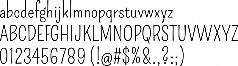
1. Litera
This is one of the cleanest fonts that you can try. Litera Regular has standard spaces and even the strokes are of defined length, attaining low ascenders and descenders in typography.
Source: FontsGeek
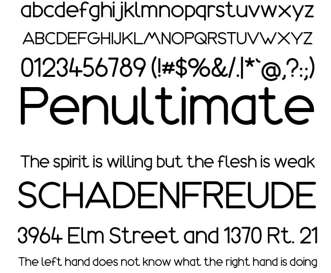
2. Teko
If you want to write in bold or highlight something, then you can also try Teko. This low ascender font is mostly used to write headlines, sub-headings, and other things that you want to focus on.
Source: Font Squirrel
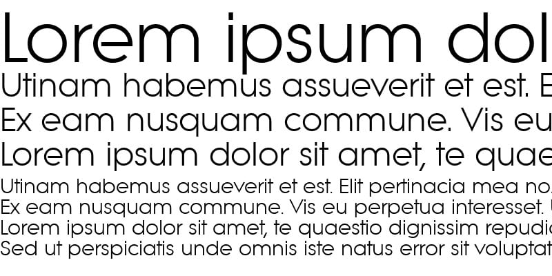
3. Futura
Another popular option for low ascender typography that you can consider is Futura. The font is pretty basic and is mostly recommended to be used in minimal spaces.
Source: Free Fonts Family
Common Fonts with No or Minimum Ascenders
Lastly, if you have minimum x-width in your baseline, then you can consider the following ascender fonts.
1. Amazonas
As you can see, this is a regular font with all the capital and lower case letters fitting perfectly within the baseline. Both ascenders and descenders in typography in this font won't cause any clash.
Source: FontGet
2. Daggersquare
This font is pretty interesting and will let you attain a unique appeal with minimum space. Mostly, this ascender typography font is used to write headlines and capital letters.
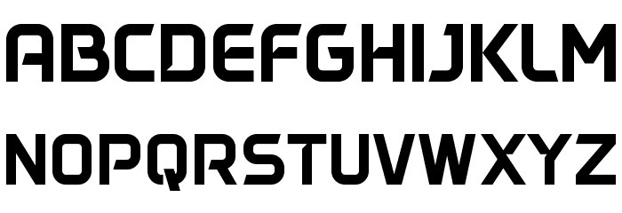
Source: FFonts
3. Monoton
If you want to add more character to your designs, then Monoton would be one of the best fonts. Almost all the characters in it are pretty uniform and would let you write your content without any crashing of ascenders.
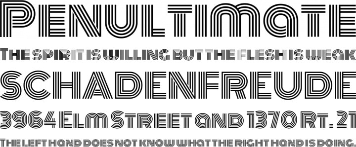
Source: Font Squirrel
There you go! After reading this guide, you would be able to know things about ascender definition and the implementation of ascender fonts. Apart from covering the basics related to ascender typography, I have also included a common issue with ascenders that designers face. While I have included some commonly used high, low, and no ascender fonts, there are hundreds of other options that you can try. To make your job easier with designing, you can even use a resourceful application like Wondershare Mockitt.