What is Gradient and The Best Way to Use Gradients in Your Design
If you are a designer, then you might already know the importance of colors in any design. Though, a plain colored canvas can sometimes make your design look bland or hard to notice. That's why so many designers use gradients in their canvas to make it look more appealing. If you want, you can have a single gradient color or add multiple tones as well. In this post, I will let you know about gradient meaning, types of gradients, and other design tips.
- Part 1. What is Gradient - The Introduction
- Part 2. Common Types of Gradient
- Part 3. How to Implement Gradients in Your Designs
- Part 4. Expert Tips to Make the Most of Gradients
Gradient Definition: What is a Gradient?
To start our guide, let's learn the basic gradient meaning in designing. In nutshell, a gradient is the smooth transition of one or more shades in our canvas. Mostly, gradients are used to come up with visually appealing and soothing backgrounds.
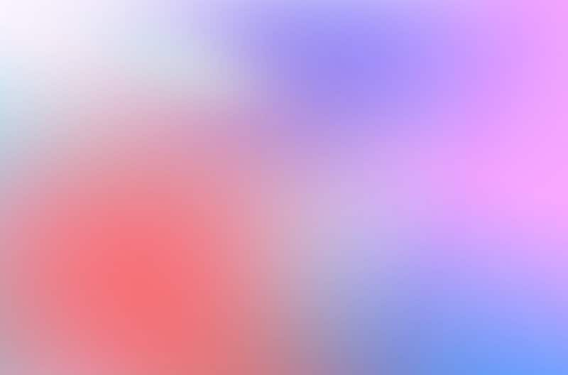
Source: 99Designs
Compared to flat colors, a gradient color canvas is smoother and will highlight your content. It will also add more depth to your designs, making them memorable. Though, while working on gradients, make sure you there is a smooth transition of colors and try not to overdo it.
What are some Common Types of Gradients?
Great! Now when you are familiar with the overall gradient definition, let's have a look at the common types of gradients that you can implement in your designs.
1. Linear Gradient
This is the most common type of gradient in which there is a straight line for the transition of colors. The line can be horizontal or vertical and we can have the transition of multiple colors across the straight line.
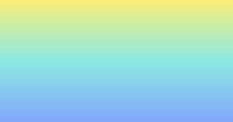
Source: Vectr
2. Radial Gradient
In this type of gradient, we have a main point (which is mostly located at the center) and a circular area for the transition of colors. This gradient color is used to focus on the second layer having any other component.
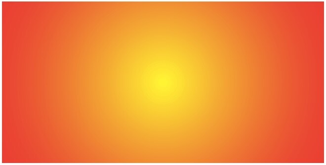
Source: Stack Exchange
3. Corner Gradient
If you are coming up with designs for invites or social media posts, then you can use corner gradients. In this, we mostly have two or more colors in which the transition takes place from the corners instead.
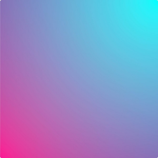
Source: Twitter
4. Diamond Gradient
This type of gradient is similar to the radial design in which we have the diamond-shaped transition instead. Although, this gradient color is not as common as others.
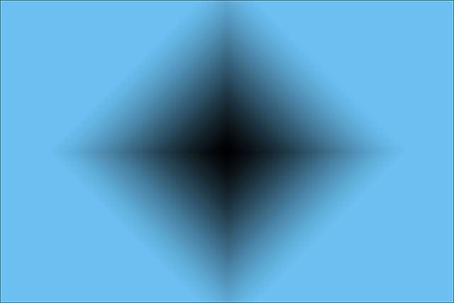
Source: Photoshop Essentials
5. Other Gradients
Apart from that, there are several other types of gradients you can implement in your designs. For instance, in the angular gradient, we have a straight line and the transition takes place in a 180-degree fashion.
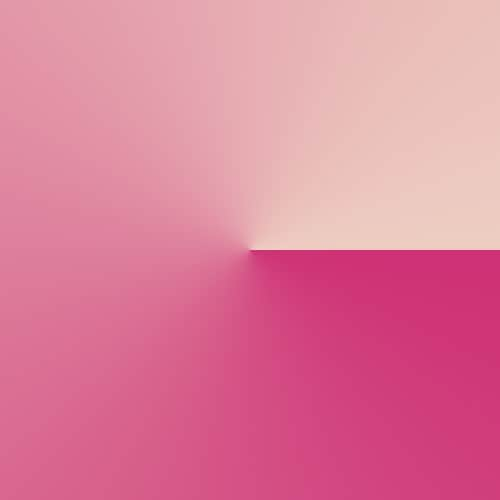
Source: Pinterest
Similarly, we also have a reflective gradient in which the same image is reflected in the design (mostly from the middle). You can also explore different other types of gradients according to your needs.
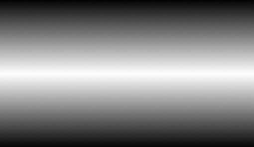
Source: Design Shack
How to Implement Gradients in Your Designs
As you can see, gradients can be used in different ways. From social media banners to website designs, these days you can see the gradient color effect all around you. Ideally, these are some of the common ways to apply the gradient effect in your designs.
1. To convey sentiments or emotions
You might already know that each color can have its significance. For instance, the blue color depicts something royal while green is more earthy. Similarly, when you work on gradients, try to match them with the sentiment of your brand and what you wish to convey to your audience.
For instance, if your brand is related to earthy or organic things, then the following brown and blue gradients would do well. On the other hand, if you include too many colors, then it might confuse your customers.
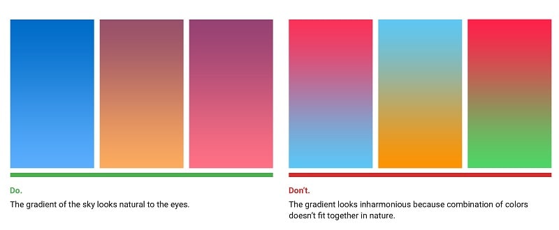
Source: UX Planet
2. To depict different dimensions
One of the best things about the gradient color effect is that they add more depth and value to our designs. To add more depth to your design, you can apply different colors and blend them according to your needs.
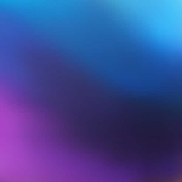
Let's consider this example of a corner gradient in which we have blended two neutral colors. They have been transitioned in the middle flawlessly, providing a metallic touch and adding more depth to our designs.
Source: UI Download
3. Making the Overall UI more Alive
Lastly, if you would apply gradient color to your designs thoughtfully, then it can easily add more life to your visuals. Even a subtle gradient touch to your design would make a flat background look more interesting.
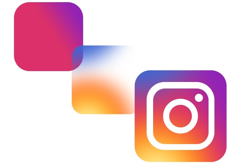
If you consider the present logo of Instagram, you can see how beautifully they have used gradients. They have simply presented the overlay of two gradients and then put the logo on Instagram to make it look so appealing and alive.
Source: Codeburst
<
Expert Tips to Make the Most of Gradients
By now, you would be able to understand the gradient meaning and its use in your designs. To make the most of them, you can also consider the following pro tips.
- Look out for inspiration
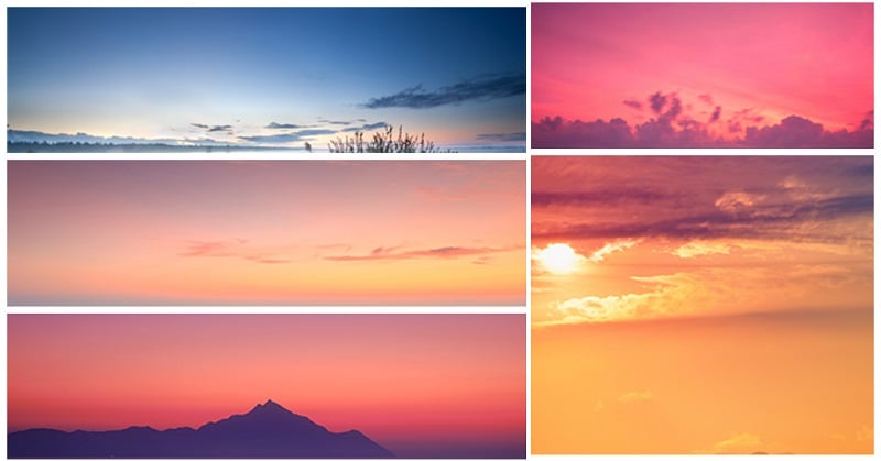
If are falling short of inspiration, then try to find something from nature. From sunset to sand, there are gradients all around us and you can look for these amazing natural patterns to implement in your designs.
Source: UX Planet
- Try to blend three colors
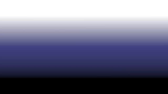
Most of the beginners only stick to two shades for their gradient color, which is a rookie mistake. If you want, you can also blend third colors in between to make your designs stand out.
Source: Fx Factory
- Try some professional tools
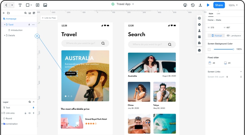
If you want to make your job easier, then you can also use a dedicated designing tool like Wondershare Mockitt. The application has tons of features related to colors, icons, vectors, etc. that you can readily use. It has a library of 500+ vectors and templates that would help you create all kinds of designs in less time.
I'm sure that after reading this guide, you would be able to include all types of gradients in your design. Apart from covering basics like the gradient meaning, I have also some smart designing tips related to gradients that you must follow. Now when you have all the theoretical knowledge about gradient color, you can work on your designs on a tool like Mockitt pretty easily.
