What is Kerning and How Does Kerning Improve Your Typography

The Basics of Kerning
What is Kerning? To get to the kerning definition, we need to understand how typography works. Each letter of the alphabet, each number, and each special character has a specific width when printed. The width of these typography elements depends on the weight, the font, and other attributes. But what about the spacing between these elements? That's exactly what the kerning meaning implies. Kerning definition in typography, per the Merriam-Webster Online Dictionary: the distance between a kerned pair of adjacent characters in a line of composed text.
So, kerning is essentially the amount of space assigned to the left and right of printable characters or glyphs. Unfortunately, automated kerning is not very reliable, at least not for designers, who tend to use varying fonts with and without serifs. Manual kerning, therefore, is the only option for achieving well-balanced spacing.
How to Work with Kerning in Typography
Although kerning originally dealt with physical typesetting for printed materials, it has now become a part of digital typography. There is a default kerning applied to any electronic text, but it's not always appropriate or visually well-balanced. Let's look at some of the important terms used in kerning that will help you achieve optimal results:
Values
Kerning values can be either negative or positive. A negative kerning value implies that the space between two characters needs to be decreased, while a positive value tells you that the space needs to be increased. This value is expressed in 'units'; for example, the image below shows a kernel value of -141 units between the capital letter 'T' and the lowercase 'o', and so on.
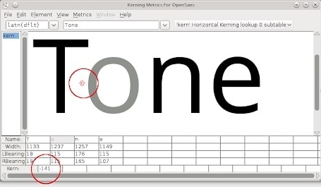
Source: Design with FontForge
As such, the general rule of thumb is that a different type of adjustment - negative or positive - needs to be applied in order to kern a particular pair of glyphs.
Another term you'll come across is 'side bearing', with each character having a left and a right side bearing expressed in kerning units. As an example, in any character pair or glyph pair, the kerning between the two characters will be the sum of the right side bearing of the first glyph and the left side bearing of the second glyph.
How can we keep track of so many combinations? That brings us to Kerning Tables.
Tables
A kerning table will show you the inherent kerning values of glyph pairs for a particular font style. Obviously, since all this information would make the table quite large, sub-tables are typically used to express the hundreds of possible glyph pairings.
Another concept to be understood is the Glyph Positioning Table, which classifies characters according to their features, resulting in standardized kerning values for each glyph pair. Using such a table allows designers to bring uniformity into their text no matter what font type, weight, or size is being used in a particular design.
Types
Kerning can be automatic or manual, and there are further sub-classifications for the former.
Automatic Metric Kerning
This method uses default kerning values for each character pair to apply kerning to the text in question. These default values are taken from the corresponding kerning table for that particular font.
Automatic Optical Kerning
A more advanced way to kern is to use algorithms based on the outline of each glyph and glyph pair. This is more suitable for serif fonts but, more importantly, it gives you more accurate kerning values for the purpose of adjusting them.
Manual Kerning
Some tools like Adobe Photoshop give users the option to do away with automatic kerning by implementing an override that allows them to control the spacing between characters manually rather than having to rely on automatic metric or optical kerning.
Contextual Kerning
This method is not often used but the results are better. It involves not only kerning glyph pairs but also adjusting the kerning based on the letters or characters that are adjacent to them. It essentially works in sets of three glyphs rather than pairs, thereby achieving greater granularity with respect to the end result. This type of kerning is generally employed for high-resolution typography projects or those involving very large font sizes.
How to Use Kerning to Spruce Up your Typography
Kerning is more important than most of us realize. Unless you want to end up in this type of situation...
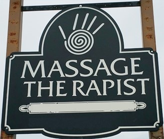
Source: Bored Panda
... be sure to watch your kerning!
Here are some tips that will help you achieve better kerning in your design typography. Some of them are obvious but it's surprising how many designers tend to ignore the basics.
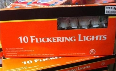
Use the Right Font Size
Kerning is affected by font size as much as font type. The larger the text, the more obvious any mistakes in kerning will be, as in the image above. The text is supposed to say "THERAPIST"; instead, it says "THE RAPIST". Would you want something like that in your portfolio? Surely not! So use the right font size. Another valuable tip, especially if you require different font sizes for the same text, is to do the kerning at the end. Don't just shrink one piece of text after kerning it. Do it individually for all the font size options.
Look at the Words the Wrong Side Up
Printing out your text and turning it upside down helps more than you know. Sometimes, because we are familiar with certain words and phrases, we'll miss key elements of the kerning. Viewing it upside down allows you to look at it as a design rather than a set of words. This helps remove any bias that might creep in because the letters are familiar to you.
Kern Frequently-used Character Combinations First
Certain letters or combinations require greater attention to detail when it comes to kerning. If you kern the most commonly used combinations at the outset, the rest becomes easier. The most important group is characters with slanting lines, such as W, A, V, and so on. Another important group is 'splayed' or uneven letters like Y, F, T, k, K, etc. Capital letters at the start of a sentence are another important group. Once these common groups of characters and combinations are dealt with, working around them for the remaining text is relatively simple.
Encapsulating your Knowledge
Kerning is not a mathematical science, even though it can be expressed in values, tables, and so on. It is an esthetic art more than a scientific one. That's why manual kerning is so critical to the end result. Kerning is not an objective entity but a subjective or perceived attribute. Always remember that the end effect is the most important factor in your design. This is true for vector design but critically so for typography. In the end, it's the viewer's eyes that are the ultimate judge of how well you've kerned your text. Just make sure you don't end up delivering a design like this one...
Source: Pinterest
