What is Aspect Ratio in Web Design

You've probably heard the term 'aspect ratio' in relation to screen sizes for TVs, mobile devices, and other screen types. The simplest answer to the question, "what is aspect ratio?" is: it is the ratio between the width of a display screen to its height. Interestingly, it is the height that's always considered to be 1. For instance, if the width is double the height, the aspect ratio would be 2:1. A 1 1 aspect ratio or 1:1 aspect ratio is essentially a square aspect ratio, which is typical on some social media sites like Instagram.
In that case, what about something like 16:9, which is the aspect ratio of the HDTV format? Why is the height not considered to be 1 in this instance? The reason is that if you assign the number 1 to the height for this particular aspect ratio, the width will then have to be represented in decimals; in this case, 1.78:1, which is another way to express this aspect ratio. However, to avoid the use of decimals, both numbers are multiplied by a number that will bring both sides of the ratio to a whole number. In this case, it's 9, which brings the ratio to 16:9.
The important thing to remember is that any image or film displayed on a screen having a particular ratio must match that ratio. If not, a part of its width may not be displayed when the height is adjusted to fit, and vice versa. In our first example, if an image has an aspect ratio of 18:9, only 16 units of its width will be displayed, whatever those units might represent.
- Part 1. How Does Aspect Ratio Relate to Web Design
- Part 2. The Effective Use of Aspect Ratio in Web Design Projects
How Does Aspect Ratio Relate to Web Design?
When designing a website, it must be kept in mind that the site may be viewed on different devices. If you design for standard desktop viewing, for instance, and the same website is accessed on a smartphone, you'll notice that the whole site is still visible but the alignment of the content is all over the place. What this means is that every design must take all possible aspect ratios into consideration. There are several key points to keep in mind when designing for the web.
1. Desktop vs Mobile
Since the aspect ratio of a typical desktop screen is different from a mobile or phone aspect ratio, a website must be designed for both. That's possible when using a versatile design tool like Wondershare Mockitt, which gives you multiple screen options when you're designing a mockup or prototyping a design. This allows you to use images freely within a particular aspect ratio without you having to worry about misalignment and other issues.
Of course, it does take time to design for multiple screens, but it is worth the extra effort because you want to make sure that your designs look stunning on any device, regardless of its aspect ratio.
2. Designing for the Broad Market
To avoid designing for every possible aspect ratio, you can use a handful of common aspect ratios found on popular device brands. The most common ones are 3:2, 5:9, 4:3, 16:9, and 1:1. This literally covers hundreds of TVs, desktop monitors, and mobile/tablet screens, most of which will usually conform to one of these aspect ratios. Using them keeps you on the safe side and ensures that your design is not affected.
3. How to Alter an Image's Aspect Ratio
Stretching or squeezing one of the coordinates of an image will skew the image itself, rendering it useless. To avoid this, use cropping to save the day. Images can easily be cropped to conform to a particular aspect ratio.
Most design platforms, including Wondershare Mockitt, will let you pick specific devices that conform to specific aspect ratios. When using this, you only need to crop an image if the width or height falls outside the artboard, canvas, or screen on which your design is created.
4. Getting the Aspect Ratio Right
How do you pick the right aspect ratio for your design before you start the project? This is the first question you need to answer before doing anything else. The answer is deceptively simple, but you need to answer these questions to get to that answer:
- What device will this be viewed on?
- Do I need more than one version of the same design?
- Can I design it to be inherently responsive?
The best way to answer these questions is to put yourself into the shoes of the end-user. What aspect ratio will deliver the best results on any device? That's your key question right there. The answer will tell you exactly what ratio to pick and how to layout your text, images, and other elements so they'll be pleasing to the eye no matter what device they're viewed on.
Note: Making your design inherently responsive is very different from the term 'responsive web design', which refers to mathematical computations that automatically adjust layouts based on the screen size. This deals with controlling the sizes of text blocks, images, and other content elements in a responsive manner. On the other hand, "inherently responsive" means to give your design the flexibility to be altered quickly when required. If your layout is too 'tight' with very little white space, for instance, it is not inherently responsive and the various elements are very likely to be thrown out of whack when rendered on different devices. And it's not very easy to change the layout because you barely have any wiggle room. On the other hand, a more minimalistic layout is more conducive to changes as and when they're required. This is an oversimplification, of course, but the point is that it is as much the responsibility of the designer as it is that of tools like CSS to make a design truly responsive.
The Effective Use of Aspect Ratio in Web Design Projects
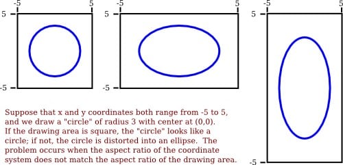
There's another useful concept that designers must be aware of, and it is called PAR or Pixel Aspect Ratio. This is basically the aspect ratio as it applies to individual pixels on the screen in question. For example, your standard NTSC or analog TV system uses a rectangular pixel that is taller than it is wide. On such a screen, a shape like a circle that uses a square PAR will be vertically skewed; in other words, it will look like a vertical elliptical object rather than a circle. The image below shows how this happens.
Therefore, that's the first consideration in web design with respect to the aspect ratio:
PAR and Resolution are Key Elements
While the PAR of your design affects how the visual is displayed, the resolution controls the level of detail that's visible. Both are important, especially when you're using special filters and effects to achieve the desired result for a particular image or set of images in your design.
Cropping Considerations
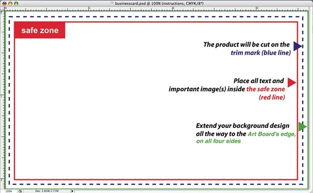
Cropping can lead to text and other content being cut off if the design is not perfect, and this is especially true when the designer doesn't leave adequate margins on all sides for proper cropping to be done. To make sure the main object of your image is always within the safe zone or safe area, have it on or near the central point of your design.
CSS Tags
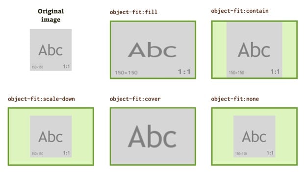
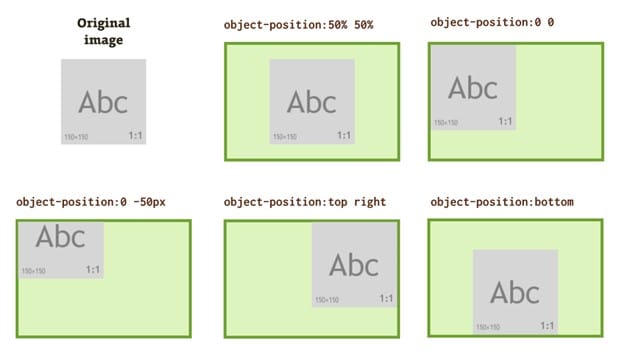
CSS tags can be a designer's best friend when it comes to responsive design. The most important of these - where images are concerned - is the 'object-fit:' tag, which guides the way images are displayed based on whatever parameter you set. For example, object-fit: cover will use all the available space in a particular container, while object-fit: contain will maintain the aspect ratio of the image and add letterboxing filler to the rest of the space. Similarly, 'object-position' is another very useful CSS tag to know.
Conclusion:
Aspect ratio is a critical component of web design and app design because of the sheer number of devices covering dozens of aspect ratios. However, with a little thought and care, your original design can easily be customized to suit any aspect ratio. All you need is the right knowledge and the right tools. A design and prototyping software application like Wondershare Mockitt is extremely valuable when it comes to targeting the right devices and the right aspect ratios, and creating your designs accordingly so there are no hiccups down the road.

