What is a Descender and How to Implement it in Your Designs

From social media posts to app mockups, typography holds vital importance in any design. Though, there are some crucial concepts like baseline, ascenders, and descenders that you should be aware of in advance. To help you cover these basics, I have come up with this detailed guide on what is a descender in typography with some common descender fonts that you can use.
- Part 1. Introduction about Descenders
- Part 2. Tips for Using Descenders in your Designs
- Part 3. Common Fonts with Long Descenders
- Part 4. Common Fonts with Short Descenders
- Part 5. Common Fonts with No Descenders
What are Descenders?
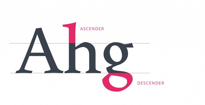
In typography, there is a baseline on which alphabets are written. Now, while writing any alphabet, some strokes might cross the x-width while some would fall below the baseline.
Ideally, the part of any character that appears below the baseline is known as a descender (and the upper stroke is called an ascender). While writing words, you can see that alphabets like "q", "g", "p", "y", and "j" are some common examples of descenders.
Source: UX Planet
Tips for Using Descenders in your Designs
If you are working on fonts or typography, then chances are that you would have to deal with descenders too. Therefore, to help you make the most of font descenders, I would recommend the following tips.
Tip 1: Look out for crashing descenders
If you have worked on different designs, then you might already know that a baseline has an x-width. Now, let's suppose there are multiple baselines to write something placed one over the other.
In case the baseline width is not sufficient, then chances are that the descender of one line might crash with the ascender of the next line. For example, the lower stroke or "q" might crash with the upper stroke of "h" from the second line.

Source: Research Gate
This instance is known as the crashing of ascenders and descenders in typography and it should always be avoided. Needless to say, crashing like this would make it harder for your audience to read the text properly.
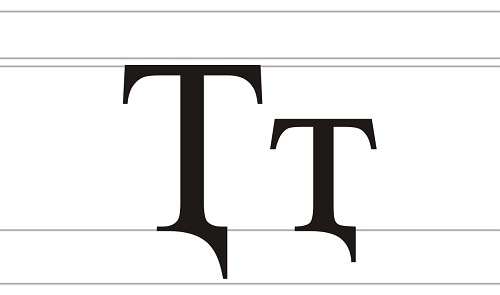
Tip 2: Check the Strokes of Capital Letters
A lot of new designers make the rookie mistake of only considering small alphabets for descenders. In typography, even some capital letters can also have descenders that you should consider in your overall design (for spacing).
Let's consider the example of the capital Q and J in English as they can have prominent descenders in typography. Not just that, there are some special characters in other languages as well that can have descenders for capital letters.
Source: Wikipedia
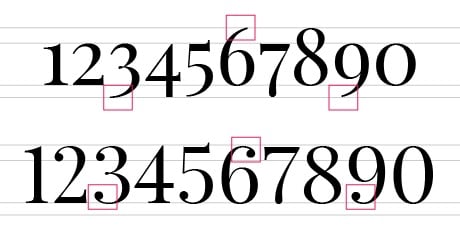
Tip 3: Always check for a font with numbers below the baseline
Lastly, apart from small and capital letters, you should also check for fonts with numbers below the baseline as they can also have descenders. In case you have written numbers like 3, 6, 7, or 9, then they can have descenders or ascenders too.
Therefore, you should keep the width of your baseline wide enough to accommodate numbers and letters with their descenders easily.
Source: Not User
Common Fonts with Long Descenders
If you are looking for some fonts with numbers below baseline (or letter), then consider the following options.
1. Aerotis Calligraphy
Calligraphic fonts are always a bit tough to accommodate in designs and this font with long descenders is certainly one of them. Not just small alphabets, but even numbers and capital letters have extended descender lengths in the font. Though, it is an extremely sophisticated font that you can use to create invites and other posts.
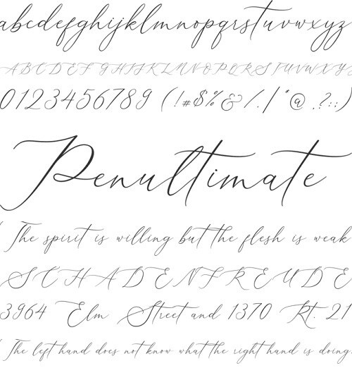
Source: CufonFont
2. Homemade Apple
This font is a combination of handwritten and calligraphy style with some prominent descenders. Although it has some beautifully drawn and extended edges that would give your design a unique appeal.
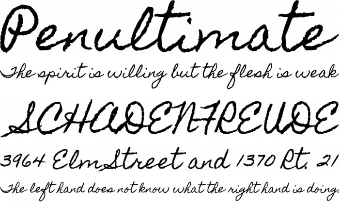
Source: Font Squirrel
3. GretchenHello
This is another common font with low descenders that you can consider trying. The best part is that the font is pretty versatile can be used for headlines or the main body.
Source: Fontsgeek
Common Fonts with Short Descenders
In case if you don't have a lot of space in your designs, then you can pick fonts with short descenders (like the following options).
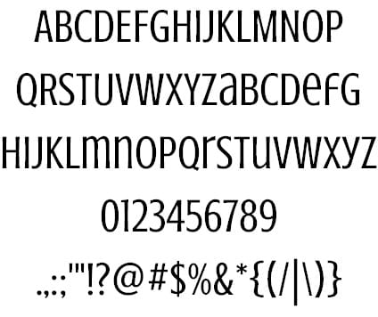
1. Kaleko
This is a simplistic font that you can use for the main body of your text. You won't have to worry too much about descenders in typography with this one as only a few letters contain an extended stroke.

Source: Identify Font
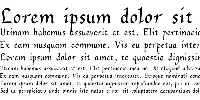
2. Philosopher
Philosopher is one of the universally known fonts with short descenders that you can try. The font is not at all complicated and can be used to write headlines or the text body.
Source: Font Squirrel
3. Passion One
Passion One comes in regular, bold, and italics, but its bold style is mostly used these days. The font has a unique statement with a simplistic appeal that you can use in different ways without worrying about descenders.
Source: Font Squirrel
Common Fonts with No Descenders
Lastly, if there is no or minimum space to spare in your canvas, then consider trying the following fonts with no descenders.
1. Crushed
This is a minimalist font in which you won't have any ascenders or descenders to worry about. You can use its capital or small letters (and even numbers) the way you like with no extra spaces.
Source: Creative Booster
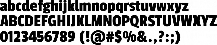
2. No Manners
No Manners might look like a minimal font at first, but it has a unique appeal that you would eventually notice. The font has almost no descenders as well, giving you the freedom to use it with no spacing.

Source: WhatFonts
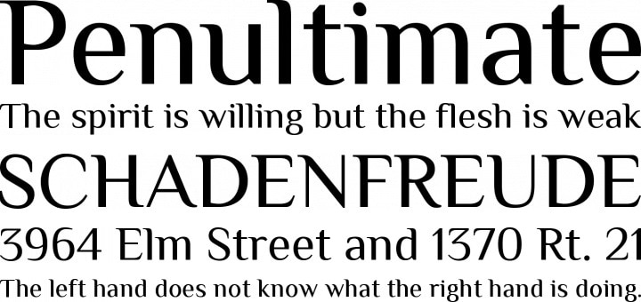
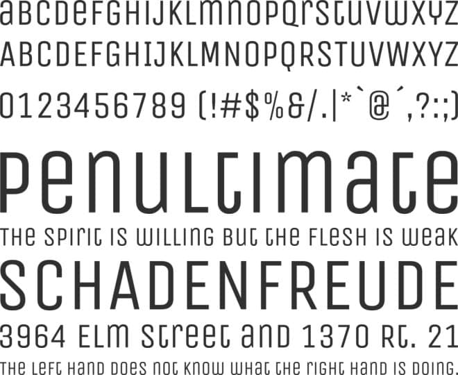
3. Unica One
Unica One might not be as popular as other basic fonts, but it is certainly worth a try. From the body of your text to its headlines, you can use this font with no descender however you like.
Source: Cufon Fonts
That's a wrap, everyone! I'm sure that after reading this guide, you would be able to know more about descenders and their use. To make your job easier, I have also come up with some tips to manage descenders in typography. Also, I have suggested some common fonts with descenders (long or short) and without descenders that you can readily use in your designs. Go ahead and use Wondershare Mockitt to implement this newly-learned concept like a pro.