How to Use Baselines in your Design?

If you are new to designing, then you should be familiar with some core concepts like baseline and typography. For instance, if you are coming up with a social media campaign or an app's design, then you would have to work on a baseline grid. Don't worry – I'm here to help you understand things like what is a baseline or what are the basic text baseline components. Without much ado, let's answer these questions and uncover the important details about baseline in designing.
- Part 1. The Definition of Baseline
- Part 2. Other Vital Things to Know about Baselines
- Part 3. How to Use Baselines in your Design?
What is a Baseline: The Basics
When we start learning how to write alphabets in any language, certain lines act as a guide. Well, this is exactly what a baseline is!
When it comes to designing, a baseline would be the invisible line (grid) that is used to write a text. Therefore, in designing (particularly in typography), it helps us write consistent content in a straight line.
- In a baseline grid, there are invisible lines on which the text sits and is written.
- While there is one major horizontal baseline, there are other parallel lines to form the entire text baseline grid.
- It helps us make sure that the words are uniformly placed and spaced in baseline typography.
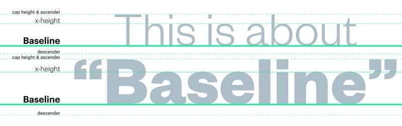
Source: Prolific Interactive
Other Vital Things to Know about Baselines
Now when you know what is a baseline, let's try to understand its other components. Ideally, a baseline is so much more than an invisible horizontal line in designing. A baseline in typography is often used as a guideline to type letters and space them accordingly.
Once you understand the concept, you can easily implement fonts in a baseline (or come up with your fonts as well). For this, you need to know the following concepts that are related to a baseline grid.
1. Ascender and Descender
To start with, let's consider that we have a baseline grid of x-width. Now, whenever we enter text in a baseline, not every letter would be contained in it. The part of the letter that would cross above the baseline would be its ascender while the stroke of the letter that is dropped below the baseline is a descender.
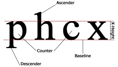
Source: WordPress
In this example, you can see the small "p" has a downward stroke (descender) and the small "h" has an upward stroke (ascender).
2. Lining Figures
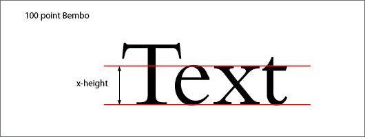
While writing any word on the baseline grid, there will be some alphabets that would fit perfectly. That is they won't have any stoke crossing the width of the baseline. These letters are known as lining figures or counters. In the above example, the smaller letter "x" and "c" are some of these lining figures.
3. Upper and Lower Case Alphabets
When you would implement any font in a baseline, you will use both lower and upper case alphabets. While working on these letters, you will realize that most of the upper case alphabets would cross the baseline grid. Although, some capital letters like "Q" would have a descender.
Similarly, most of the lower case alphabets would either sit perfectly or have descenders in baseline typography. There will be some exceptions here as well like the small "h" alphabet.
Source: Pinterest
4. Glyphs
While writing text in a baseline, we can have different versions for the same letter. These different variations of the same letter are known as glyphs. For instance, if in your baseline font, you have 2 ways to write the letter "q", then "q" will have two glyphs. Usually, glyphs exist in rounded alphabets and numbers like o, 9, 0, q, p, g, c, etc.
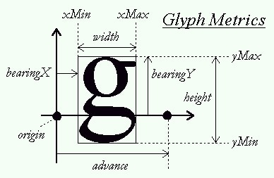
Source: StackOverflow
How to Use Baselines in your Design?
If you want to attain uniform-looking and aesthetically pleasing designs, then you should write texts in a baseline. Here's how a baseline grid can help you improve your designs.
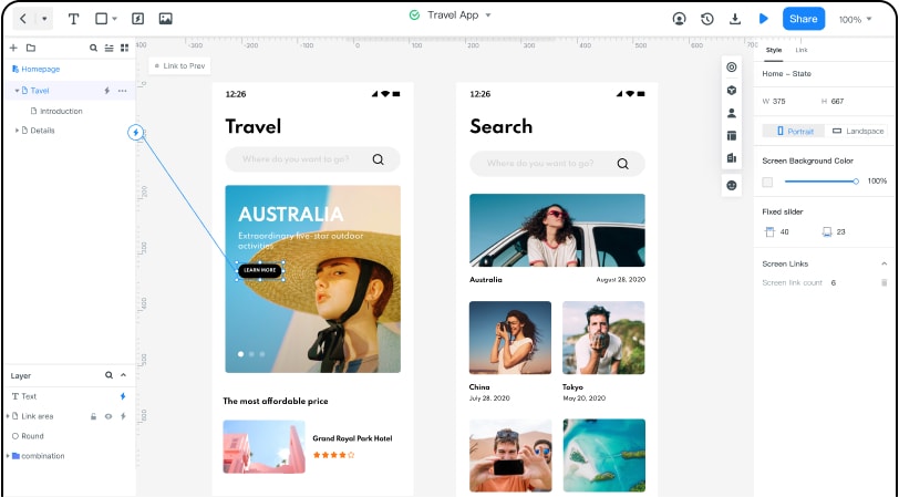
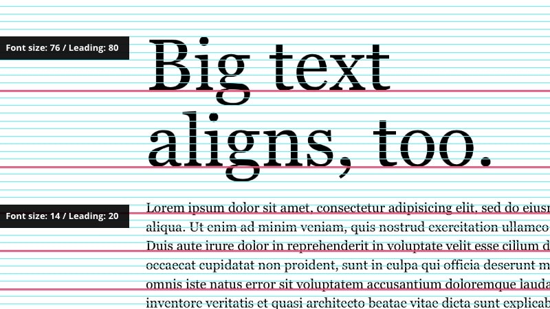
Tip 1: Use a Baseline Grid to Attain Uniformity
This is the most important use of a baseline in typography. As we have listed above, a baseline grid would have different horizontal and parallel lines that you can view on your canvas. You can use them as a guideline to write alphabets and numbers of all kinds in almost any font. If you are careful, it will help you place all the letters in a consistent manner.
Source: InVision
Tip 2: It will help you create a Visual Hierarchy
In any design, you can check that there is a hierarchy in the baseline typography. For instance, the first headline (H1) would be the biggest, followed by the second headline (H2), and so on.
Therefore, with the help of the baseline grid, you can decide the overall size of H1, H2, H3, body text, reference text, and so on. Try to follow a top to bottom approach first and then traverse from bottom to top again to attain a correct hierarchy.
Source: Hongkiat
Tip 3: Use 4/8/16px baseline grid
The rule of thumb in designing is to have the baseline grid in the multiple of fours. As in, your grid would be of points 4, 8, 16, 32, 64, and so on. The best practice is to have a 4px extra space for your font. If your font size is 28, then you can add 4px to make it 32px instead. This will help you utilize your baseline in typography pretty easily.
That's a wrap on what is a baseline and its major components from our end. Ideally, the more you would work on baseline typography, the more you will learn how to implement this concept. It will help you work on different fonts in a baseline and you can even come up with your own fonts or symbols as well. Go ahead and work on your designs using a reliable designing tool like Wondershare Mockitt and come up with uniform-looking visuals by using baselines.