What is a Hero Image and How to Pick the Best Hero Image for Your Website
If you are looking for ways to design a striking website, then you should explore the idea of a hero image design. Unlike having a carousel of images as a banner, a hero image is focused on a single picture that is mostly placed at the top of the web page. Though, there are a few things that you should know in advance about the implementation of a hero image. In this post, I will let you know what is a hero image and how to implement it in your designs.
Hero Image Definition: What is a Hero Image
In nutshell, a hero image is a large banner that is placed at the top of the website. It is mostly used to leave an everlasting impression on your audience and let them know about your website instantly.
Mostly, a hero image is stretched to the entire screen so that it would be the first thing that the user would see. A lot of times, designers try to grab the attention of their audience by establishing an emotional connection or list the major services that are offered by the business in the hero image.

Source: WhatPixel
Every Important Thing to Know About the Hero Image Design
Now when you know about the basic hero image definition, let's dive in and know other important things about its implementation.
- Consider the significance of your hero image
At first, you need to understand why you are applying a hero image on your website. Ideally, there are unlimited ways to implement the hero image design and it can largely vary from one situation to another.
From a call-to-action to depicting the unique selling points of your business, a hero image can depict it all. To come up with your hero image design, you should understand the business and what you wish to achieve via the website design you are working on. Most of the companies use the concept of a hero image to introduce their services to their audience like this.

Source: Salesforce
- A hero image can be more than just a picture
A lot of designers make the rookie mistake of using a single picture as a hero image design. While you can have one image as your website's banner, there are so many things that you can do with your hero image.
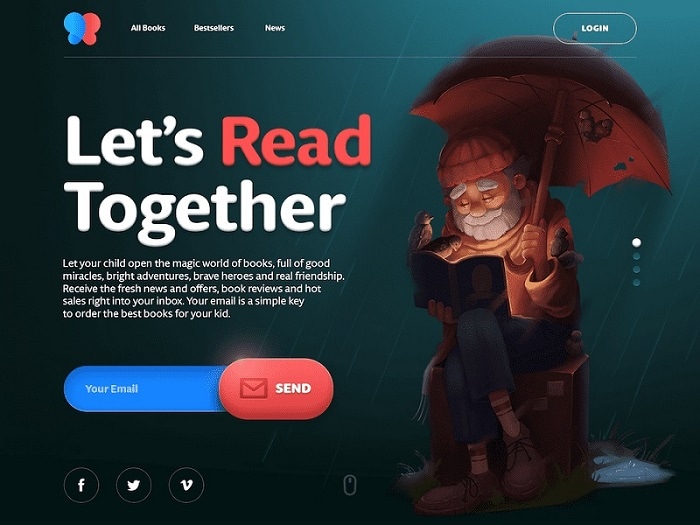
Once you have set up the basic design for the hero image, you can include tons of other things. Let's consider the example of this hero image design in which the client is asking for the email id of the prospective subscribers. Apart from that, the links to various social media platforms are also included, making the hero image a perfect way to funnel the marketing leads.

Source: UX Planet
- Weigh the Pros and Cons of a Hero Image Design
You should know that a hero image is one of the many ways to design your website or apps. You can consider other concepts (like the carousel design) and the pros/cons of the hero image design before you make up your mind.
Pros
- A visually appealing hero image can catch the attention of your audience immediately.
- It will help you convey the overall idea of your business or products easily.
- It will impart a unique and consistent appeal to the overall design of the website.
- A hero image for an article will make it easier to be shared on social media platforms.
- It will make the overall design more flexible as you can easily change the image in the future.
Cons
- Ideally, it might make the design of your website one-dimensional.
- A hero image would take a lot of space on the screen and might hide other important things.
- A large hero image might take a lot of time to load, causing design flaws.
- It might not be as impactful on mobile designs compared to desktop websites.
Pro Tips to Implement Hero Images in your Designs
If you want to create maximum impact with hero images, then try to consider the following design tips.
- Don't hesitate to showcase your products
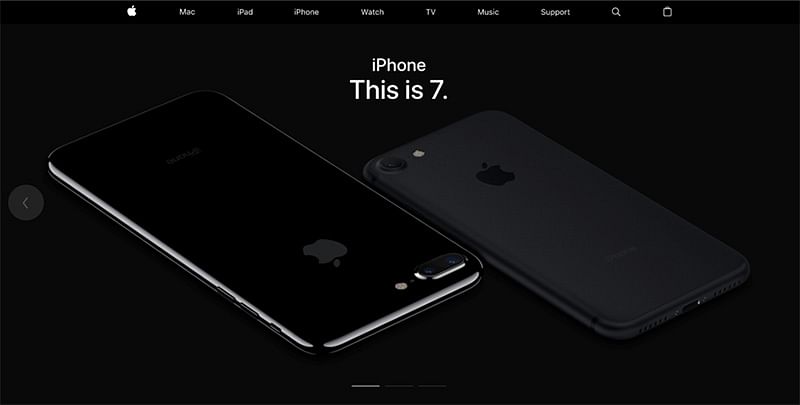
If your company is product-centric, then you should include some of the flagship products in the hero image. In this way, you can immediately introduce your products to your audience. If you see this example of the Apple Store website, then you can clearly see how flawlessly their products have been displayed.

Source: Apple
- Always test the design in advance
Before you finalize the hero image design, make sure that you experiment with its styling, size, colors, and other things. You can also consider doing A/B testing to get to know the experience of your audience in advance.
Also, make sure that the image is of high-quality and test it on different screen sizes. You can take the assistance of a dedicated tool like Wondershare Mockitt to preview your designs from different perspectives in advance.
- Keep it simple!
Last, but most importantly, try to keep your hero image design simple yet appealing. If you would add too many components in your hero image, then it can make the overall design look cluttered and your audience might find it hard to focus on one thing.
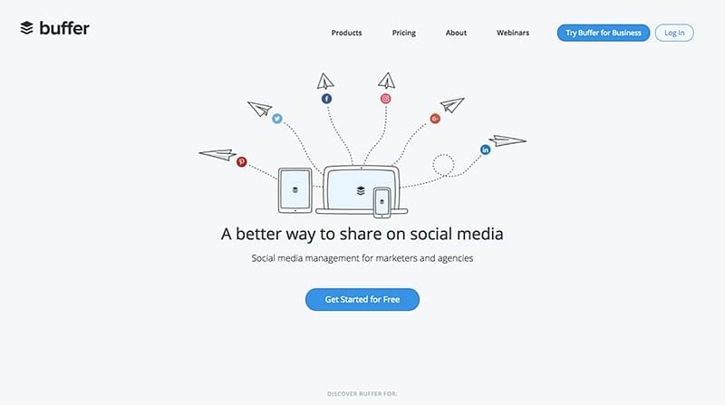
You can check this example of Buffer's hero image where they have introduced the major services of the company in a simplistic yet meaningful way.

Source: Buffer
As you can see, with the help of a hero image design, you can easily catch the attention of your audience in less time. This was a beginner-friendly post in which I discussed things like what is a hero design and other tips to implement it in modern designs. Now when you are familiar with the basic things, you can use a tool like Wondershare Mockitt to make the most of hero images in your designs.
