What is a Serif Font and When are Serif Fonts used by Designers
As you enter the world of typography, Serif is probably one of the first terms you'll need to familiarize yourself with. But what is Serif, exactly? Do you know the Serif definition, or even how to explain what is a Serif if someone asked you?
- Part 1. What is a Serif
- Part 2. Categories of Serif Fonts
- Part 3. When are Serif Fonts used by Designers
- Part 4. Serif Font Examples in Real-world Designs
- Part 5. Serif Fonts for Up and Coming Designers
So, what is a serif?
The simple way to define serif: A serif is a mark at the end of a printed or printable character believed to be introduced in stone carving, as a guide for each letter of a word. The painter would typically end some characters with a flare, which has come to be known as a serif. Others maintain that the serif was introduced as a stylistic element to make the ends of letters look neater. The origin of the word is the Dutch "schreef", which literally means pen stroke or line.
Regardless of its origin, the concept of serifs is a very important aspect of modern digital typography.
Serif Fonts - 4 Categories You Should Know
Fonts are generally classified into Serif and non-Serif. The fonts that come under the Serif category can be further broken down into four subgroups. Each of these is outlined below:
Old Style Serif Fonts
If the Old Style looks like it has its roots in calligraphy, you're right. Inspired by the calligraphic art sometime in the 15th century, the Old Style class of serif fonts has certain peculiarities such as thick-to-thin transitions, slanting serifs on lowercase letters, and ending strokes that are rounded, just as they would be in calligraphy.
Times, Baskerville, and Garamond are some of the most famous serif fonts used in digital typography today.
Transitional Serif Fonts
Transitional serif fonts are known as such because they were popular during the period between the Old Style fonts and modern-day typefaces. The thick-to-thin transitions are more pronounced than in the previous serif styles.
Some of the more popular transitional serif fonts are: Times New Roman, Bookman, Georgia, and Cambria.
Didone
These modern fonts are easily distinguishable by their thick and thin lines being markedly so. Vertical lines are usually quite heavy, while horizontal lines and serifs are much thinner.
Two popular didone or neoclassical font types are the Didot and Bodoni families of serif fonts.
Slab Serifs
Slab serif fonts are heavy-set fonts with block-like serifs that may be as thick as the vertical lines themselves. Rather than having wedge-shaped or tapering serifs, the serifs here are like rectangular blocks. The thick-to-thin transition has been done away with, giving the font a very heavy look that is ideal for posters.
Slab serif fonts include Egyptian Slate, Rockwell, Serifa, and so on.
When are Serif Fonts used by Designers?
Now that we've answered the question, "what is a serif font?" and have explored the various types of serif typefaces, let's look at the purpose of using serif fonts from a designer's perspective.
Company and Brand Logos
Modern designers tend to go with sand-serif fonts, which are fonts that do not contain the serifs discussed here. For example, the original AOL logo is a sans-serif font:
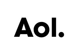
Source: LogoTyp.us
Similarly, companies like Uber and Google also went with sans-serif for their own logos. In fact, Google actually went from a serif font to a sans-serif font, which you can see in the image below:
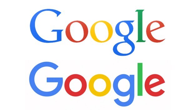
Source: Canva
The psychology of that change is quite understandable. Initially, Google would have needed to establish its authority as the go-to portal for information on the Internet, which means it needed to exude an air of reliability, accuracy, authority, and so on. Over time, that authority became globally accepted, so the serif font was no longer needed. Google presumably wanted to highlight the simplicity of its applications and bring a look that would appeal to modern businesses; hence, the new logo.
More traditional companies and brands that seek to demonstrate authority, such as Wikipedia, use serif fonts:
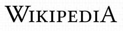
Source: LogoTyp.us
Rolex is another famous brand that went with a serif font because it wanted to establish its authority in the watch-making industry. Look at company logos all around you and you'll see that the choice of serif versus sans-serif tells you a lot about the kind of image the company wants to project and portray.
In general, most modern companies prefer the sans-serif option for their logos. When designers use it in their logos, it makes a powerful statement of authority and class.
Print Media
Traditional print media tends to use serif rather than sans-serif. A lot of newspapers still use Old Style fonts like Times and Garamond because the typeface is more appealing to the reader and it gives them a more classical look.
Some of the oldest newspapers on the planet continue to use serif fonts even though they now work with modern printing equipment, and one of the reasons is that the authority that a serif font establishes. That's how powerful a font can be.
Font Combinations
Another popular use of serif fonts is to contrast them with sans-serif fonts. These combinations are called pairings. They can involve the use of a serif font with a sans-serif font or even a combination of the same font in two different sizes and/or weights.
Serif Font Examples in Real-world Designs
Here are some classic examples of how serif fonts can "class-up" a brand and give it an authoritative look.
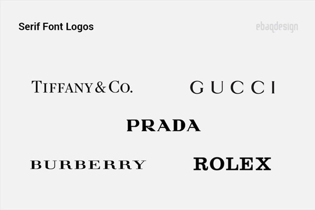
The one thing all these brands have in common is the need to establish elegance, authority, class, style, and exclusivity. If you notice, most of them are luxury brands as well, and the serif font helps get that message across.
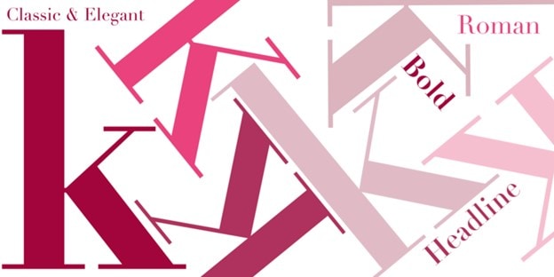
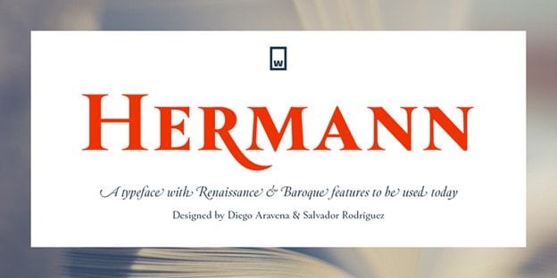
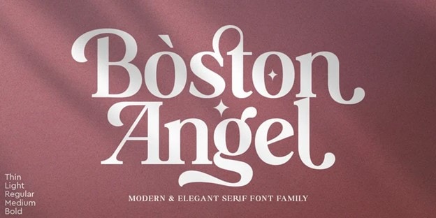
Serif Fonts for Up and Coming Designers
If you're new to the world of design and typefaces, you can get an edge up by using some of the most powerful serif fonts in your designs. The following typefaces demonstrate authority and a professional look that will go well with strong brands that need extra visual appeal in their logos and marketing materials. Use them to showcase your work and impress your clients.
Linotype Didot
Conclusion: As you can see, serif fonts can send a very powerful message to your audience, as long as you use them appropriately. Serif fonts have been around for a long time and will be here until long after we're gone. If you want your work to live on, artfully used serif fonts are definitely the way to go. Our recommendation is to go with free serif fonts until you're comfortable with them; you can then explore premium options that will really make your designs pop.
