One Page Design: 9 Best Examples for your Inspiration
Since people seem to be busy, no one has the extra time for excessive browsing. The one page design available from many building apps like Mockitt shows extreme simplicity and friendliness to the user.
Every site that has only one page to advertise its goods and services, while proceeding to checkout and payout, seems hard to create. However, modern platforms have made it easy for beginners and novices to create a one page website design that matches all tastes and desires.
Now it's time to check the Mockitt know-how in creating the one-page site miracles!
Design a One Page Website Prototype Online
Wondershare Mockitt is easy to learn and provides you with a useful online tutorial to create any kind of website. It has the ability to gather all the various components of website pages and integrate it into a single one.
Since Mockitt has expertise in single page design you only need to log in to your account and go to the main screen.
There you will find the single page website maker button. It is easy to press and should guide you through the whole process of website building. The single page website usually needs more codified information than any other kind of sites.
The visitors should have a clear view of your intentions and take as much information as possible to absorb from a single web page. Mockitt application can propose to the beginner users a single product page design that can incorporate all the vital information about it.
Prices, availability, inventory, and reviews should be accessible by the single-page website.
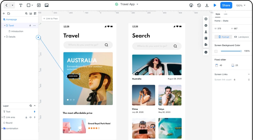
Going further on, Mockitt gives you the chance to apply an automatic site adjustor to meet any type of device requirements. Single pages usually work better for mobile phone users. However, there is always the chance to access the single page site from the desktop computer with the same ease.
Finally, Mockitt has many templates and fonts to choose from. Single page website design requires you to have hidden menubars and sidebars that get activated with mouse-overs. The application can also allow the site builder to create an HTML5 compatible site and upload all the pictures and scripts through the well-known drag and drop procedure.
Mockitt can create your single page site prototype in less than an hour. Then you can share the link with your friends and peers and take their valuable opinions about it.
One page Site Designs: Here are the 9 Most Beautiful One Page Site Designs
Besides the competent work done with Mockitt application, here are some one-page sites that seem to be ambitious and became popular to visitors:
#1: Plant22
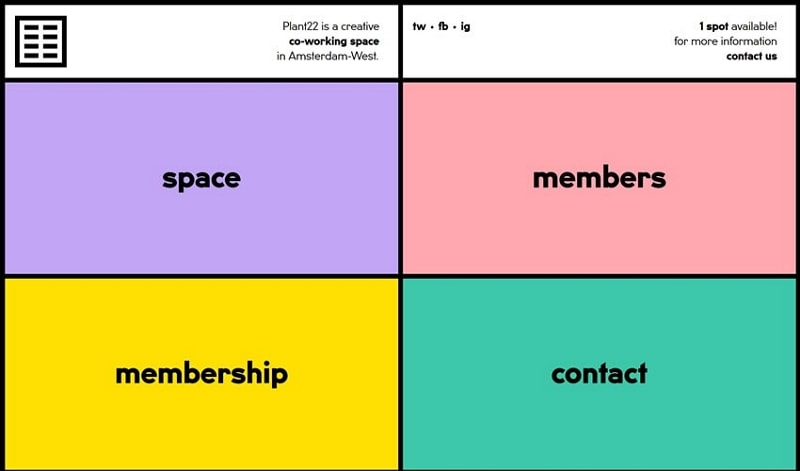
Plant 22 is an example of the one page design html the way programmers imagine it. It represents a busy workstation that gives slots to people who want to work together efficiently. No matter where they are around the world, the Plant 22 single page site can provide them the resources to work together.
Even with one page, Plant 22 can verify all the members' information and assign them different workstations. That is one of the most incredible parts of the work done with this site.
#2: Sheerlink
This website introduces the one page design document having the aspiration that visitors will stay longer. Sheerlink provides useful services to people that love music.
The single-page design gives opportunities to visitors to stay longer and increases the webpage traffic. All the menubars you are going to need are there and revealed after a mouse-over.
The Sheerlink can go on to external pages if the visitor asks. However, a single-page has some serious advantages that creators enjoy.

#3: Small Victories
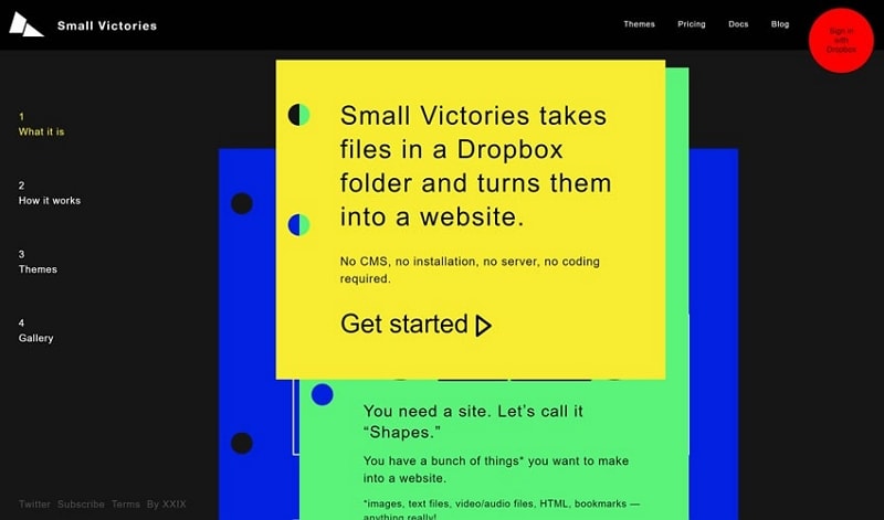
No more hassle with huge sites that you cannot find the information you need. With Small Victories, you can upload any kind of file, using your Dropbox menu, and then have a site built from that action.
In this website, you can find the single page design inspiration you have always been looking for.
Small Victories also have an exceptional communication and chat bar available for people who need further tutoring. You will never feel like any information is missing or hidden. It seems like a single page is always better and preferable than larger sites where you simply can't put anything in order.
#4: One Page Pro
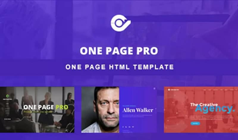
It is the very first site that advertises itself. The One Page Pro shows a significant proliferation among the beginners and younger users of online site-building.
It shows you how to put the various templates and scripts together so that you can have a consistent website. Then it is a simple WordPress site that provides the HTML5 code you need to incorporate and make it workable.
#5: 360 Mirror
360 Mirror is a concept site showing that a single page can attract more customers than any other type of online engagement. The concept page gives visitors an incentive to know more about the 360 Mirrors that have once again come to the fashion trend.
You can always see details about these mirrors since the mouse-over is going to give you viable details. Then from the same site, you can also proceed to checkout and payment.
Never again have you seen a website as more successful than this one, in terms of sales and marketing.

#6: Pacific Northwest Travels
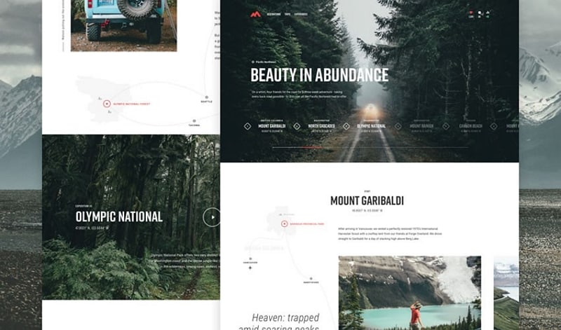
Here is another exceptional effort to bring the travel industry directly to the hands of the public. People who enter the single-page site of Pacific Northwest Travel are eager to book their next excursion there.
The travel agency has managed to attract much more traffic than the usual multi-page website it usually maintained.
People are entering there thanks to the innovative scripts and templates. They change according to customer needs and destinations. For that reason, the Pacific Northwest Travels can customize their trips and communicate efficiently with their customers. It is a real revolution for the travel business at large.
#7: Coffe Circle Impact Report
Here you have another vibrant example of how a social group organization can motivate people online. The Coffee Circle Impact Report has to do with illegal children labor in Kongo, where the coffee beans get extracted.
The original site used to have less traffic as time passed by.
The touching picture of the Kongo children working as a template in the single-page site made people think that it is worth to give more attention to that matter.
The site has increased the traffic through the years and also gathers donations for Kongo children to go to school and receive primary education.

#8: Outdoor One Page Template<
What about a site that only has one page to show thousands of templates to the public? That is the case with Outdoor One Page Template, and it seems to be growing from year to year.
People who enter this site are web page builders who want to get in touch with the latest site design trends. That is why the single-page effect can change their life forever.
They can find all the templates they need, just by mouse-over the pictures that they look up on to. Never again have you seen a single-page site to be so successful.

#9: Cleverbird Creative
A fellowship of constructive creators and designers decided to upload the Cleverbird Creative site. It is a single-page site that has made it possible for people to start looking for artistic work.
The site is easy to access from all kinds of devices and can quickly download its content. People who use Cleverbird Creative want to have their plots available the same day.
The site also provides online handling of any severe case. Visitors just need to enter the chatbot and communicate with a customer representative.
We can see that one-page sites have become the latest online trend to follow and blossom.
