Web Color Palette: Best Examples for Your Inspiration
Every UI/UX developer wants to make a positive impression with their work. No matter how creative you are, most beginners find it difficult to get the job done.
Web designing is all about innovation and hard work, sometimes all you need is a sample to replicate the original idea into a whole new level of design. There are many examples on the internet with a web color palette. We have gathered some useful sources for you to transform your visualization into reality. Other than that, you can consider Wondershare Mockitt with all your projects to work on routinely web projects.
- Part 1: How To Choose A Color Palette For Web Design
- Part 2: Best Web Color Palette Examples for Your Web Design
- Part 3: Use Mockitt for A Perfect Web Design
How To Choose A Color Palette For Web Design?
1.Understand Color Psychology
It is important to get recognized with color psychology to choose the best color palettes for web design. Color associations make a huge difference. We are attracted to colors since we are infants, and we develop a relationship with colors. These connections are often everlasting and instinctive. Most of them are universal such as green is associated with leaves and nature and yellow color with the sun. Selecting the right color association is very important for a brand to maintain its global appearance. It really depends on what colors you use, some people might connect something negative with your web design or brand just because of the colors you used.
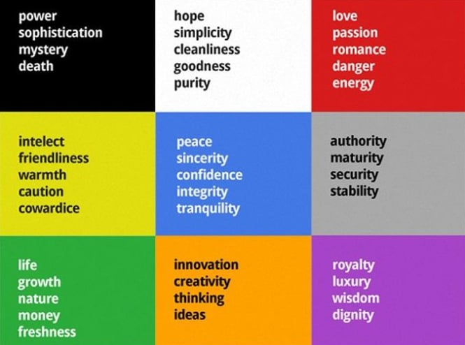
2.Get Familiarize with The Color Theory
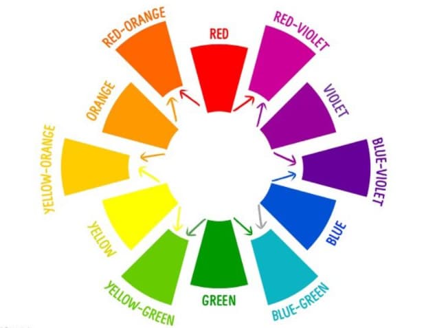
If you are eager to know, how to choose a color palette web design. Then you should look into color theory. It is considered as the science of colors. You will even find many college courses related to this topic. But, there are also a few simple concepts to clear your confusion and understand the basics of color for web design.
Primary colors cannot be created by blending any other two colors. Red, yellow, and blue is the 3 primary colors.
Secondary colors are made by blending two of the primary colors. For example, if you mix yellow and blue you will get green as a secondary color.
Tertiary colors are made by mixing both primary and secondary colors on the color wheel. For instance, mixing blue and violet creates blue-violet which is called compound color.
3.Simple Colors
This might seems like it will be complicated, but choosing a simple color scheme from a modern web color palette indicates simplicity. Complicated and busy color schemes usually confused the visitors. There are benefits to keeping things simples. You can effortlessly make a color scheme even if you have a choice of few colors. Everything will still look consolidated. Visitors won't face a hard time to process what's the purpose of a website. If you go overboard with color combinations, the visitors might get baffled. As you can see WordStream has done a great job as its home page only consists of three colors orange, blue, and a splash of green.

Best Web Color Palette Examples for Your Web Design
1. Facebook
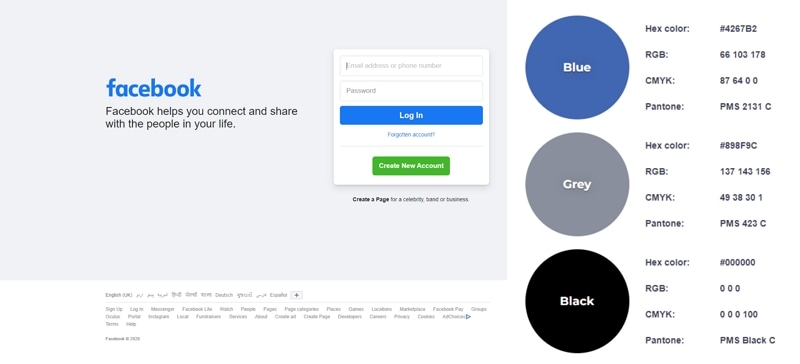
When you hear about the social media platform Facebook, blue color pops in mind from the web page color palette. You will be shocked to know that there is an interesting reason behind this as founder Mark Zuckerberg is Green-red color blind. He said: I find blue color intense. Well, it may not seems like a reasonable explanation, but the blue color has made its impression when we think about Facebook. Most of us find its web design color familiar trustworthy, and calming. This is where we can get in touch with all of the loved ones.
2.Beauregard
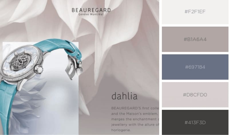
Beauregard is one of the perfect examples of how to use a color palette in web design for a brand. It is a website that is offering a product of art and beauty combined in watch designs. It looks so relaxing and charming. The website offers the visitor a unique experience that was possible with a lovely color scheme conveying simplicity and luxury. Colors in the scheme include Quicksilver, Isabelline, Light Gray, Black Olive, and Aurometalsaurus. You can see the hex codes. You can add these color schemes to your collection for beautiful web design.
3.Libenar
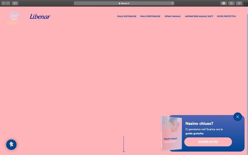
Libenar has used the best web color palettes. As you can observe their website color scheme is a soft pastel that symbolizes purity, which is a perfect strategy for a brand offering baby products. This website design was created with pale and soft pink and blue nuances, which complete the main message of the business website. It is a simple tactic used by many web developers.The colors used from the color palette are Spanish Pink, Snow, Soap, Dust Storm, and Yale Blue. We have also given the color hex codes to lower developers' effort.
4. Mend Seltzer
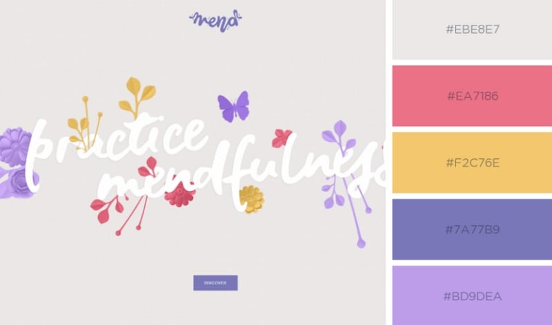
Sometimes you need a calming and romantic color scheme. A beautiful and caring color scheme is specifically selected by Mend Seltzer to represent healthcare-related products. This can be done by adding romantic hues of Yellow, Lavender, and pink to the web design. So you can get the project done in an artistic and creative style. The colors used in this web design are Tango Pink, Platinum, Orange Yellow, Toolbox, and Bright Lavender. These are the exact names along with the hex codes. You can use the powerful color to build a website with opportunities and make a positive online appearance.
Use Mockitt for A Perfect Web Design
As a UI\UX designer, you need a platform that will help you to create prototypes and wireframes in less time. This tool is very advantageous for a daily basis developing projects and designing requirements. Wondershare Mockitt is the best opportunity for you. The workspace provided is well-organized and immediately creates a website design without worrying about a single line of code. If you are working as a crew you can efficiently collaborate with each other and build clickable prototypes for mobile applications.
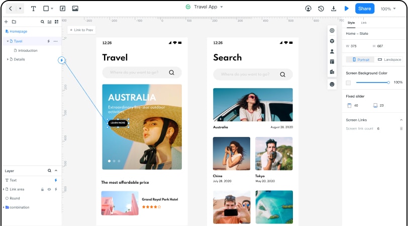
Mockitt incorporates predefined widgets, combos, and object templates. These are very simple to merge into your project, you would simply have to drag and drop to move them into your canvas. You can also share your project progress with the team members as this tool can generate a URL, which allows the project to be viewed in any browser. However, changes or edits cannot be done.
You can also test the prototype on Apple or Android device and generate a QRcode with Mockitt. The device camera can scan that code and present your application and you can get feedback from the users or clients. Most importantly Mockitt enables users to create combo and object templates. But don't forget that you can only select from a category of built-in widgets.

