7 Stunning Website Color Schemes to Inspire Your Ingenuity

One of the hardest aspects of creating a screen design is choosing a website color scheme. However, by applying different methods you can achieve a successful color combination. It is not always easy to find a color combination that fits the topic and whose colors also fit and harmonize with each other. A color combination that is easy to read in texts and also clarifies the content structure and the visual hierarchy of the website.
The most beautiful website color scheme or combination is of no use if it cannot be used sensibly on a website design. On the one hand, colors are supposed to evoke certain associations. Colors create orientation and give meaning to the elements. They support the visual hierarchy of the website and guide the visitors through the content.
7 Stylish Website Color Scheme
Colors are not just a matter of taste. They have a certain effect on the viewer, which you can use for your web design. The effect of colors is gender-specific. Women more often perceive the colors pink, purple, blue, and green as pleasant. Men tend to prefer the colors green, blue, and black (Although black is not a color). There are also cultural differences in colors. If you have to pick good website color schemes for the Asian market, the meaning and perception of colors are completely different than Europe.
1. Netflix
Red is the iconic color used by brands like Coca-Cola, McDonald's, KFC, KitKat, and many others. All in all, red is used very often in food and is also an excellent choice there. Red is also popular in entertainment. That's why a most popular brand like Netflix used red color on their website as well. Netflix used an awesome color scheme of red, white, and black to enhance their text visibility. The color scheme used by Netflix gives and guides orientation and strengthens its own brand. The color scheme of Netflix evoked the emotions like energy, excitement, passion, and sexuality, etc.
2. VISIA
VISIA is a digital marketing agency. They combined the color orange, white with the warmth of red on their website. Orange stands for a good mood and challenges us to live the moment. The darkness of red, on the other hand, represents calm and security. The color white in-text creates a "solid ground under your feet". Orange can be used for websites from the creative industry background. Red-orange accents immediately draw the eyes to just the right places, from the top of the page to at the bottom. The website color scheme of VISIA, make their web design more elegant and fresh. The color scheme of VISIA evoked emotions like energy, activity, change, and success, etc.
3. ToyFight
ToyFactory used the color combination of yellow, white, and black on their web design. The meaning of the color yellow is contradicting itself. While yellow is a warning color in nature, it also represents serenity and optimism. The color yellow reminds us of the sun and is the lightest basic color. In many cultures, yellow represents the divine and sacred. The combination of yellow, white, and black evoked emotions like - creativity, optimism, and friendliness, etc. The color scheme of ToyFactory create feelings of happiness and encourage activity. But be careful: too much yellow can quickly become intrusive and overwhelm the visitor. Therefore, use the color yellow sparingly in your screen designs.
4. MOCKUUUPS
Violet has a mystical effect. It is the color of self-reflection. This results in a very complex effect. MOCKUUUPS used violet, the heavenly blue, and the earthly red on their website design. The color scheme of MOCKUUUPS evoked emotions like luxury, ambition, authority creativity, and mysticism. Violet is used especially in the beauty and lifestyle industry. It may sound like a cliché to you, but purple is used to appeal to a feminine audience. Since the color also contains a lot of red, you should also be careful with this color.
5. TOWER
Blue symbolizes consistency and professionalism. Hence, this color is often used by financial services and tech companies. The color blue is particularly suitable for subject-related topics. TOWER used dark and light shades of blue with white and yellow on their website design. They used light blue because light blue is more energetic and can cancel out the coldness of darker blue.
You should be careful not to use too much blue in your website color scheme. Then your website can quickly get a very cool and soulless character. Depending on your industry, this can of course also be desired.
6. CASH APP
Green radiates harmony. Green stands for nature and growth and is the easiest to process for the eye. CASH APP used green, white, and black color scheme on their website. The green color with white and black creates a certain calm and therefore also be used extensively in web design. The green color is mostly found in connection with nature, the environment, sustainability, and tourism. CASH APP used their web design color scheme very wisely. Their color combination makes their UI design more elegant and more attractive.
7. idweaver
Violet has a mystical effect. It is the color of self-reflection. This results in a very complex effect. In the violet, the heavenly blue and the earthly red meet. Here the opposites of the two colors are united. Cold and hot. The male and the female. This is why feminists mostly use purple - this is to represent androgyny. idweaver used a violet color scheme on its home page. They used purple with white and blue. The combination of purple, blue and white enhance their design layout make it more elegant design style.
Useful tool for your web design
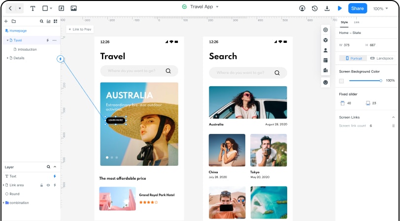
Wondershare Mockitt is a Web and Mobile application prototyping platform. With Mockitt you can do collaborative work on a UX design. For example, the UX designer in New York uploads a design, and comments can be made directly on the professional Android app design. The Entire conversations can take place right on the design. No more annoying email attachments or conversations about designs. The other team member would like to leave a comment on the button? Click on the button and he can pin a comment there. Mockitt is like a visual conversation about design. This works for the web, iPhone, Android and now also watch apps.
There are lots of industry-recognized prototyping tools are available on the internet - such as Figma, InVision, FramerX, etc. But Mockitt is the best suitable tool for you. With Mockitt you can easily create website designs, wireframes, and prototypes, etc. It has lots of features that make your design process much handy. Its drag and drop feature is one of the best features. It has a huge library of widgets and easy to configure design shape options.