What Do You know About Mobile Responsive Website Design

Regardless of how your website performs for the desktop and laptop screens, you can not call it a responsive website if it does not work well on Mobiles. Since more than half of the web traffic comes from the Mobile phone and also Google ranks a mobile responsive website for a better position, so you should make sure that your website becomes one of the contenders in availing those benefits.
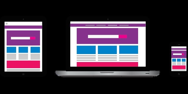
Source: Pixabay
And to make it happen, we have to understand what it means to have a responsive site.
Throughout this article, we shall explore what is meant by making a site responsive for better outcomes and the critical considerations one has to make while making a responsive website.
But first, let's see if one of the biggest CMS (WordPress) is Mobile friendly or not, so Let's get started!
Is WordPress Mobile friendly?
WordPress is a CMS that allows its users to design the front end by making changes to the back-end. There are a couple of page builders such as Elementor that can help you see how that particular page will be shown on Mobile screens. Furthermore, WordPress allows you to use various responsive default themes for your website.
So, yes, WordPress can be made mobile-friendly. Also, Wix responsive website builder ensures a mobile-friendly website for all of its users.
What is Responsive Design
Responsive design is a method to organize the content within your website to respond dynamically to every screen size where it appears. In this way, the user experience would remain consistent across all the devices (Mobile, Tablet, Laptop, Desktop).
To make it happen, designers create fluid grids and flexible code into the images using CSS of the site so that HTML can be rearranged in direct response to the resolution and size.
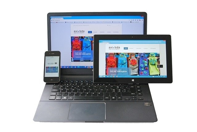
Source: Pixabay
If you keep changing the screen sizes of responsive websites on your desktop, you will notice that content blocks and pictures would make arrangements to adjust them accordingly to the screen size. It would allow you to read content on any screen size without a hassle.
Depending on the screen size where you view the site, the website rearranges itself due to the CSS media queries that apply specific rules to the page. HTML would not change but gets rearranged by the CSS. For every rearrangement on-site, you can alter CSS to make it happen.
In a nutshell, a responsive website uses the same code across all platforms while ensuring consistent performance on all of the viewing mediums.
How to check if the Website is Mobile friendly?
There is a likelihood that your website may look great on your mobile phone, but it doesn't mean that it could work fine on other mobiles as well, so it is recommended to use a couple of phones to ensure if your site can be considered as a mobile friendly website. You may either have to make a few tweaks to your existing design or rebuild an entire design from scratch.
There is a tool that is developed by Google to check if your website is mobile-friendly or not. Access this link https://search.google.com/test/mobile-friendly and enter the URL of a site for an assessment. Based on the analysis, it will tell you the results.
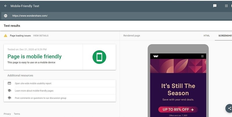
Source: I have taken a screenshot
Responsive Websites vs. Mobile Apps
The decision of choosing between Responsive Website and Mobile App depends on the purpose of the site. Many websites would not need to have a Mobile App because their design is responsive enough to cater to different devices' needs. However, a Mobile App becomes useful where a user needs some specific functionality within their mobile phones. Your bank typically offers Mobile App to make you able to check out your balance from anywhere with an internet connection. You do not have to go to your desktop computer every time you want to check your remaining balance. Twitter and Facebook also make adjustments in their Apps to incorporate different functionalities to facilitate mobile use.
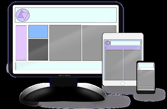
Source: Pixabay
Performance Considerations
Your site's overall performance will get affected by the responsive design. Since catering to different device sizes involves a lot of work, loading various images of different sizes and CSS can be expensive from back-end processing. So, it is important to consider performance while assessing responsive design as a part of the process. Although the user expects a mobile site to be a bit slower - they will shut down your website on their mobile devices if it takes more than a few seconds to load. There are some other factors that you cannot control – for instance, the cellular network which that particular user is using might experience latency and could add up other elements in increasing your load time. You should ensure that you design your responsive website by considering performance parameters from the very beginning.

Source: Pixabay
Making a website responsive requires some tasks to be performed, so ensure that you have completed them to make your website optimized for Mobiles.
Image Optimization: Optimize your images so that they appear automatically and proportionally based on the screen size.
HTTP Requests: Stay vigilant with your amount of JavaScript and CSS; keep them concise and relevant.
Assets Management: You won't need to use large buttons and images for smaller devices, so make sure to place those essential assets – Do not over-design.
On-Demand Loading: Make sure to initialize resources priority wise so that performance can be improved.
Make a Website Prototype With Mockitt
As with time, more and more people are turning towards their mobiles and other hand-held devices to access websites, so you should also strive to make your website mobile responsive.
Remember, It is not enough to know the meaning of having a Mobile responsive website; the primary job is to design a website by considering these tips from the very beginning. It will allow a design to be responsive from the day it gets live.
And the first step towards designing is to make a website prototype with Wondershare Mockitt.

A Prototype is a demo of an interactive site. It allows you to implement all your design thoughts by keeping mobile-friendly features under consideration.
Mockitt comes with a freemium and premium plan.
With Mockitt, you can design your website prototype in few easy steps even if you have never created a prototype before.
Mockitt allows you to select its pre-installed template, which is ready to be customized. Other than that, you can also create a new project from scratch. Whichever method you use, you will have access to the library full of widgets and icons.
You will not have to learn any coding language to use Mockitt; by just dragging and dropping elements, you can create stunning prototypes within a few steps.
You can also make your design interactive and appealing by creating links between various designed screens.
And when you complete the design, your stakeholders can always access that design to give their feedback and approval.
Undoubtedly Mockitt is a no brainer. It is a simple, user-friendly, and features loaded tool.
Make sure to create a prototype before you start developing your responsive websites for better guidance and approach.
