Top 9 Free Responsive Website Templates That You Can Use Right Away

These best free responsive website templates that we will discuss within this article will sort out all of the design and technical aspects of a responsive template. And your page will follow all the regulations and the latest trends of a modern web.
So if you are on a tight budget or a beginner, you can select any of these responsive website templates to get started. These templates can adapt to any screen size automatically, so you do not have to use page builders to make sure if the design is mobile-friendly or not.
So without further ado, let's discuss each of them in detail.
Best free responsive website templates
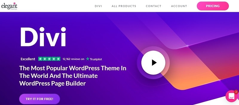
Divi (WordPress)
You can build any website you want from this responsive and flexible tool. With a massive collection of over one hundred website packs, you can save yourself a lot of time. You can even set up your page by using a sample within a few clicks.
Source: Screenshot
Divi also has an integrated builder that allows you to fine-tune, edit, and improve the layout as per your tailored requirements. You do not have to do any coding work to change the default settings.
Divi is SEO and Mobile friendly, and it has cross-browser compatibility. You can create a stunning website and take your project or a business to a whole new level in a nutshell. Without the need to hire a designer or coder, you can create a page within minutes.
Jevelin (WordPress)
It is another flexible and spectacular tool that allows you to build a website quickly. It comes with tons of layouts and over thirty samples that saves you a lot of time.
With Jevelin, you do not have to start from scratch as you will get a one-click install, custom made shortcodes, WooCommerce, Slider Revolution, contact form 7, and mega menu.

Source: Screenshot
To resolve your issues and address your concerns, you will get access to the support team. Other than this, you can look out for comprehensive documentation and video tutorials.
Undoubtedly you can build a first-class website with Jevelin.
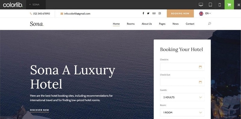
Sona
Sona is a responsive web template for resorts, heck, hotels, motels, and hostels. It is a business-driven template that has various impactful and practical features.
Source: Screenshot
With the Sona kit, you get a blog section, slider, rooms page, online booking ready form, Google Maps, and a contact form.
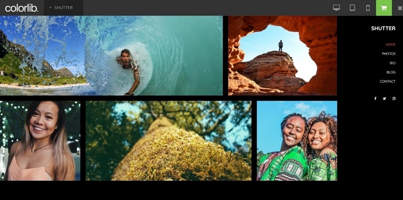
Shutter
Although Shutter is designed for photographers, you can also make full use of it if you are a creative individual - anyone who is looking to make an impressive online portfolio can opt for Shutter.
Source: Screenshot
It comes with a dark mode feature, a sticky sidebar menu, and the home page grid.
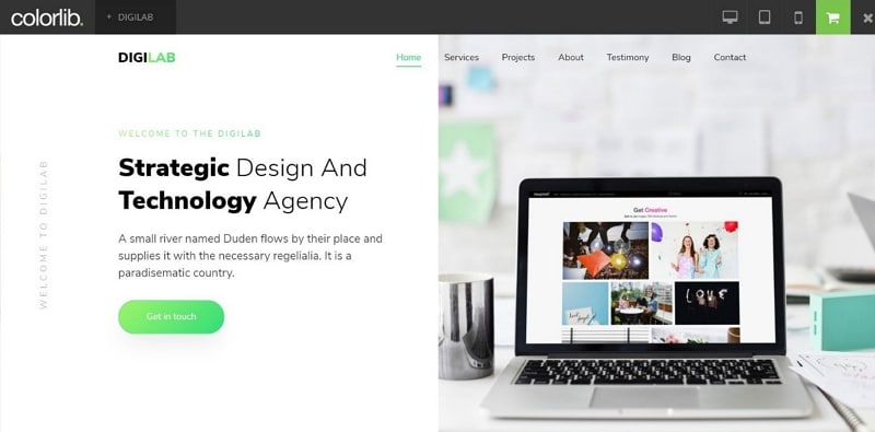
DigiLab
DigiLab is a suitable option for creating a small business website, an agency, and a freelancer. It is a single page template web responsive free from glitches.
With Digilab kit, you get scrolling animations, Google Maps, a Split-screen slider, contact forms, and carousels.
Source: Screenshot
Space
It is a minimal free template that is used to build stunning online portfolios. Whether you are a freelancer or an agency, Space will cater to all of your needs.
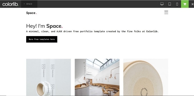
Source: Screenshot
You can grab everyone's attention by using its content reveal feature. Space allows you to integrate contact form and Google Maps. So if you want to display your services, skills, testimonial, and portfolio, you can use Space for better outcomes.
WebMag
If you are looking to build an online magazine, you can quickly do this job with WebMag. Since it is an HTML Template, you need to use some coding skills to activate it properly.
WebMag has a very tidy and neat foundation that is an excellent choice for beginners. You can use WebMag for both of the news types; Niche focused and General.
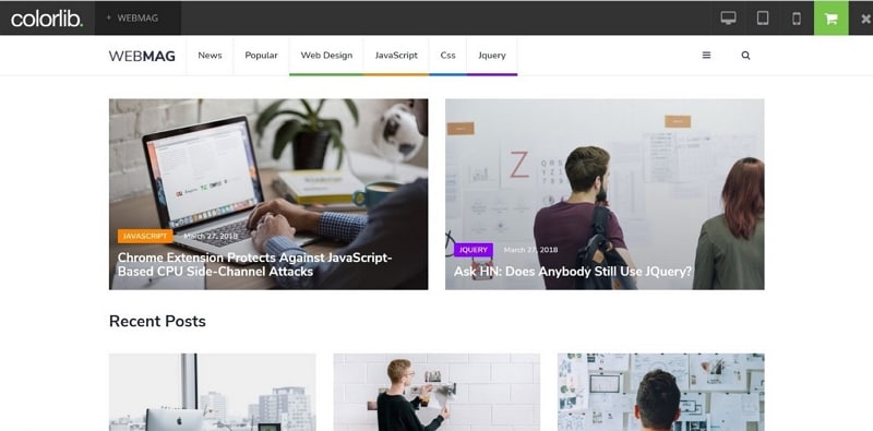
Source: Screenshot
With WebMag, you will get the Working Contact form, sidebar menu pop up, floating navbar, and social icons.
Shionhouse
Shionhouse will create a stunning and responsive eCommerce website for your business. Its minimal and simplistic design will make your products stand out beautifully.
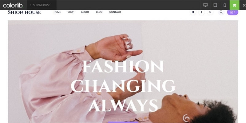
Source: Screenshot
With Shionhouse, you get a sticky menu, a big slideshow, social media buttons, scrolling animations, and back to top button. You will also get contact and Blog pages.
Delicious
Delicious, as the name suggests, allows you to promote different recipes on the internet. You can easily twist this template in your creative way. Its well-organized code will enable you to make improvements to align an end product with your branding direction. Its clean design ensures that your food-related images stand out nicely.
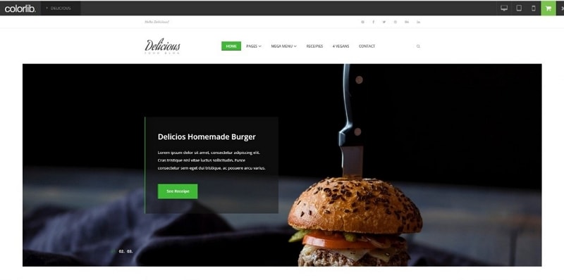
Source: Screenshot
With Delicious comes Slider, recipe post, internal pages, mega menu, and multi-level drop-down menu. It also saves you time by integrating Google Maps and building a contact page for you.
Tips
There are many other templates available that are free and based on Bootstrap Framework. For instance, Europa, Loans2go, Aspiration comes under the category of "template bootstrap responsive free of cost."
Things to do before choosing a website template
Of all the options we have mentioned, you can select any free responsive website templates for your business. But keep one thing in mind that you should be well aware of your website requirements before selecting these free responsive templates. It is a good idea to design a website prototype, and then based on that prototype, template selection should be made. Because in this case, you can audit a template and check if that allows you to customize itself according to your website prototype.
And to make a prototype, you can use Wondershare Mockitt that is one of the finest tools of Wondershare.

With Mockitt, you can create a stunning prototype even if you have never used a design tool before.
Mockitt allows you to either pick up any of its pre-installed templates or create a new prototype from scratch.
These templates are available for almost any business type and are ready to be customized.
If you choose to create a new project from scratch, you can select various screen sizes based on your requirements. Screen sizes are available for Mobile, Web, Tablet, watch, and others – you can also create a custom screen size by putting in the height and width of a working screen.
Once you create a new project, you will see a vast library of widgets and icons beside your working screen. You can easily drag and drop the required elements to your working screen.
Once you create different screens, you can link them to give it the original website's look and feel.
Mockitt also allows you to share your prototype with your stakeholders by giving them access through the link and QR code.
Certainly, Mockitt is one of the best prototyping and collaboration tool we have these days. Make sure to use a structured approach - build a prototype first and then select a free responsive template based on that designed prototype. Doing this will save you a lot of time.
