What is Web Design? Creating a Clear Understanding About Web Design

- Part 1: Comprehending the Nitty Gritty's of Web Design
- Part 2: 5 Web Design Tools Recommended by Expert Web Designers
#1: Wondershare Mockitt
#2: Sketch
#3: Webflow
#4: Axure
#5: Invision
Good web design is requisite in the modern marketplace, especially if you are looking to build your unique identity. From the message flow to content, typography, and visual embellishments, the web design definition has become much broader, more significant, and deep-set from the previous years.
There is no such thing as just a website. A lead-generating website needs to formulate and propagate a clear message that resonates with the viewer. There isn't a single answer to the question: what is web design definition? It is much more convoluted than you think.
That is why we are here to ease out things for you and help you understand the true and progressive meaning of web design.
Comprehending the Nitty Gritty's of Web Design
How would you define web design? Is it the visual representation of the website's elements? Or is it the realization of impeccable user experience and engagement?
Well, web design is all these things and much more. A website will promote your brand 24/7, and no employee, not even you can do that, beautifully said by Paul Cookson.
Great web design practices the simplification of brand messaging; it works on providing a unique value proposition and executes the 'Why and How' blend of brand messaging perfectly.
Simply put, the definition of website design includes creating interactive designs boasting legible typography, appealing color scheme, seamless navigability, and appropriate use of media elements. When all these aspects are fused and work like a machine to attract more users and convert leads, we can call that the web design is good and functional.
Most importantly, a good web design strives to enhance usability while endorsing your brand's unique message. Now to create a good website is not cut and dried for everyone. A lot of factors play a role in the creation and execution of the ultimate web design.
The Steps for Web Design
Creating a web design is a gradual process beginning from ideation to creating wireframes, mockups, prototypes, and virtual representation.
Step 1 - Find X
Just like any mathematics problem, we need to find the X. In our case, X represents the purpose of building a website. From here, we will get to know the core definition of website design. The right purpose will combat the flaw of usability, which many websites suffer from.
Step 2 - Identifying the Scope
The scope here implies the configuration of the website. The number of pages features integration and determining the timeline. In this aspect, we also look at the value proposition aspect of the website.
Step 3 - Wireframes and Sitemaps
Create three forms of sitemaps (Website planning, Human-Visible listings, and Structural Listings). Collating the wireframes with the sitemaps makes it easier to sort the interrelation between different screens and pages of the website. Also included in this aspect of the responsive web design definition are the mockups and website prototypes. It is essential to ascertain the smooth flow between screens and the interaction of different segments of the website before moving to content creation.
Step 4 - Writing the Content
Create content for the website while adhering to the latest SEO guidelines. Good and interactive content is important for understanding web design meaning.
Step 5 - Media and Other Visual Aspects
Media content helps augment the website's visibility and raises its aesthetics appeal. Therefore, it is vital to add media and create a website design that resonates that has effective placements of the media elements. This includes, but is not limited to, carousels, sliders, videos, images, graphical presentations, animated content, GIFs, and whatnot.
Step 6 - Pre-Launch Testing and Evaluation
The screens are ready, content is flowing, and the media is also added. Now comes testing the website to evaluate the User Experience. From checking the interface design to conducting usability analysis and alignment of the brand's message with the design and content, testing is imminent to success.
Launching: Between testing and launching, you need to look at some hype-creation marketing strategies for your website. Plus, the launch time and communication with the prospective audience is also considered.
Design Principles
Since we have already established that a good and conversion-ready web designing meaning is not restricted to a single aspect, instead, it is synergistic efforts of various elements coming together to harness desired results.
However, certain design principles are omnipresent in all the good website designs.
- Simplicity: The adage "Simplicity is a virtue" resonates very well with good website design. Websites that are cluttered and do not adhere to negative space usage end up creating not-good website designs. Thus, it is essential to keep it some, easy on the viewer's eye while conveying the message.
- Readability: A website's readability covers a lot more than typography and content structuring. It also includes ensuring limited distractions and creating a balance between the written form of content and different types of media.
- Compatibility and Responsiveness: In the 21st Century, any website must not be limited to the web browser. Instead, focus on creating websites that run on all the devices and platforms with apt responsiveness to platform-specific configurations like screen size, button placement, etc.
Difference between Web Design and Web Development
Web development is the client-side structure and creation of the website's elements and layout. In contrast, the definition of website design includes the visual aspects and the usability of the website.
Simply put, website design is how a website looks and feels to the end-user. Web development is the process that ensures the creation and execution of the ideas, stories, layouts, and everything else. The web developers give life to the designs created by the designers.
A web designer's arsenal of tools includes Mockitt, AxureRP, Adobe, or any other tool that helps them create responsive web designs. On the other hand, a web developer works with technologies like JS, CSS, HTML, and others.
5 Web Design Tools Recommended by Expert Web Designers
Now that we know more about the web design definition, let's move on to the next section. Herein, you will find an introduction to the top 5 website design tools that are used by industry-leading designers and agencies.
Frank Chimero sums up the importance of having a good website design in a single line; "People ignore DESIGN that ignores PEOPLE."
If you want to ensure that you create a design that incorporates every element of success, read on.
#1: Wondershare Mockitt
Wondershare Mockitt has redefined the definition of website design with its next-gen features, making it a designer's go-to tool. With its drag and drop features integration coupled with handoff and vector editing and media modification, Mockitt is going to give the top-grossing tools a run for their money.
The best part is that Mockitt is a web-based free-to-use tool. Creating wireframes and website prototypes with this tool is both fun and a learning experience. With one of the biggest arsenals of icons, transitions, animations, and creative elements, any designer can instantly start designing with Mockitt.

Advantages and Features:
- An amazingly clean and decluttered artboard plus interface equipped with a big set of tools and integrations is pleasing to the eye and improves work productivity.
- A smart Handoff allows copying the development code of every design element, and the CSS configurations also help developers replicate the exact design.
- The create and collaborate, the model that works on a cloud makes Mockitt accessible to the entire team or your clients in real-time.
- This allows the team members and clients to leave comments within the design that creates a better understanding.
- 128-bit SSL protocol securitization and data encryptions restrict data loss. Further, Mockitt is also embedded with disaster recovery backup that protects your work in any unwanted incident.
#2: Sketch
Sketch did what other designing applications and tools were not able to do, and gave cut-throat competition to Adobe. Before Sketch and Mockitt came to the market, Adobe had been the unchallenged king of the industry. But, not anymore.
Sketch boasts a friendly-looking interface that is added with all the necessary tools needed to create utilitarian website designs. However, Sketch does lack somewhere as it does not have an apt library of interactions and features.
But, it compensates for it with the plugins. Sketch allows creating interactive website designs that resonate with business goals and helps get conversions.
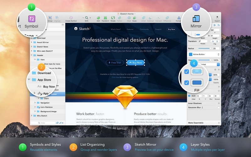
Advantages and Features
- It comes embedded with CSS to help convert a static design into a dynamic, similar to Mockitt.
- Sketch allows you to divide the artboard into different segments with their specific dimensions and set of properties.
#3: Webflow
Similar to Sketch and Mockitt, Webflow is also changing the true web design meaning with its next-gen features. We chose webflow because unlike other tools, Webflow does stand to its statement of being a universal tool for designers and developers.
Webflow was created to bridge the gap between designers and developers to understand and execute the design specifications and bring them to life. Along with this, Webflow is apt in creating highly-interactive website designs, starting from mockups to visual representations.
However, Webflow has a steep learning curve when it comes to converting the animations and other dynamic visual content into CSS or JS codes. For the beginners navigating through the Webflow Interactions 2.0 is going to be painstaking.
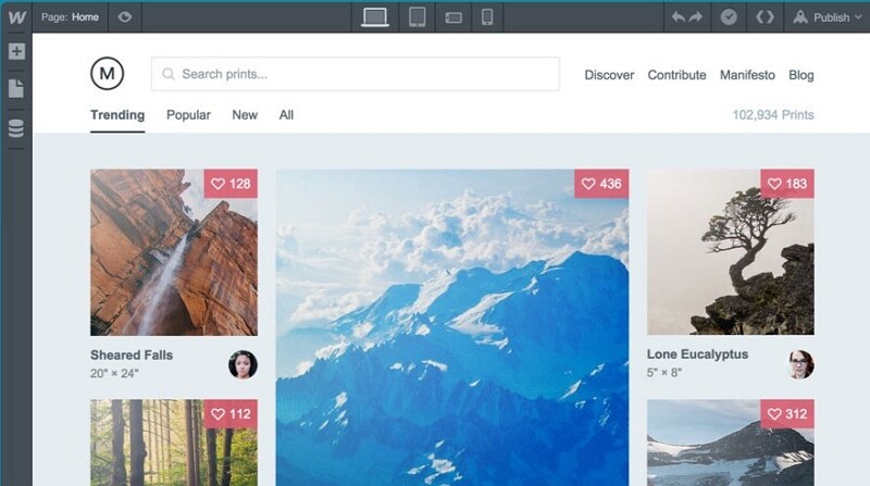
Advantages and Features
- Webflow provides a University platform with a plethora of tutorials and guides to set up your website designs and get them running ASAP.
- An amazing feature of Webflow is that after you have created a website design, you can check the layout on other platforms by enabling "Responsive Resize."
#4: Axure
Axure is a simple to use and smart tool that stands abreast with the modern web design definition. Like the other tools listed above, Axure also allows you to create fully-functional mockups without writing a single line of code.
One of the unique aspects of Axure is that it automatically creates a flow shape library of all the screens included in your website. It creates a subset of different pages, and the screens include under that page that helps visualize the website's navigation.
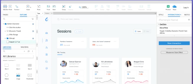
Advantages and Features:
- Similar to Mockitt and Webflow, Axure also allows you to preview the responsive designs of the website created with the specifications of a one type of platform.
- Apart from code transferability and integration with third-party tools like Figma, Sketch, and Adobe XD, Axure also supports cloud compatibility.
#5: Invision
Invision is one of the most used web design tools by large IT houses. The reason being that it is easy to use and makes the design process a breeze for every type of designer.
Invision is known for its animate-ready designs that can help you realize the future-ready responsive web design definition. Apart from providing a fully functional prototype, which is also available in Mockitt, Invision is fast, smooth, and boasts an interactive interface.
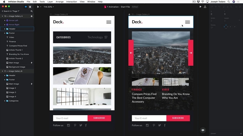
Advantages and Features
- Invision is connected to the cloud. So, even a change in the image by half an inch will be saved on the cloud.
- Further, Invision is enabled with real-time collaboration among the team members and brings synchronicity to the designing process.
