How to Create a Website Homepage Design
The world post-Covid is well-aware of the importance of establishing an online presence in order to reach a vast range of potential clients. Yourwebsite homepage design can make or break your online presence. Putting ample amounts of effort and thought into a website homepage design can truly make a difference, leaving your potential customers with the initial good or bad impressions of your company or product. This is why it is especially important to come up with a creative homepage design, which can leave lasting impressions on those visiting your website.
Step-by-Step Guide for Simple Homepage design with Wondershare Mockitt
Wondershare Mockitt can help you create prototypes for mobile (IOS or Android), touchpad, web, TV and watch. Here is a step-by-step guide for making a simple homepage design with Mockitt.
Step 1: Create Project
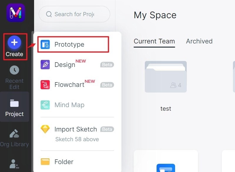
After logging in, click on “Create” Project to begin prototyping. Create a Blank project by choosing the required device type and name the project, or simply choose to Create project from demos to choose a given template. In order to choose a template for your website homepage design, choose from a variety of templates offered by Mockitt. This can be done by clicking Create Project from Demos to enter the project.
Step 2: Name your project
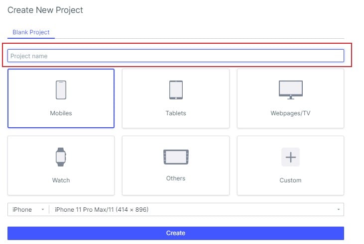
In case you chose blank project, give a name to your project by typing it in Project name bar.
Step 3: Choose your device
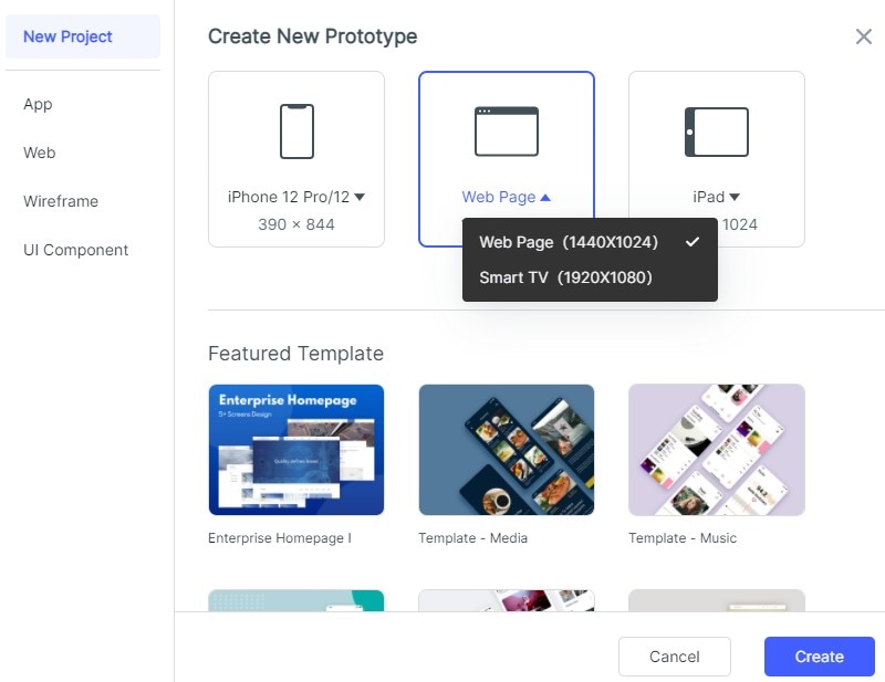
Choose Web page to begin building your Web homepage design. Click on Create.
Step 4: Choose the page
Choose Home to build your website homepage design to begin by clicking on Edit Screen. A blank canvas will appear in front of you. Then you can start to design your homepage.
In order to begin designing, add Fast Widgets on the left by either:

- Double clicking the widgets
- Dragging the widgets to the canvas
- Pressing the hotkeys and draw
On the right, you can also choose from Build-in Widgets, My Widgets and Icons.
Clicking on a widget will allow you to edits properties in the Inspector Panel.
Step 5: Add Notes for Future Reference
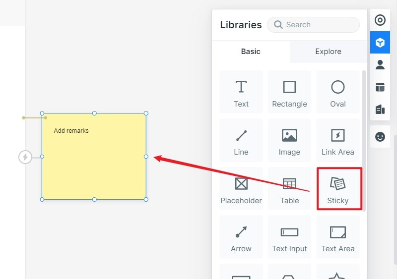
For adding notes for your design for future reference, simply use the Sticky in the Build-in Widget library. Then simply put in the text.
Step 6: Add Interactive Animations
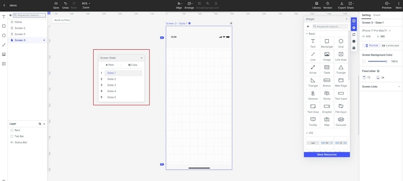
You can add interactive animations to your homepage by using screen state switching which can change the position, size and color of an image in the screen.
Step 7: Share your prototype with others
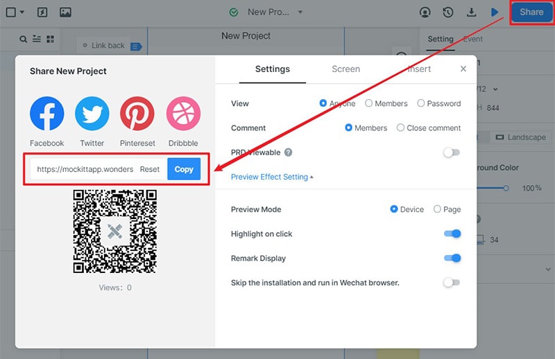
It is extremely easy to share your prototype with others for preview or with users as well for user testing. Simply click on the share button and get a QR code and a sharing link.
The best part is that they do not have to register with Mockitt in order to view your prototype! The privacy settings can also be ordered as you wish.
Step 8: EXPLORE!
Using a Mockitt prototype is extremely easy and user-friendly. You can explore it on your own and experiment to fulfill your needs. It is simple and interactive. No trouble at all!
5 things you need to pay attention to while creating homepage design
The homepage is the most frequently visited page on your website and is normally the first entry point from social media links or search engine results. This is why you need to make an impressive impact straight away. Your website audience will eventually leave if you dont answer their queries correctly, which is not only bad for your business but also for SEO.
From appearance and functionality to navigation, a lot is involved into creating a user-friendly, eye-catching homepage design. Web designers and developers need to collaborate in order to build a homepage which can drive maximum SEO, engage consumers and stimulate conversions.
The following tips can help you in creating the best homepage design for your website:
#1: Keep it clean and responsive
Your websites visitors are coming through a variety of devices including PCs, tablets and smartphones. To ensure the best user experience with whichever device is being used, it is important to build a responsive homepage design. A responsive design signifies that the user experience on your homepage will be the same or quite similar, regardless of which device they are using. Navigation should be an extremely easy process through which users can roam around your website. Moreover, functionality should be similar irrespective of which device is being used. Your homepage design should be clear- offers clearly displayed for users on every screen size.
When the homepage design will be cohesive and responsive, your visitors are bound to have a positive and memorable experience while visiting your website. This will also ensure that they do not get bored and leave quickly, rather stay on your website.
#2: Interactive, dynamic and engaging
Homepage designs which are emotionally charged are always better than neutral ones. The best web homepage designs are dynamic and engaging.
A dynamic homepage design tends to evoke positive emotions in the website visitors. It is increasing chances of their interaction with your website becoming quite a memorable one. How can you let your visitors engage with your homepage emotionally? There is no easy way out. But the simplest way is to use changing illustrations, animations, videos or mini-games. All of these can help you connect with your users well.
Dynamic layouts is another way of giving your homepage visitors with a glimpse of what you are offering. Adding aspects of virtual reality or 360 degree virtual page, product or companys tours will give the visitors a thorough understanding of what your brand is offering. It will solidify their connection with your brand.
#3: Modern Standards for Homepage Design
Up till recently, graphic design and technology has greatly matured. Brands are becoming more daring, bending all rules and designing with a greater creative approach. Now the modern standards of web homepage design are no more monotonous and boring. It is time to use a minimalistic approach to forming a design skeleton and incorporating innovative approaches while positioning elements and also in choice of color palettes.
Designers now have more leverage in playing around with sample website designs and developing exciting, new modern standards. Most modern website homepage designs are made up of:
- Innovative layouts
- Appropriate use of space
- Pleasing colors
- Fitting fonts and supporting elements
- Emotionally engaging experience
- Pleasant background music
As discussed before, your homepage can literally make or break your first impressions for visitors. Therefore, it is crucial that your website homepage design deals with the introduction effectively which lets your consumers know who is your company and what are you offering.
#4: Appropriate calls-to-action
Having a good number of visitors come to your page is a great start. However, once they are there, what is it that you are doing with them? Modern homepage design makes efficient use of their traffic and lets visitors focus with a particular call-to-action (CTA). These can include Sign up now! or Join today!, Subscribe now or even Get started with a free trial.
The main goal of the best homepage design is capturing the attention of the target audience for guiding the visitors further into their website and encouraging them to delve deeper. On a minimum level, visitors are expected to leave their contact information or somehow get in touch with the company.
#5: Simple and sleek navigation
Your visitors should find your website to be user-friendly as they browse through your homepage. Interacting with your first page shouldnt be a frustrating endeavor for them. A negative first impression can significantly damage your future relationship.
The best homepage website designs prioritize simple navigation through menus and options that are easily identifiable. Labelling of different pages also makes logical sense as users tend to quickly identify where a button or a navigation tab may take them. So keeping in mind little details such as visual representation is extremely vital during homepage design.

