How to Create an Effective Dashboard Design

Enterprise applications gather and organize a sea of data that runs the organization. These applications revolve around Dashboards. They are the gateway to all the data out there. When you dig deeper, you realize that what's more important than data in dashboards is information. This is what makes dashboards valuable. A good dashboard web design provides on-demand access to all of your most important metrics. Certain charts, plots graphs work better for comparison, whereas a few works better for plotting data points. If you do not fully understand data, you'll end up using the wrong visualizations and the data becomes difficult to interpret. So, before choosing the visualization, have a concrete understanding of the type of message you're conveying through the data.
Users have a certain mental model of expecting finding contents within a collapsed dashboard menu. So, when you're categorizing these menus, if you don't align them with the users' mental model, you'll create an unusable product. Extensive user research must be done to categorize and name the sub-menus and sub-sub menus within the main menu. You can use Contextual Inquiry and Card Sorting processes while designing dashboard models.
How to design a web dashboard and prototypes with Mockitt
If you are wondering that what is the fastest and most cost-effective way of creating mobile or web application designs?. The answer is Wondershare Mockitt. Mockitt is a prototyping tool for iOS, Android, and web design projects. Basically, it is an editor that allows both Windows and Mac users to develop interactive mockups on the web. With Mockitt, all of your prototypes and designs will look like real things. You can also design web dashboard designs with Mockitt. It allows you to test the project from the start, and apply adjustments as you work on the design.
This software is simple to use, which makes it the preferred option over many tools. Everything can be modified or customized by simply dragging and dropping. Choosing Mockitt over other software meets all your requirements perfectly. This tool comes with a lot of amazing features, which allows you to create navigable mini-websites designs, look pretty much similar to the native iPhone or Android apps and demo prototypes.
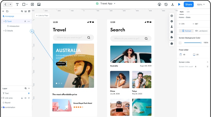
Let's start, first of all, you need to click on the Workspace button here at the top right next.
1. Then click on the top left menu. From here you can switch between your personal and enterprise spaces.
2. Now you can go to the demo group then you will create a new project. Where you can find and utilize pre-built templates based on Effect, Industry, Basic and other options.
3. Now you will view the details of the project and come up here to make edits. You can access the different pages from the menu on the Left.
4. On the right side, you can access the widgets. You can see widgets. Below that we have the icon library where you can easily search for icons and drag them onto the canvas.
5. You can edit the dimensions in the right menu or just click and drag it. You can also change the color down here and connect it to the comments.
6. You can also choose a transition duration.
7. Now, you will come to the comments section and connect the back button to the preview button and change the duration back in the library.
8. You can see a preview of what you have done so far and even click on the search and back icons to ensure your changes took effect.
5 essential factors that a good dashboard web design should have
1. Use Dynamic Content
Static content on a dashboard serves no purpose. The website dashboard design has no place for static content. If a user knows what will be on the dashboard every day, then he'll have no need for the dashboard. On the other hand, Dynamic content is what encourages repeat uses. And this dynamic content should be at the heart of the dashboard. They require attention therefore your web dashboard design should cater to highlighting dynamic content.
2. Avoid Excess Padding
Avoid Excess Padding and white spaces. Similar to how a static web page is done, many web designers use excess padding and white spaces in website dashboard designs. However, they miss the point that data is the key and it should be available with the least scroll. The spread-out design creates inconvenience. Each time a function has to be performed Global interactions such as sort, search, and filter
should also be easily accessible. Compact design is the key point here.
3. Design Dashboard For Different User Roles.
Always design a dashboard for different user roles. When you don't understand the
role position of a particular user in an enterprise, it is a recipe for an unusable web dashboard design. You need to understand the context objectives of different users more than the data alone. You need to conduct extensive user research to better understand the underlying needs. Also, the best web dashboard designs could have different views for different roles of users and it is important to understand everyone's requirements to design better.
4. Apply 5 Second Rule
Your dashboard should provide relevant information in about 5 seconds. Your dashboard should be able to answer your most frequently asked business questions at a glance. This means that if you're scanning the information for minutes, this could indicate a problem with your dashboard's visual layout.
When designing a dashboard, try to follow the five-second rule this is the amount of time you or the relevant stakeholder should need to find the information you're looking for upon examining the dashboard. Of course, ad hoc investigation will obviously take longer; but the most important metrics, the ones that are most frequently needed for the dashboard user during her workday, should immediately pop from the screen.
5. Select Right KPIs
For a truly effective KPI dashboard design, selecting the right key performance indicators (KPIs) for your business needs is a must. Your KPIs will help to shape the direction of your dashboards as these metrics will display visual representations of relevant insights based on specific areas of the business. Once you've determined your ultimate goals and considered your target audience, you will be able to select the best KPIs to feature in your dashboard. To help you with your decision, we have selected over 250 KPI examples in our rich library for the most important functions within a business, industry, and platform.
When reading a visualization (or any other kind of communication), your reader has a limited amount of brainpower to dedicate to the problem. Some of this brainpower will be dedicated to decoding the visualization; any brainpower that is left may then be used to understand the message. -Noah Iliinsky and Julie Steele (Data Visualization)
