Guide:Add Components in Wondershare Mockitt
Wondershare Mockitt allows you to add various components to level your design game. Components are also known as digital assets or widgets. They are integral in representing different elements and actions in a design.
Here is a detailed guide on adding components to a project using Wondershare Mockitt.
- Add and Adjust a Carousel
- Insert Various Components
- Insert Text, Shapes, and Buttons
- Fixed Component Position
- Add and Manage Dynamic Widget
- Pro-tip To Master All Components
Step-by-Step Guide to Add and Manage Components
Add and Adjust a Carousel
The carousel is a dynamic widget for showcasing several pictures like a gallery. Following are the steps to add this component to your design.
Step 1: Open Wondershare Mockitt via its desktop or web app, log in, and open your project.
Step 2: Scroll down the left toolbar until you find the Media section. Drag the Carousel and drop it on the artboard.
Step 3: The right toolbar will show the properties of the Carousel. Under the Assets tab, click the image icon. You can upload images from your device or select stock photos from Wondershare Mockitt's library.
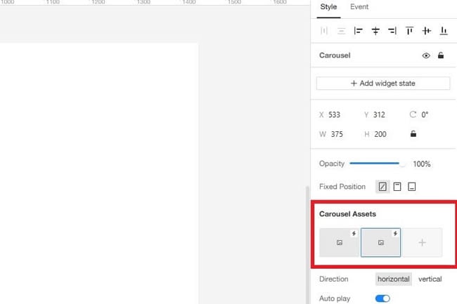
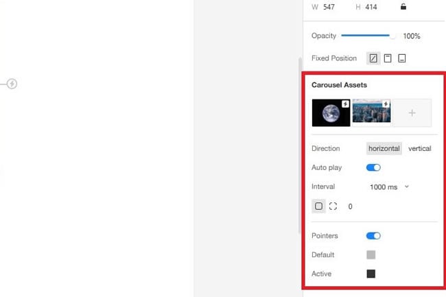
Step 4: After adding photos, you can edit the Carousel's properties. Change the directions, adjust auto-play, set interval durations, and more options are available under the Carousel Assets tab.
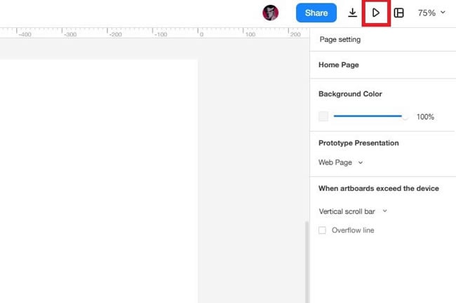
Step 5: After that, you can see how the project looks by clicking the Preview icon in the top right corner.
Insert Various Components
- Add The Map Component
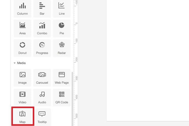
Step 1: Scroll down to the Media section on the left toolbar.
Step 2: Choose Map and place it on the artboard.
Another way to insert maps is by adding a web page. Here's how it works:
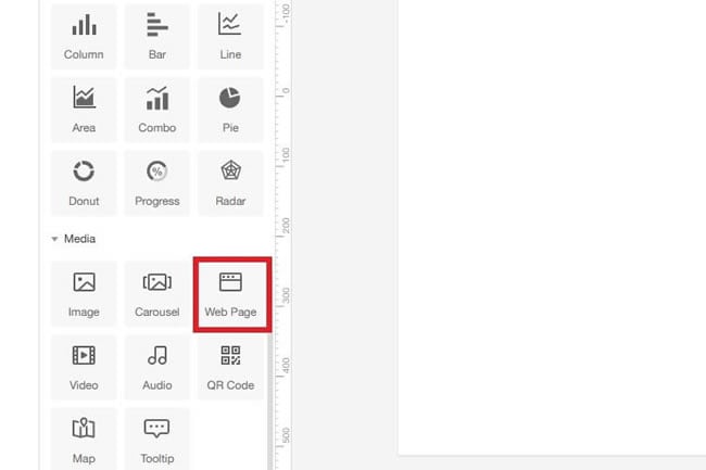
Step 1: Select Web Page from the Media section and place it on the canvas.
Step 2: Go to the right toolbar, and under Web Address.
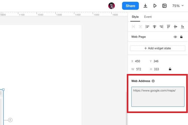
Step 3: Now, preview the project to see Google Maps work.
- Add and Edit an Icon
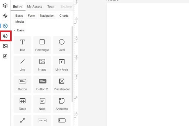
Step 1: Click Icons under the Widgets tab on the left toolbar.
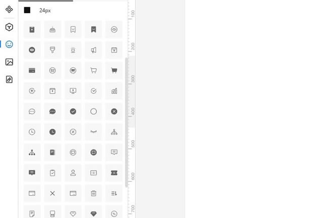
Step 2: Choose any icon from the library and place it on the artboard. You can also search for specific options.
Step 3: You can edit its appearance and other settings from the right toolbar.
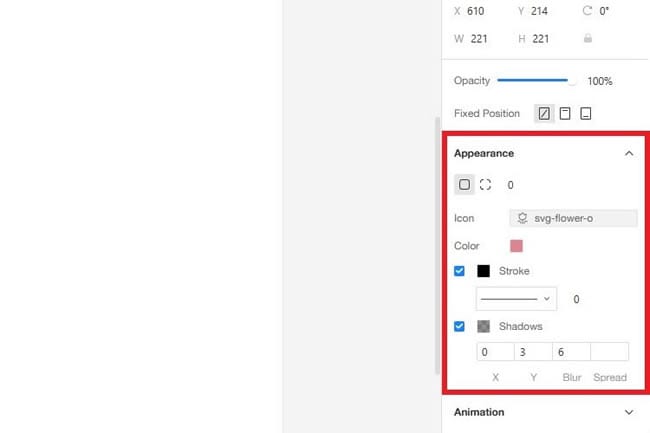
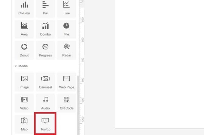
- Add The Chat Bubble Component
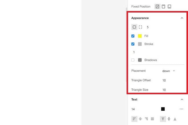
Step 1: Drag Tooltip from the Media section and drop it on the canvas.
Step 2: Change its placement direction and color from the right toolbar under the Appearance section. The Text section is also available, which allows you to add and edit the text in the chat bubble.
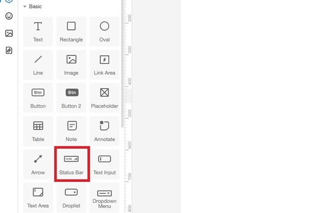
- Add The Status Bar Component
Step 1: Select the Status Bar from the Basic widgets section.
Step 2: Drop it on the artboard.
Step 3: Edit its text and body color from the right toolbar.
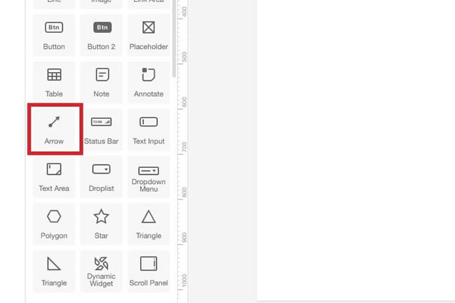
- Add The Arrow Component
Step 1: Drag and drop the Arrow on the canvas from the Basic widgets section on the left toolbar.
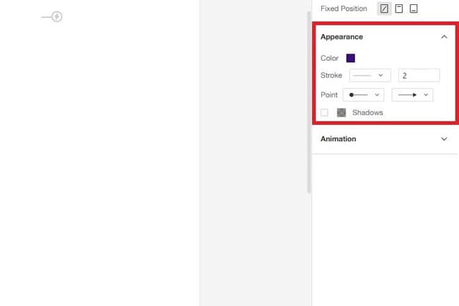
Step 2: Change the arrow's color, stroke, and point from the right toolbar.
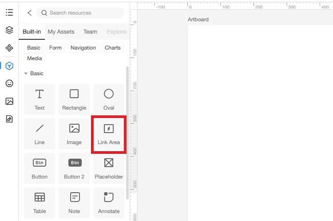
- Add A Link Area
A link area activates a jump point on a particular part of the artboard. It is also commonly known as the Hot Zone. Follow the steps below to add a link area to your project:
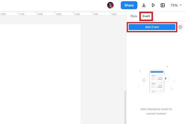
Step 1: Select the Link Area component from the Basic widgets and place it on the canvas.
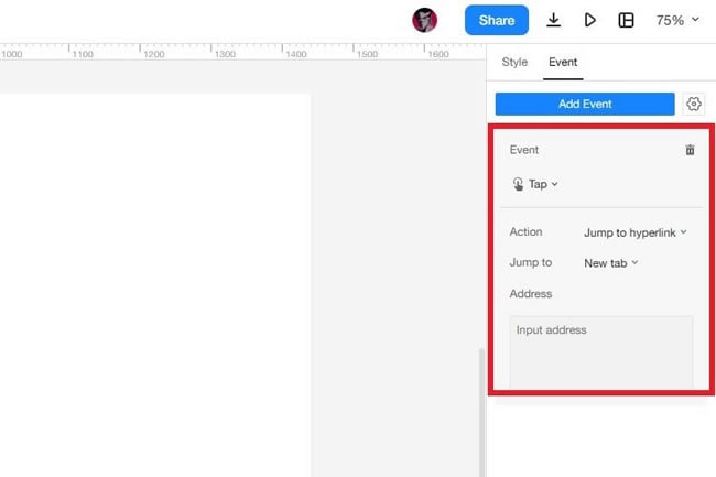
Step 2: Now, go to the right toolbar and click Event > Add Event.
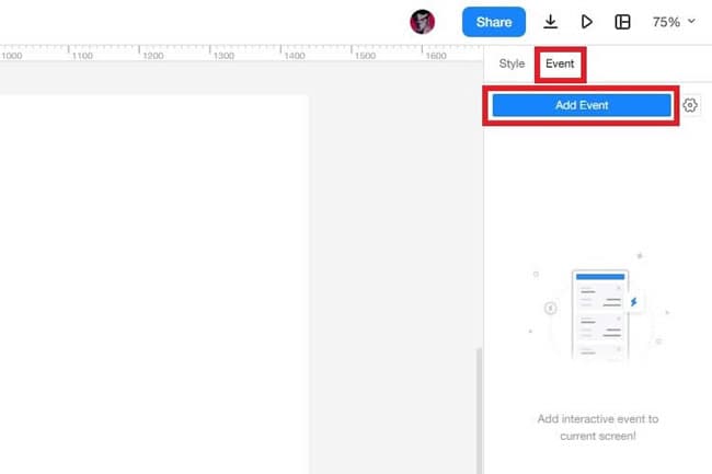
Step 3: Choose an action, such as Jump to hyperlink. Enter an input address to activate the hot zone.
- Add A Web Page
Step 1: Drag the Web Page from the Media section and drop it on the artboard.
Step 2: Enter the URL in the Web Address on the right toolbar.
Step 3: Now, go to the Event section and click Add Event.
Step 4: Select an action and enter the address you want to link.
Insert Text, Shapes, and Buttons
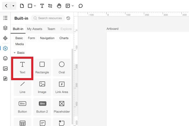
- Add Text
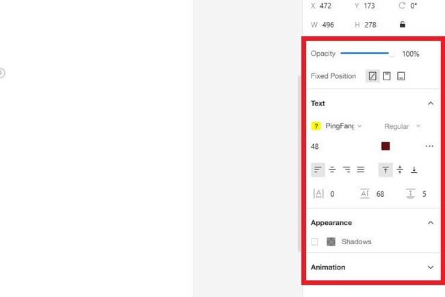
Step 1: Under Basic widgets, select Text and drop it on the canvas.
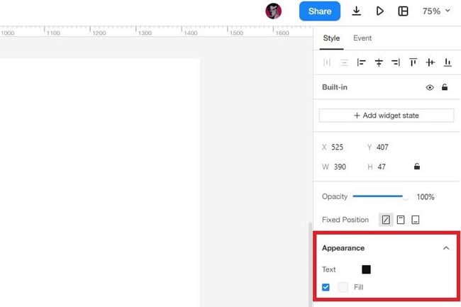
Step 2: Double-click the text box to write something in it. From the right toolbar, you can customize the font, alignment, color, size, appearance, etc.
- Add and Edit Shapes
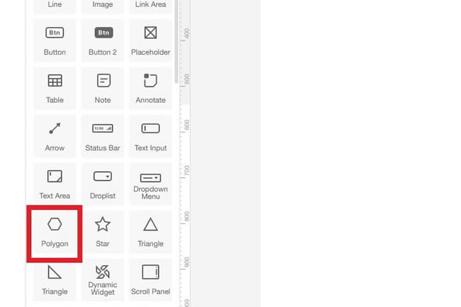
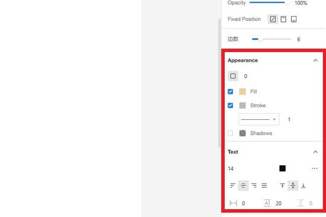
Step 1: Select a shape from Basic widgets and draw it on the artboard. For this, we will use a polygon.
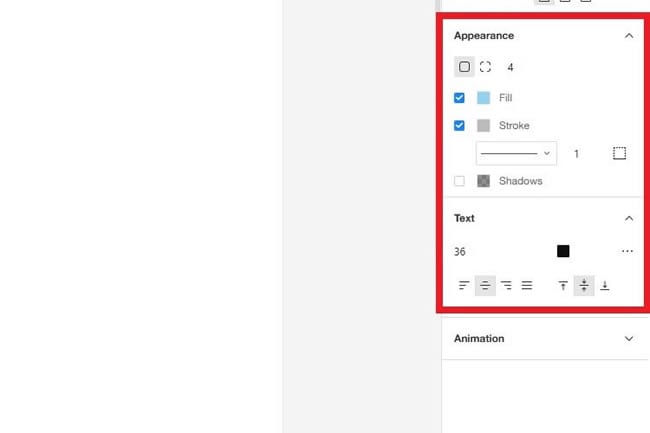
Step 2: Edit its color, size, stroke, and other properties from the right toolbar.
- Add Buttons
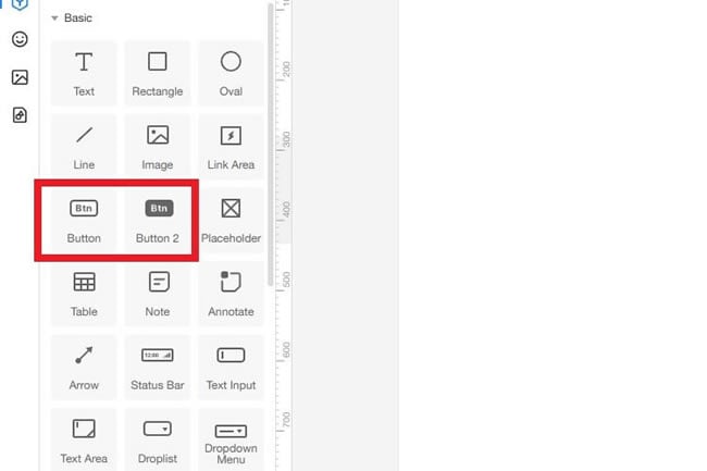
Step 1: Choose a button from the Basic widgets section and place it on the canvas.
Step 2: Double-click the button to edit the text inside it. You can edit its other properties from the right toolbar.
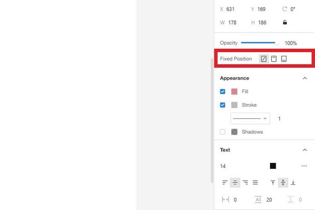
Fixed Component Position
The fixed position ensures that the component will remain there during operations. When you place a new widget on the canvas, its position is not fixed. Here's how to set it:
Step 1: Select any widget and drop it on the artboard.
Step 2: From the right toolbar, set its Fixed Position to Relative to Top or Relative to Bottom.
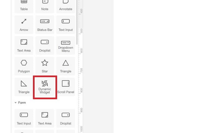
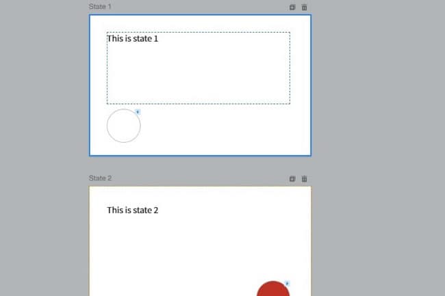
Add and Manage Dynamic Widget
Before learning how it works, it is important to know about the dynamic widget. In general, dynamic widgets are an interactive component that can change its position, color, size, alignment, or other properties on the screen. They come in handy for animations.
Here's how to use them in your projects:
Step 1: Choose Dynamic Widgets and place it on the canvas.
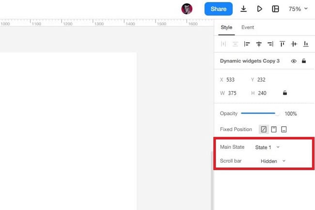
Step 2: From the right toolbar, set its main state and scrollbar.
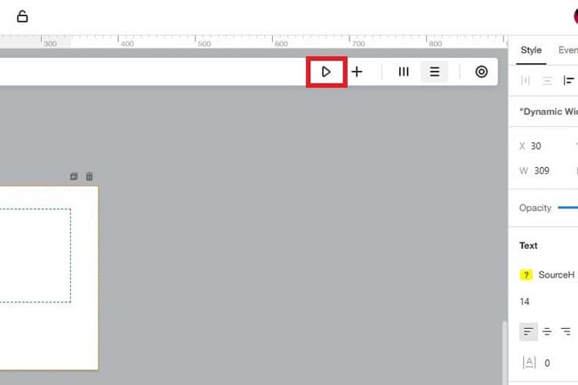
Step 3: Double-click the widget to edit its states.
Step 4: Lastly, click the Play icon to test the demo.
Pro-tip To Master All Components
Each component offers something different. Hence, you can use multiple ones to create demo projects. It will give you a better understanding of how various widgets can work together.