Make Web Design More Effective With These Tested And Proven Principles
It could be a daunting task to make web design of your website workable when you do not have any prior knowledge or experience in website designing. Whether you intend to make website with google or with any paid platform, it is worthwhile to learn and implement these design principles which we have laid down throughout this article.
Website designing is generally a process of planning, building and maintaining websites.
Good web design is not only about attractive images on your website; in fact, it is much more than that. Usability and Utility are two of the most critical determinants of a nicely designed website.
Few people have a misconception that only putting captivating images on a website would serve the purpose of creating an efficient design.
So, we have shortlisted and discussed all those practical principles which you need to follow while you design your website at any platform.
There are many websites to make websites free of cost; for instance, you can either make website with google or with Wix. When it comes to a paid plan, with the help of Godaddy make website in few easy steps and that too at affordable rates.
Whichever platform you choose, make a Web design prototype with Wondershare Mockitt before proceeding towards actual web development.

Keep Things Simple
If you are one of those designers who like to add multiple elements on a web page to make it look more exciting and converting, you better stop doing it.
With a lot more elements, your website will look cluttered and messy. People would find it hard to navigate within your website. In addition to that, if you add more unnecessary elements into your website, your website will take a longer time to load, and hence your SEO will affect.
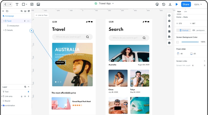
Wondershare Mockitt is a design prototyping and collaborative tool which helps you to build a design prototype of your website. By using Mockitt well before time, you can put all of your design ideas into a prototype and can get a feel, if your website will look clean after implementing those ideas or not.
Of course, every business builds a website to convert customers eventually, and if that is not happening, there is no point of overdesign your website.
Consistent Approach
Imagine yourself as a visitor to that website where you find inconsistent layouts on all of its pages. Every page has its own colours combination, typeface and button sizes. Would you like to keep navigating that website? Perhaps, no!
Your website's theme must remain consistent throughout your website. Not a single page at your website should deliver a different design message.
Start planning about these design elements before website development and to achieve that Mockitt will be yours alongside design partner. Mockitt allows you to create multiple clickable pages and build links between them. In this way, you may design every page independently with your selected elements and can ensure the consistency throughout all the pages of your website.
Typography
While design attracts the visitor, your written content on your website retains and convert your prospects. Undoubtedly a well-written copy is easier to understand and helps in SEO ranking. Whichever keywords you plan to target on your web pages, arrange them within your writeups with the help of relevant font types and sizes.
Make sure to align headlines and body text with the opted keywords you chose for SEO. Mockitt allows you to choose between various text sizes and fonts. You may select any font of your choice and can see if that looks good on your buttons, sections or anywhere you want it to be placed.
Mobile Responsive
Since 51.3 % of online traffic generated from mobile, it is crucial to optimize your website as a mobile responsive. It is also one of the most critical ranking factors in search engine optimization. If you are not optimizing your design for mobiles, you will miss out on a wide range of opportunities.
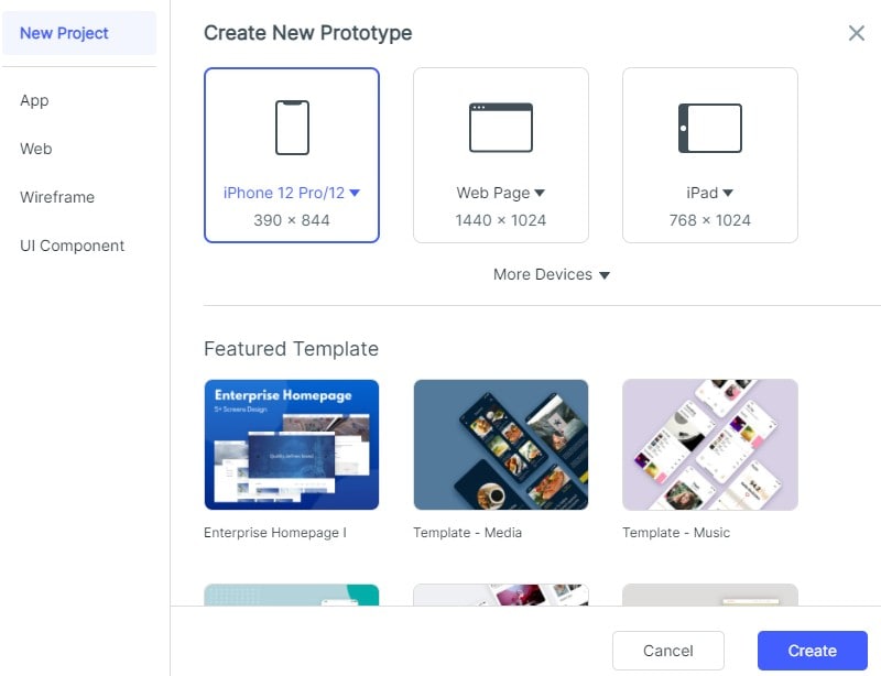
Mockitt is one of those designing tools which allows you to create a prototype for your mobile screen. There are a couple of pre-designed sizes available for the mobile category. But you can also create a custom screen size if the model number of your mobile phone is not available in provided templates.

Color Combination And Images Placement
It goes without saying how important it is to use the various colour combination on your website to make a first pleasing impression for your visitors. And, it is equally important to align colours combination with your brand identity. Suppose you provide services for the men's gym clothes. You might do not want to use pink as a theme colour for your website. 3-4 colours of your own choice can be utilized for the whole website.
Furthermore, it depends on your business type that if you want to include multiple vibrant images or not. You should avoid placing a lot of pictures of different colours and sizes; it doesn't make your page look consistent.
Mockitt has a different section of the colour palette where you can select colours either by clicking on it or by adding HEX colour code in the given space.

With the widget named image, either you can upload a new photo on your design prototype from your computer or can select from the already uploaded images. Place it on your web page and show the prototype to your stakeholders to have their judgment about if they want that particular image to be placed there.
Use white space (negative) wisely within your website as it would help your visitors not to use much of their cognitive abilities to read your content; basically, less effort they have to put to consume your content.
Optimization
Use a clear but optimized image. By optimization, it means that your text and alt text should be included because it helps in SEO. Also, if your image size is not too big, it would help your website to load more quickly, which eventually would lead to better ranking on search engines.
Navigation and Communication
The more your visitors find it easy to navigate through your website, the more they stay and convert. Ensure to use consistent buttons and aligned texts throughout your website. Use more prominent CTA (call to actions) buttons where you want your prospects to click. The most important content should be placed within more significant sections.
Your visitor should know where to click for a specific action; actions like if they want to read your blog, buy your services, or make contact with your team.
It is vital for a professional website to provide all the relevant information to its users and to achieve that you can make a prototype by using Mockitt and see if it is conveying the intended message. Place text, visuals and navigations menus within your prototype, show it to the users for testing purposes and make changes as per the feedback.
Concluding Remarks
Use all of the above techniques and make web design work to your advantage. You can make website and earn money for free, but when you follow all these principles, the probability of converting your customer would be increased.

